 |
VOOZH | about |
|
VOOZH | about |
Descriptive statistics are techniques used to summarize and find the key characteristics of a dataset. It's a important step in data analysis, helping to provide a clear overview before moving to more advanced modeling. It involves summarizing and visualizing the key characteristics of a dataset, giving insights into its structure, patterns and any potential issues that may require cleaning.
Quantitative descriptive statistics typically include measures like mean, median, mode, standard deviation and variance. These statistics provide us with key insights like:
We will implement quantitative descriptive statistics using R programming language. Base R has all the needed functions for calculating all the statistical values we need.
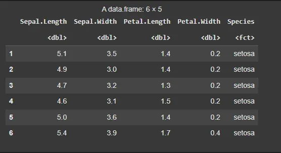
The iris dataset is a built-in dataset in R that contains measurements of the sepal and petal length and width for 150 iris flowers, categorized by species (Setosa, Versicolor and Virginica).
Output:
We will calculate the minimum and maximum values of the Sepal.Length feature. We can use the built-in min() and max() functions.
Output:
Minimum Sepal Length: 4.3
Maximum Sepal Length: 7.9
To find particular central tendencies like mean, mode, median, quantile and percentile we have inbuilt functions for them by their name only which can be used to find a particular measure.
Output:
Mean of Sepal Length: 5.843333
Median of Sepal Length: 5.8
1st Quartile of Sepal Length: 5.1
3rd Quartile of Sepal Length: 6.4
Interquartile Range of Sepal Length: 1.3
To measure the spread of data, we can calculate the standard deviation and variance. These metrics give us an idea of how much the values deviate from the mean.
Output:
Standard Deviation of Sepal Length: 0.8280661
Variance of Sepal Length: 0.6856935
The fivenum() function provides a quick summary of the data, including the minimum, 1st quartile, median, 3rd quartile and maximum.
Output:
Five-number summary of Sepal Length:
4.3 5.1 5.8 6.4 7.9
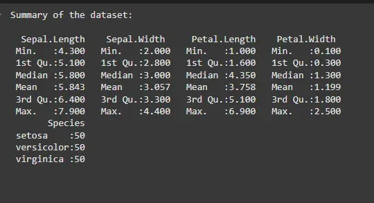
For a comprehensive summary, the summary() function provides the min, 1st quartile, median, mean, 3rd quartile and max of each numeric column.
Output:
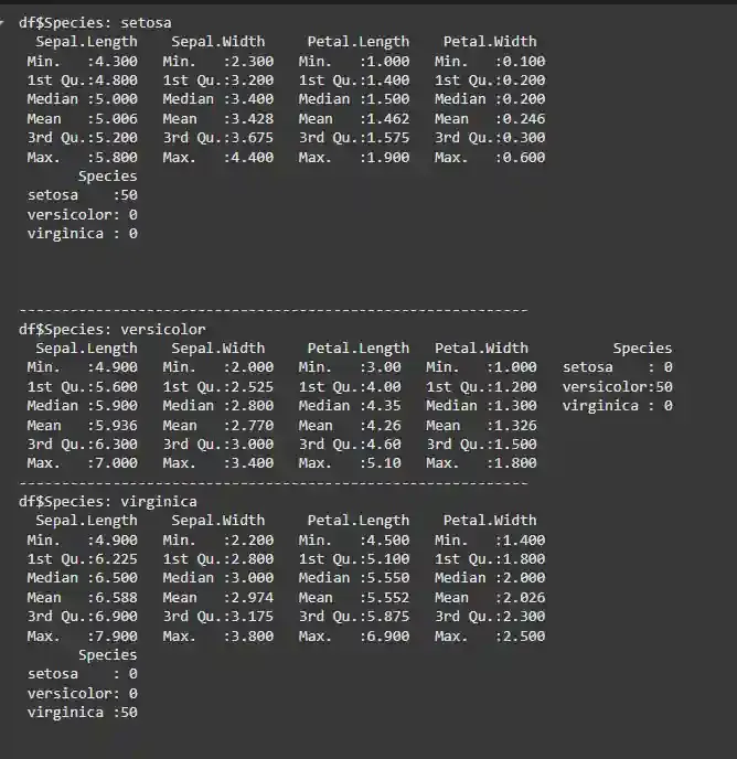
We can also group the dataset by the Species column to get descriptive statistics for each species separately
Output:
We also have different packages as well which provide such functions which are mainly to get the descriptive statistics of the dataset.
7.1. Pastecs Package
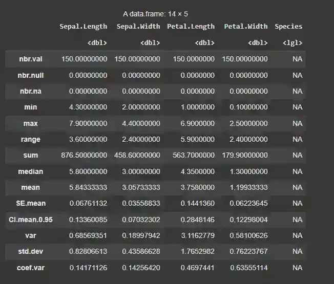
For example, we have stat.desc() function in the pastecs package which provides all the statistical measures of the dataset.
Output:
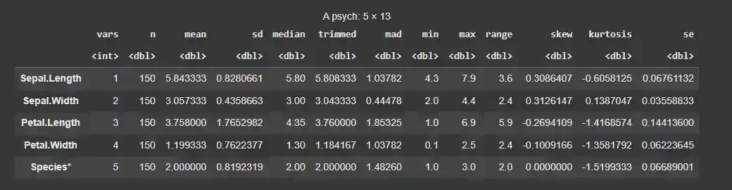
7.2. Psych Package
Another such example is the describe() function of the psych package which is similar to the describe() method available in the pandas library of Python.
Output:
Analyzing numbers requires some level of expertise in statistics. To tackle this problem we can create different types of visualizations as well to perform descriptive statistical data analysis. Some of such data visualizations that can be used for descriptive statistical analysis:
We will implement graphical descriptive statistics using R programming language. Base R has nearly all the needed functions for plotting all the visualizations we need. We will also use ggplot2 for some visualization.
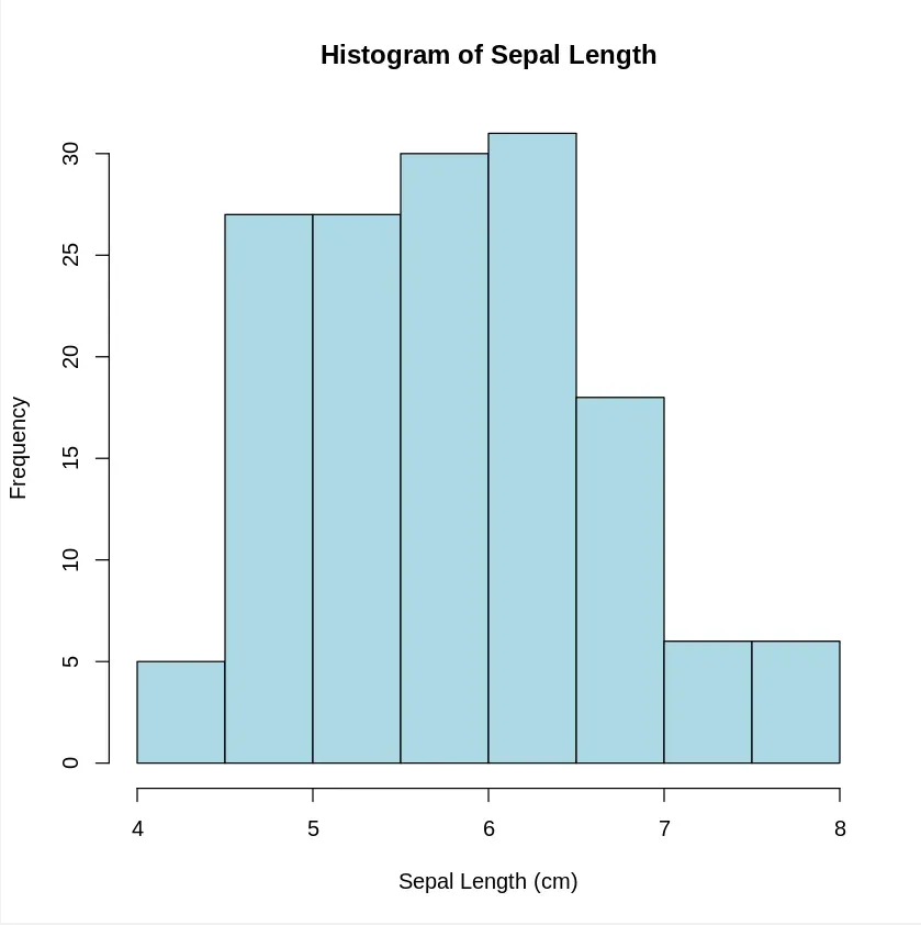
A histogram shows the distribution of a single variable. It groups the data into bins and the height of each bar represents the number of data points in each bin.
Output:
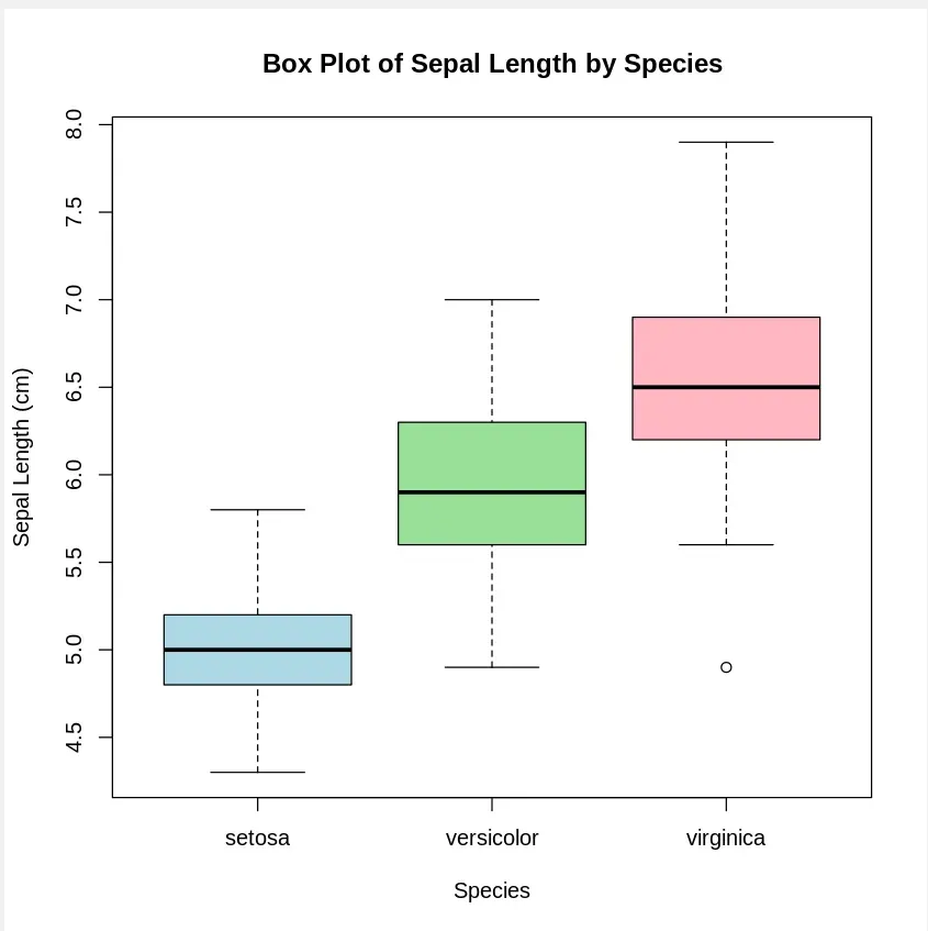
A Boxplot shows the spread of data and highlights the median, quartiles and potential outliers.
Output:
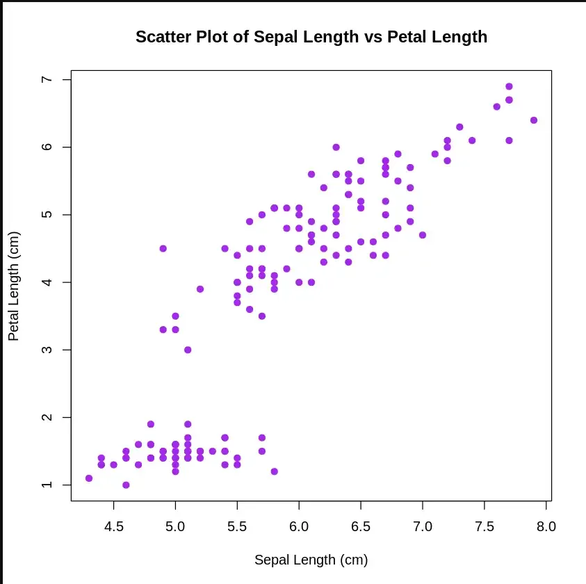
A scatter plot is a set of dotted points to represent individual pieces of data on the horizontal and vertical axis. The values of two variables are plotted along the X-axis and Y-axis, the pattern of the resulting points reveals a correlation between them.
Output:
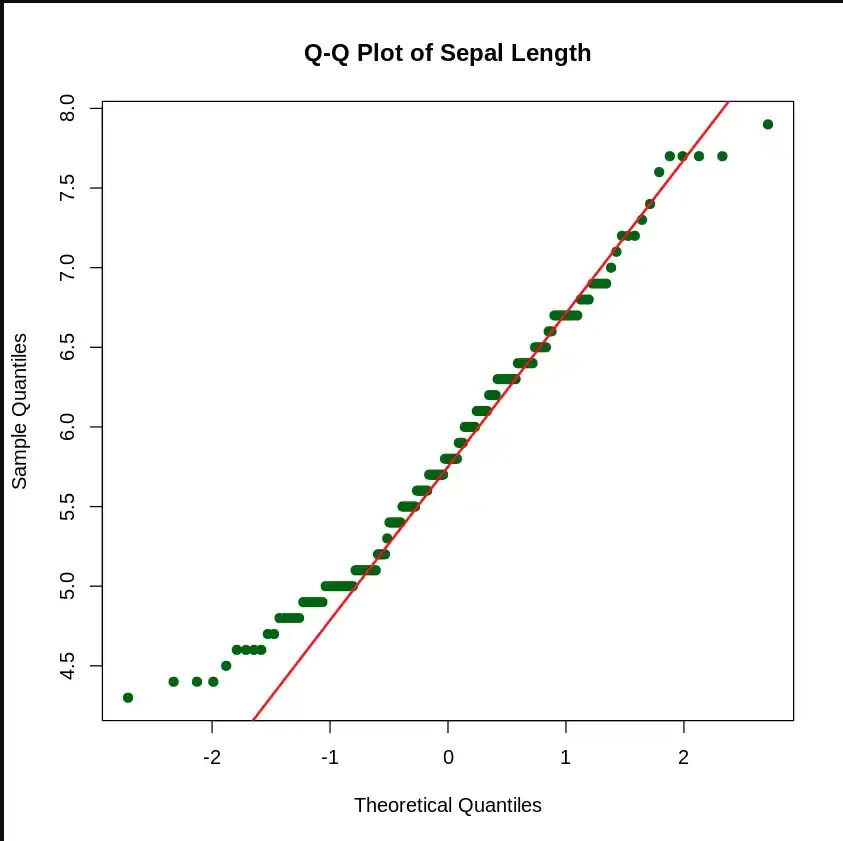
The (quantile-quantile) Q-Q Plot helps us determine if the data follows a normal distribution. It compares the quantiles of the data against the quantiles of a normal distribution.
Output:
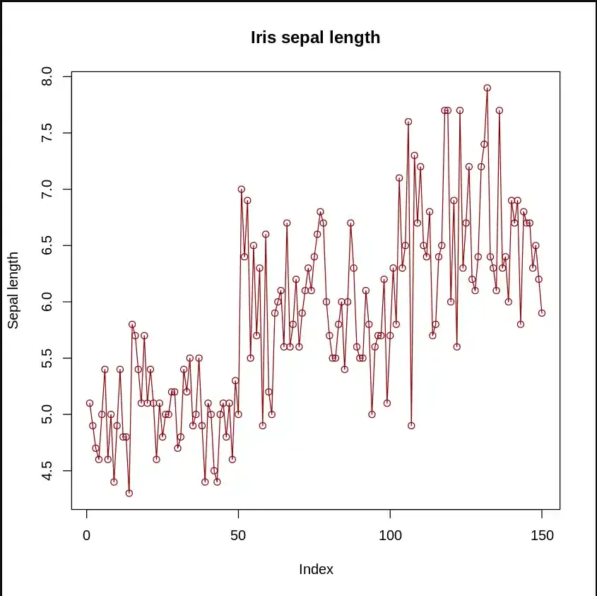
In a line plot, is useful for visualizing trends over time or across ordered categories.
Output:
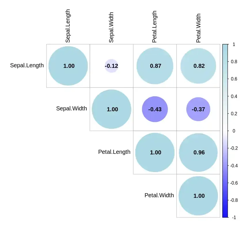
A Correlation Plot visualizes the pairwise correlations between multiple variables.
Output:
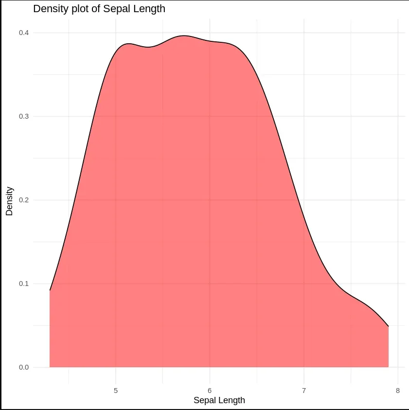
Density Plot is a type of data visualization tool. It is a variation of the histogram that uses ‘kernel smoothing’ while plotting the values. It is a continuous and smooth version of a histogram inferred from a data.
Output:
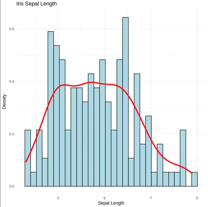
We can also plot the density plot as well as histogram on the same plot as well.
Output: