 |
VOOZH | about |
|
VOOZH | about |
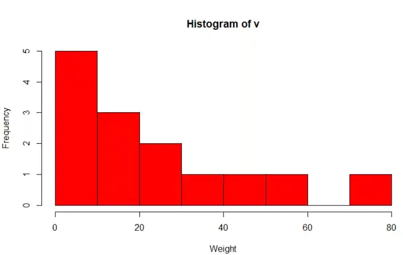
A histogram is a graphical representation that groups numeric data into ranges (bins) and helps visualize the distribution of values. It displays the count of observations within each bin using bars, making it ideal for understanding the frequency distribution.
Syntax:
hist(v,main,xlab,xlim,ylim,breaks,col,border)
Where:
Example:
We create a histogram to visualize how the numeric values are distributed across defined ranges.
Output:
A density plot is a smooth curve that shows the distribution of a numeric variable using kernel density estimation. It helps identify where values are more or less concentrated.
Syntax:
density(x)
Where:
You can download the dataset from here.
A histogram shows data using bars grouped into bins, while a density plot shows a smooth curve based on the same data. Histograms give frequency counts and density plots show probability distribution. Density plots are smoother and not affected by bin size.
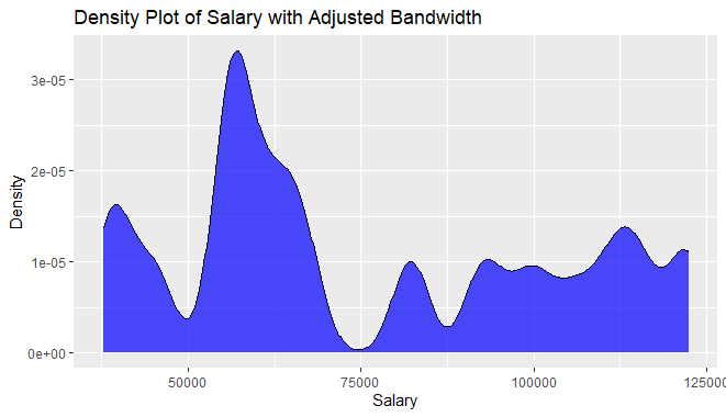
We create a density plot to visualize the distribution of a numeric variable using a smooth kernel density curve. We read a dataset from Excel and uses ggplot2 to create a density plot for the Salary column.
Output:
We changed the border color using color, made the line dashed using linetype and adjusted transparency using alpha.
Output:
We controlled the smoothness of the curve using bw and changed the fill color to blue.
Output:
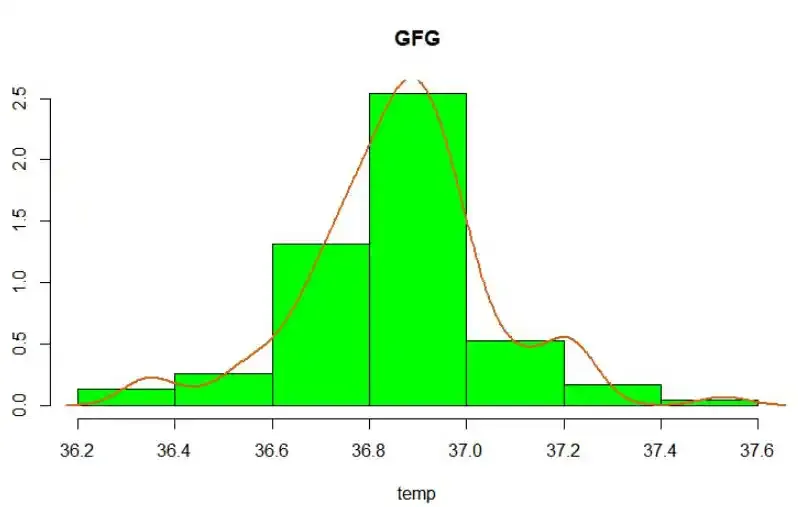
We combined a histogram and density curve using lines() and enabled probability scaling using prob = TRUE.
Output:
We customized the histogram further by adding lty = "dashed" and used fill = "lightblue".
Output: