 |
VOOZH | about |
|
VOOZH | about |
A histogram is an approximate representation of the distribution of numerical data. In a histogram, each bar groups numbers into ranges. Taller bars show that more data falls in that range. It is used to display the shape and spread of continuous sample data.
We can use the ggplot2 library in R to plot an histogram. The geom_histogram() function is an in-built function of the ggplot2 module.
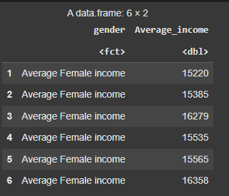
We’re setting a seed for reproducibility and creating a data frame with simulated income data for two groups: Average Female income and Average Male income. Each group has 20,000 values generated from a normal distribution.
Output :
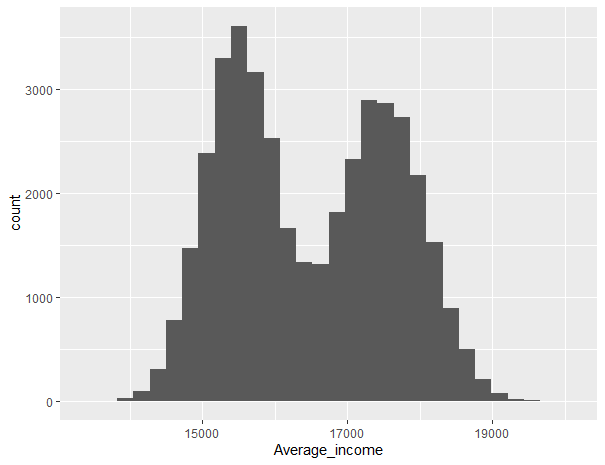
We’re loading the ggplot2 package and creating a histogram of the Average_income variable from the data frame using ggplot(). This helps visualize the distribution of income values across both groups.
Output:
There are several customizations that can be made to a histogram as per the needs.
The color argument within color in this modified code is set to "black" to indicate the border color of the histogram bars.
Output:
We’re using ggplot() to plot a histogram of Average_income, setting binwidth = 1 to create more detailed income intervals. This gives a clearer view of how the income values are distributed.
Output:
We’re creating a histogram of Average_income with white borders and a red fill using ggplot(). This enhances the visual contrast and makes the distribution easier to interpret.
Output:
geom_vline()We are creating a histogram of Average_income by gender with overlapping bars, customizing the bin width and transparency. We add vertical dashed and dotted lines for the mean and median using geom_vline(), and customize colors with scale_fill_manual() and scale_color_manual(). The plot is simplified with theme_minimal(), and the title, labels, and legend position are adjusted for clarity.
Output:
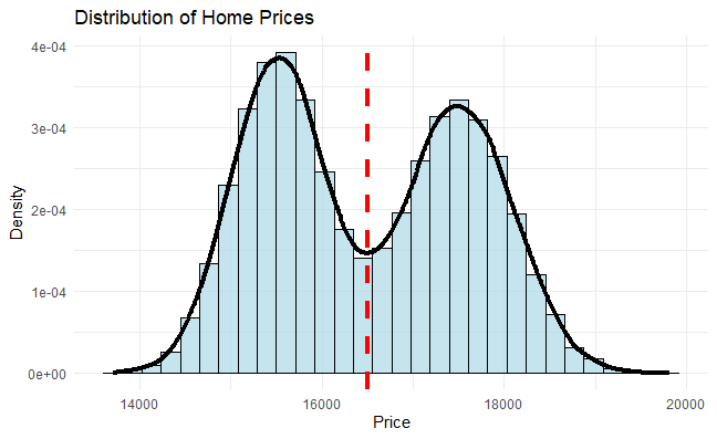
We are creating a histogram with a density plot overlay to visualize the distribution of Average_income. We use geom_histogram() to create the bars, with density values on the y-axis, and add a vertical dashed line for the mean using geom_vline(). A density curve is added with geom_density() to highlight the overall distribution shape. We customize the plot with a title, axis labels, and apply a minimal theme.
Output:
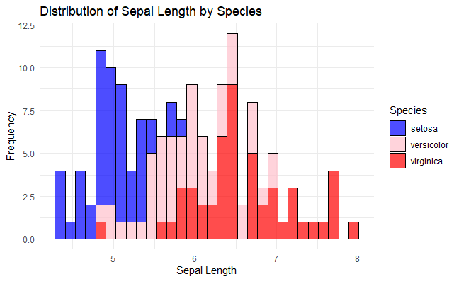
We are creating a histogram of Sepal.Length from the iris dataset, with colors based on the Species column. The bars are outlined in black with a transparency of 0.7, and we use scale_fill_manual() to customize the color palette for each species. The plot includes a title, axis labels, and uses a minimal theme.
Output:
We are creating a histogram of Sepal.Length from the iris dataset, with colors based on the Species column. The plot is faceted by Species, allowing each species to have its own histogram with free scales. We customize the labels and apply a minimal theme
Output:
In this article, we explored how to create histograms in R using the ggplot2 package, covering basic plotting, customization, and enhancements to effectively visualize data distributions.