 |
VOOZH | about |
|
VOOZH | about |
In all organizations, be it small or big, local or global, the effectiveness of the people employed determines the organization's efficacy. Realizing what it takes to thrive in the cutthroat business setting of today demands you as an entrepreneur to do one thing and that is to strive to optimize your employee performance. In this article, the main area of discussion is employee performance through the R Programming Language that has been proven to be applied in data analytics.
By analyzing the data with the use of powerful analytics tools and making lessons that will be used as a guide, we will identify solutions that will be implemented to enable the workers to work better and also be satisfied.
Employee performance analysis involves evaluating various metrics such as productivity, efficiency, and output quality to assess individual and team performance. By leveraging data analytics, organizations can identify top performers, areas for improvement, and potential training needs.
Output:
 EmployeeID Date Department Gender Rating
1 1 2023-06-28 Marketing Male 2.3
2 2 2023-01-14 HR Female 2.6
3 3 2023-07-14 Sales Female 3.5
4 4 2023-11-02 HR Male 4.2
5 5 2023-04-28 Marketing Male 2.0
6 6 2023-10-26 Finance Female 4.3
Visualizations are essential for interpreting the data effectively. We'll create multiple visualizations to uncover patterns and insights.
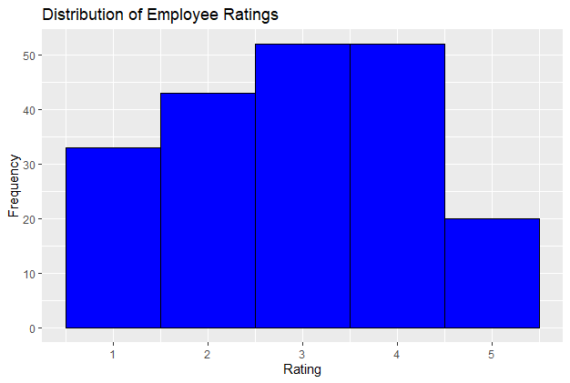
A histogram can show the distribution of employee performance ratings.
Output:
This histogram will help us understand how employee ratings are distributed across the organization. A normal distribution might indicate a balanced performance, while a skewed distribution could highlight potential issues.
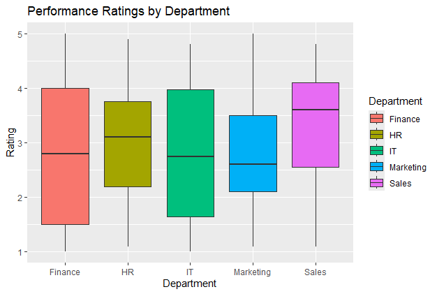
A boxplot can compare performance ratings across different departments.
Output:
This boxplot will show the spread and central tendency of ratings for each department, allowing us to identify departments with high or low performance levels.
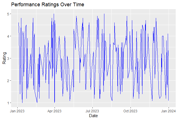
A line chart can illustrate how performance ratings have changed over time.
Output:
This line chart will reveal any trends or seasonal patterns in employee performance, which can inform strategic decisions regarding workforce management.
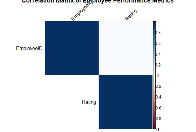
A correlation matrix heatmap can show the relationships between different numerical variables in the dataset.
Output:
The heatmap will highlight strong positive or negative correlations between variables, helping us understand how different factors are related to employee performance.
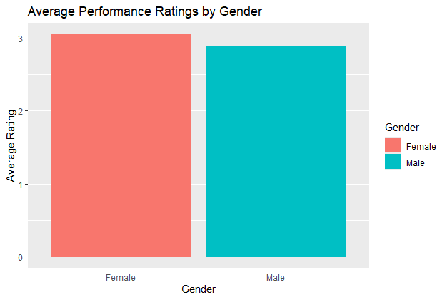
A bar chart can compare performance ratings between male and female employees.
Output:
This bar chart compares the average performance ratings between male and female employees. Differences in average ratings can highlight potential gender-related performance trends and can inform discussions about equity and diversity in the workplace.
Employee performance analysis is essential for understanding workforce effectiveness and making informed HR decisions. Using the ctrrate dataset, we demonstrated various visualizations to analyze and present employee performance data. These visualizations, including histograms, boxplots, line charts, correlation matrices, and bar charts, provide valuable insights into performance distribution, departmental performance, trends over time, relationships between variables, and gender comparisons.