 |
VOOZH | about |
|
VOOZH | about |
Managing personal finances is important for maintaining financial health and achieving financial goals. Building a personal finance tracker dashboard in R can provide valuable insights into income, expenses, savings and investment performance. In this article, we'll outline the steps to create a simple yet effective personal finance tracker dashboard using R and popular visualization libraries like ggplot2 and shiny.
Start by gathering your financial data from sources such as bank statements, credit card statements, investment accounts and budgeting apps. Organize the data into a structured format, such as a CSV file, with columns for date, category, amount and description.
Dataset Link: Personal Finance
Use R and ggplot2 to analyze and visualize your financial data. Create visualizations such as:
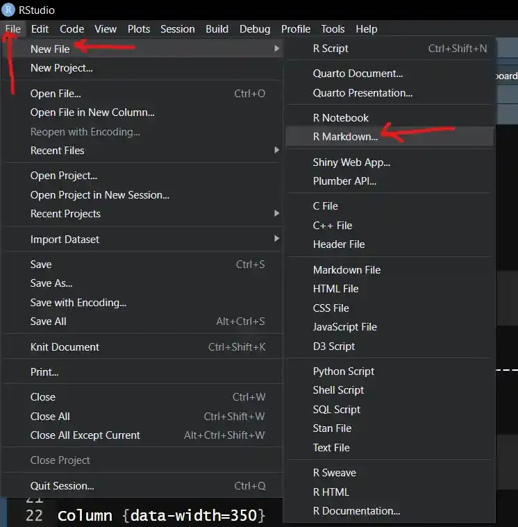
We are using R studio, so the first thing we have to do as follows:
Go to File --> New file --> R markdown --> Templet --> Flex Dashboard --> Click ok
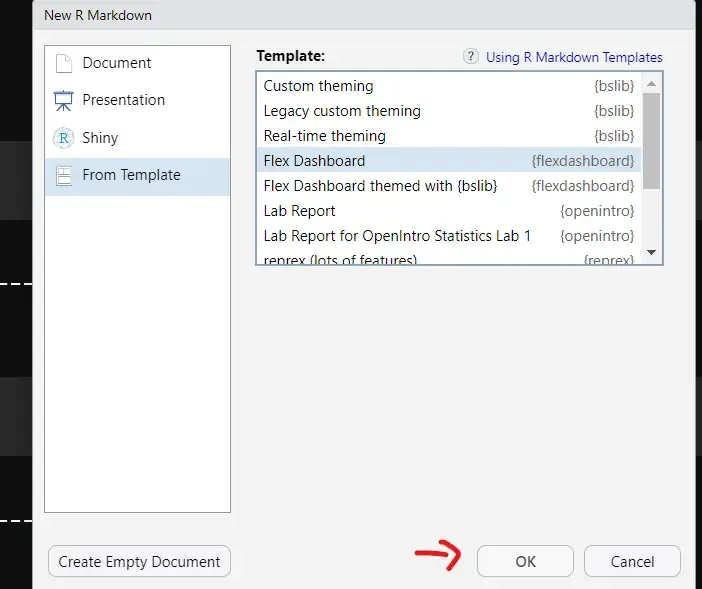
After clicking on that we get this window.
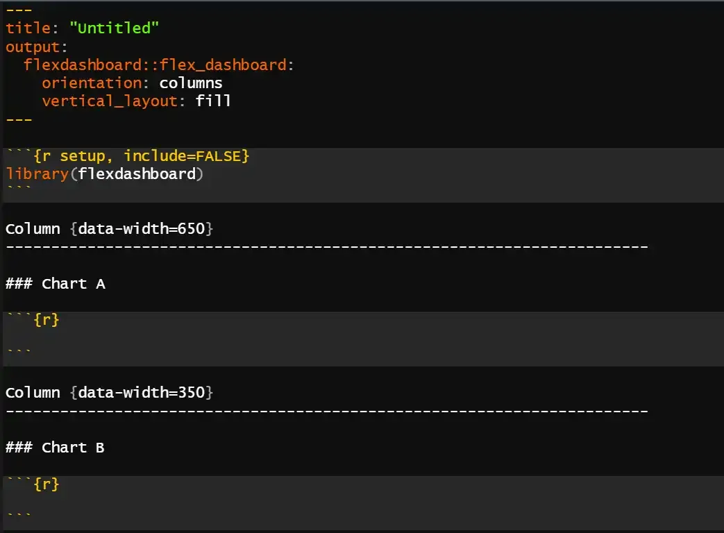
Then you get a template look like as follows:
Now we will create the Dashboard layout and pass the arguments in a chunks.
This section describes the dashboard's title and layout choices. The dashboard will have social sharing buttons and rows as its main layout style.
We load all the necessary libraries in this chunk
We will load our dataset using read_csv() function.
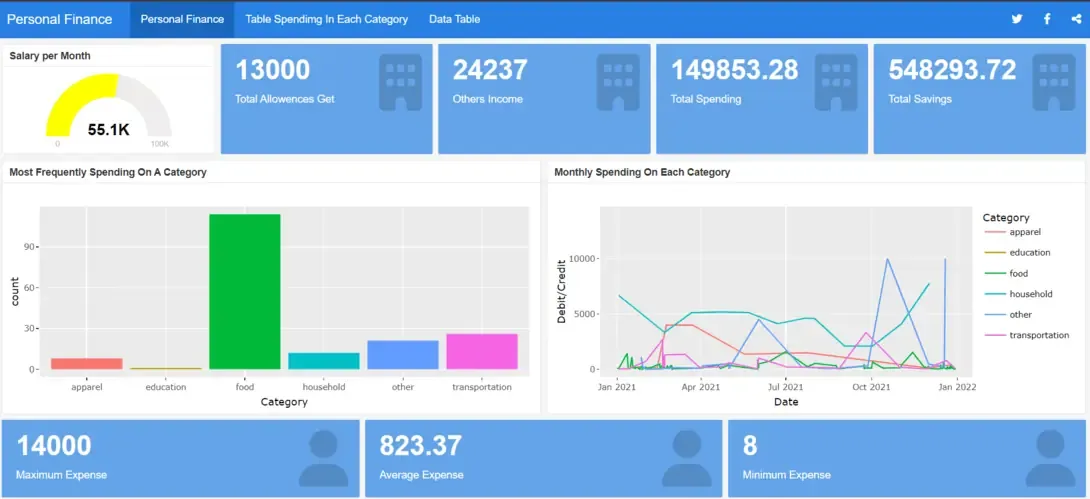
The dashboard is divided into rows and columns, each of containing tables or different visuals.
This section computes the mean salary by filtering the data for salary portions. The average monthly salary is shown visually on a gauge chart.
Output:
Similarly we made:
Combining the power of ggplot2 for static visualizations with the interactivity of Plotly creates dynamic and engaging plots that enhance data exploration and presentation.
Output:
Similarly we made:
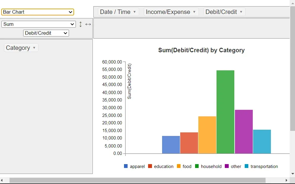
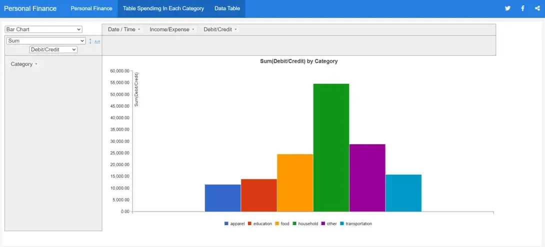
Applies PivotTable to create a pivot table to summarize the spending of a person by category.
Output:
There are lots of options you can use in the pivot table.
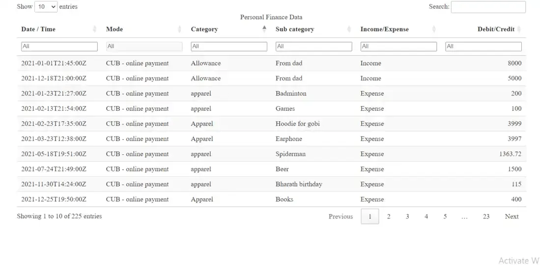
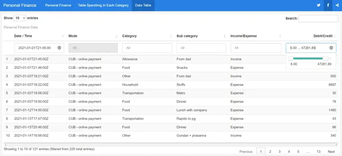
Create a new page and using 'DT::datatable' to display the data in an interactive table in the new page.
Output:
It will show the complete visualization in the R Dashboard.
Here is the whole code for the process of creating the Personal Finance Tracker Dashboard.
Output:
After knitting the current file we get the below output and you can then publish your dash board on the web.
After knitting the current file we get the below output and you can then publish your dash board on the web.
Overall, this flex dashboard provides a comprehensive overview of personal finance data, allowing users to analyze income, expenses, savings and spending patterns effectively. It offers a combination of visualizations and summary statistics for better understanding and decision-making regarding personal finances.