 |
VOOZH | about |
|
VOOZH | about |
A Control Chart is a statistical chart used to monitor process performance over time and identify variations that fall outside acceptable limits. It helps distinguish between normal variation and special-cause variation by using upper and lower control limits. They are useful for:
Tableau does not provide a direct Control Chart option, but it can be created using table calculations, parameters and a dual-axis setup.
Note: For this article, a sample dataset "vgsales.csv" is used, to download click here.
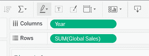
Drag the Year field to the Columns shelf and drag Global_Sales to the Rows shelf.
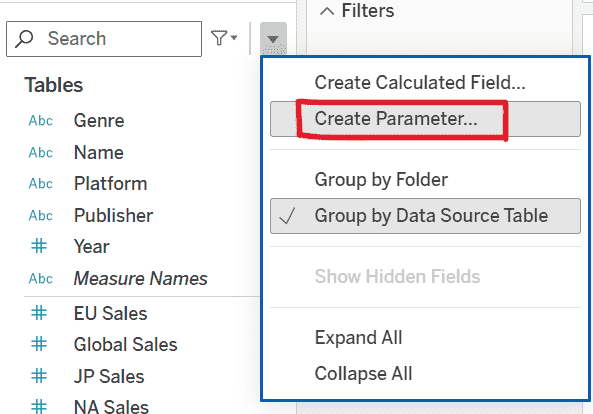
1. Click the drop-down arrow in the Data pane and select Create Parameter.
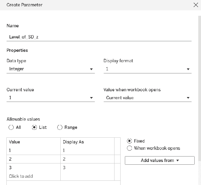
2. Configure the parameter as follows:
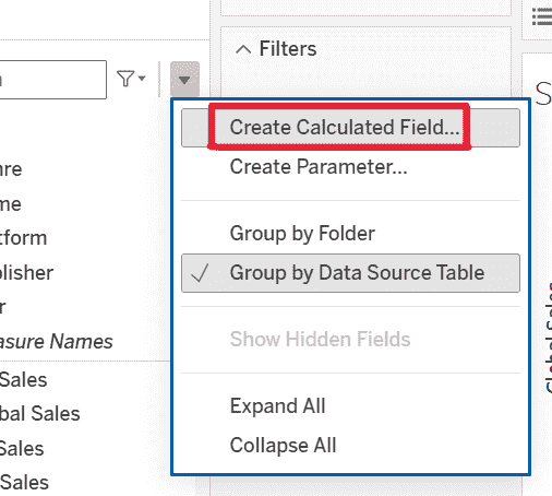
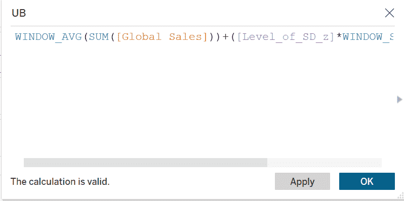
1. From the Data pane drop-down, select Create Calculated Field and name the field UB.
2. Enter the following formula:
WINDOW_AVG( SUM( [Global_Sales] ) ) + ( [Level_of_SD_z] * WINDOW_STDEV( SUM( [Global_Sales] ) ) )
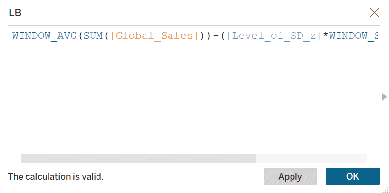
Again select Create Calculated Field and name the field LB. Enter the following formula:
WINDOW_AVG( SUM( [Global_Sales] ) ) - ( [Level_of_SD_z] * WINDOW_STDEV( SUM( [Global_Sales] ) ) )
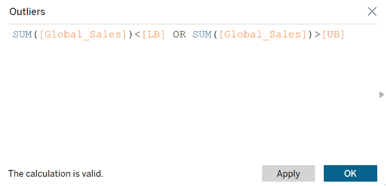
Create another calculated field and name it Outliers and enter the following condition:
SUM( [Global_Sales] ) < [LB] OR SUM( [Global_Sales] ) > [UB]
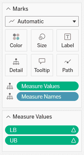
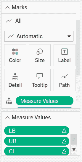
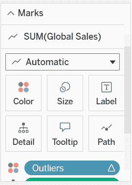
Drag Measure Values to the Marks card and in the Measure Values shelf, keep only LB and UB
Remove all other measures.
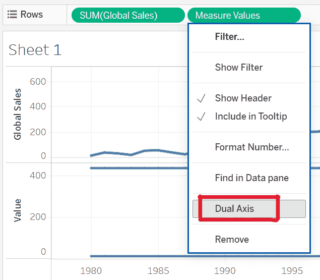
Drag Measure Values to the Rows shelf and right-click the second axis and select Dual Axis.
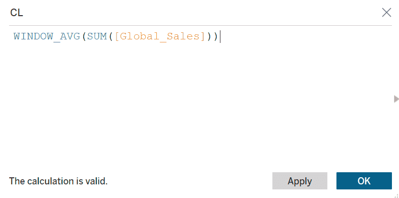
Create a new calculated field named CL and enter the formula:
WINDOW_AVG( SUM( [Global_Sales] ) )
Drag CL into Measure Values.
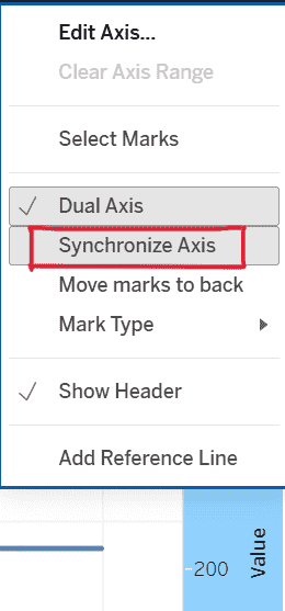
Right-click on the Value axis and select Synchronize Axis.
1. In the Global_Sales Marks card, drag Outliers to the Color shelf.
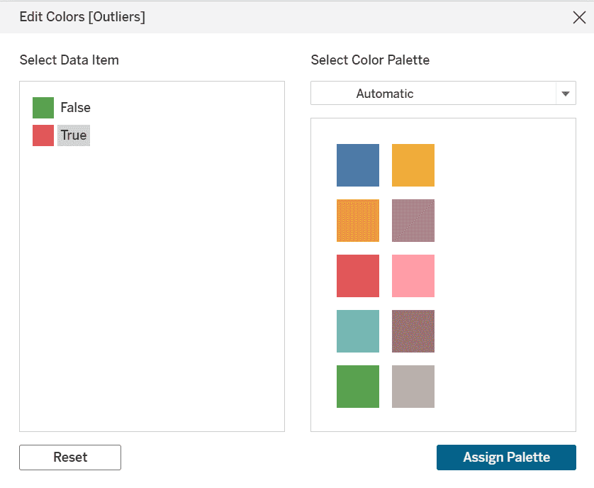
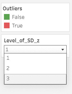
2. Click Edit colors: False -> Green and True -> Red.
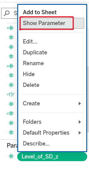
Go to the Parameters pane right-click Level_of_SD_z and select Show Parameter.
Change the Level_of_SD_z value to:
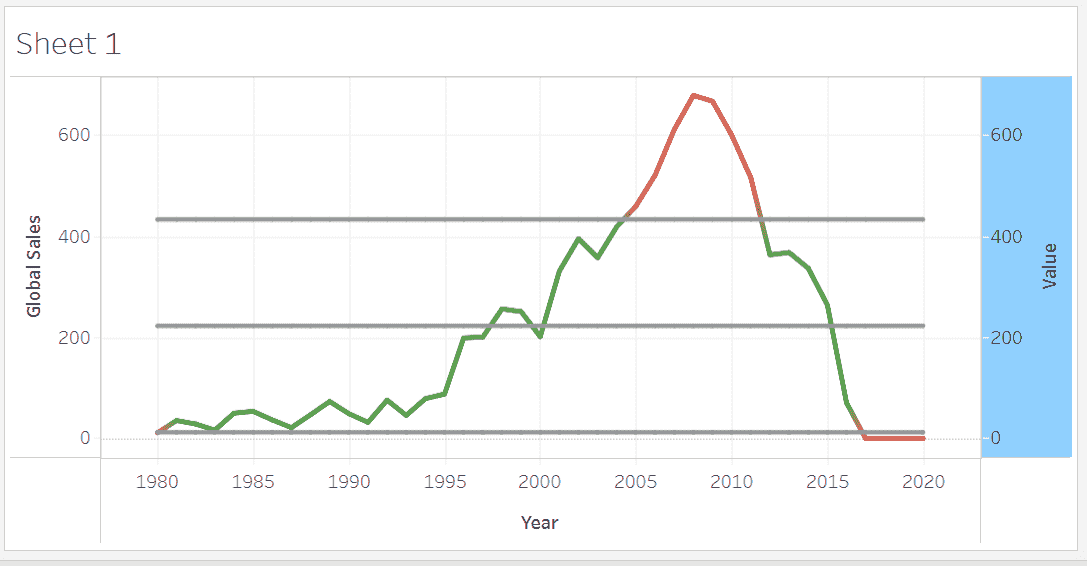
The final Control Chart displays:
This chart is ideal for monitoring stability, detecting anomalies and analyzing process behavior over time.