VOOZH about

URL: https://www.geeksforgeeks.org/tableau/heat-map-in-tableau/

โ‡ฑ Heat Map in Tableau - GeeksforGeeks


  • Courses
  • Tutorials
  • Interview Prep

Heat Map in Tableau

Last Updated : 19 Jan, 2026

A heat map in Tableau is a visualisation that uses colour intensity to represent the magnitude of data values across two dimensions, allowing users to quickly identify patterns, variations and relationships within a dataset. By mapping meacolourures to colour, heat maps make it easy to spot high and low values, trends and anomalies in a visually intuitive way.

  • Uses colour to show data density or value strength
  • Helps compare values across categories
  • Quickly highlights patterns and outliers
  • Works well with large datasets
  • Makes complex data easier to interpret

Implementation

For this we have to follow some steps :

Dataset used can be downloaded from here.

  • Open the Tableau tool and connect a dataset to it.
  • Drag and drop the one sheet of the connected dataset.
  • Click on sheet1 to open the Tableau worksheet.
  • On clicking Sheet1, you will get the whole dataset attributes on the left side and a worksheet for work.
๐Ÿ‘ Image

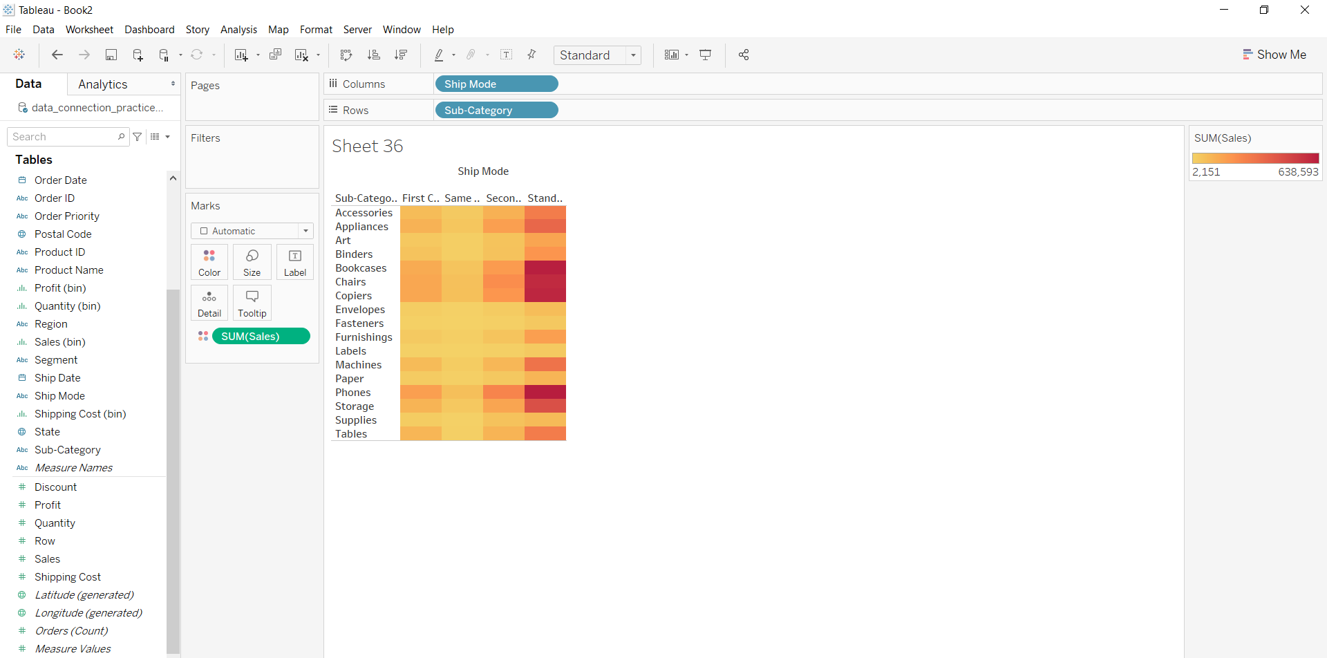
Example 1: To draw a heat map you have to select a minimum of two attributes (one in the row and one in the column) by drag and drop then select the chart option as a heat map.

๐Ÿ‘ Image

Example 2: This example is also drawn similar to above example 1 with some extra marks and which is explained in steps given below:

  • Select the Ship mode and Subcategory as column and row respectively.
  • Select the chart type heat map.
  • Apply color marks based on Sales
๐Ÿ‘ Image

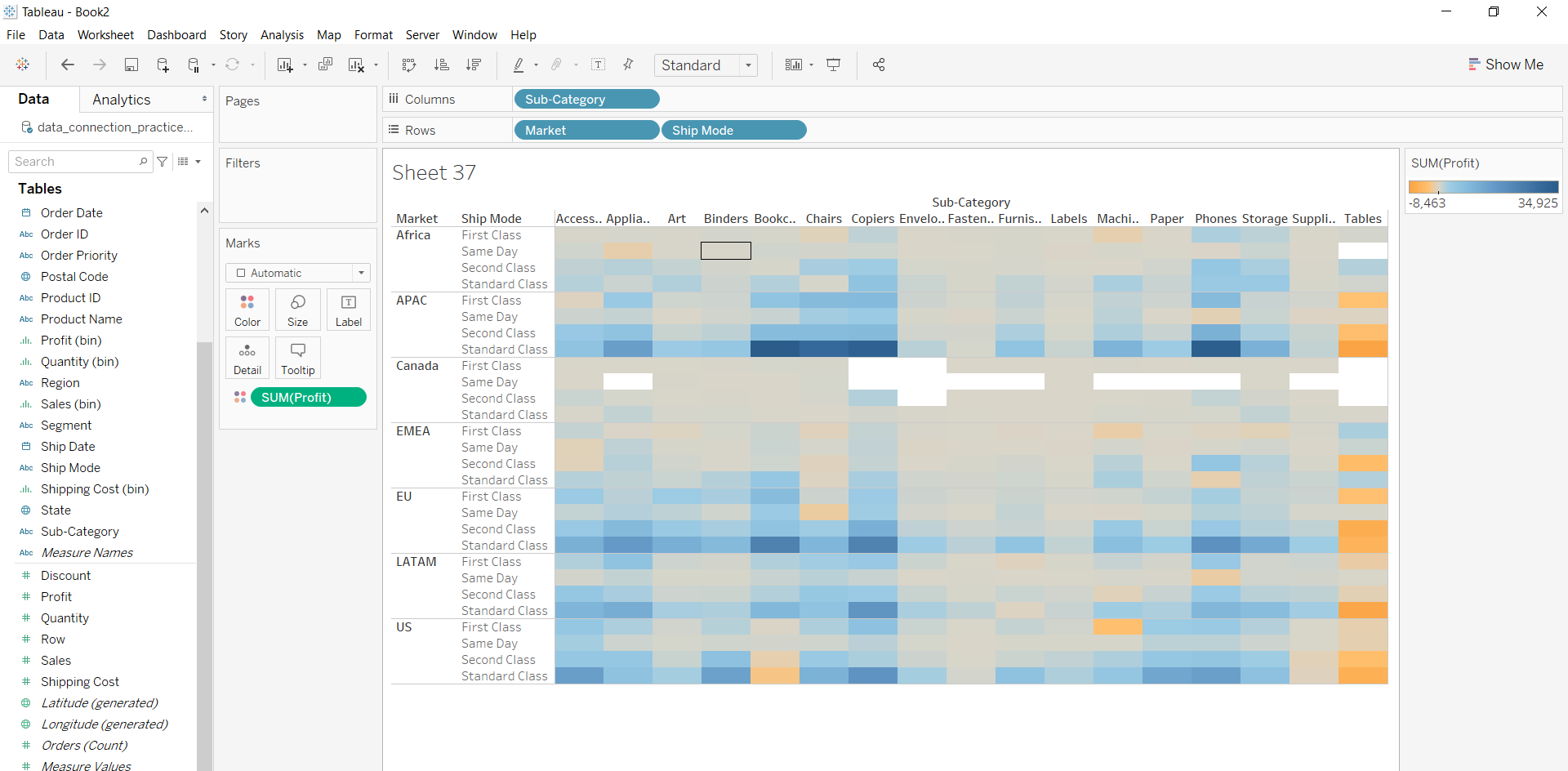
Example 3: This example is also drawn similar to above example 1 with some extra marks and which is explained in steps given below:

  • Select the Subcategory and Market with Ship mode as column and row respectively.
  • Select the chart type heat map.
  • Apply marks by color of profit.
๐Ÿ‘ Image
Comment
Article Tags:
Article Tags:

Explore