 |
VOOZH | about |
|
VOOZH | about |
In this article, we will learn how to do manual sort of visualization in tableau worksheet to do further operations.
Tableau is a very powerful data visualization tool that can be used by data analysts, scientists, statisticians, etc. to visualize the data and get a clear opinion based on the data analysis. Tableau is very famous as it can take in data and produce the required data visualization output in a very short time.
Visualization or visualisation (see spelling differences) is any technique for creating images, diagrams, or animations to communicate a message. Visualization through visual imagery has been an effective way to communicate both abstract and concrete ideas since the dawn of humanity. Sorting is any process of arranging items systematically, and has two common, yet distinct meanings:
There are various ways in which the visualizations can be sorted, among which sorting them manually is explained here.
For this we have to follow some steps :
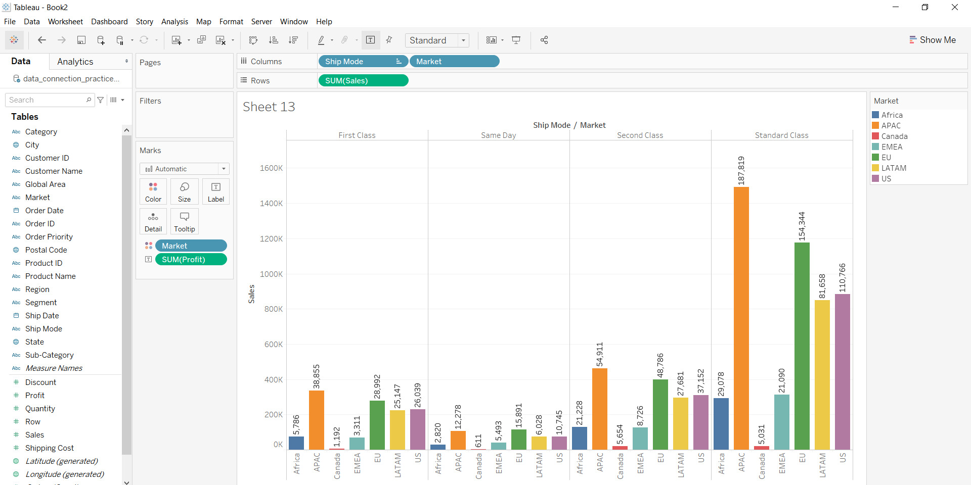
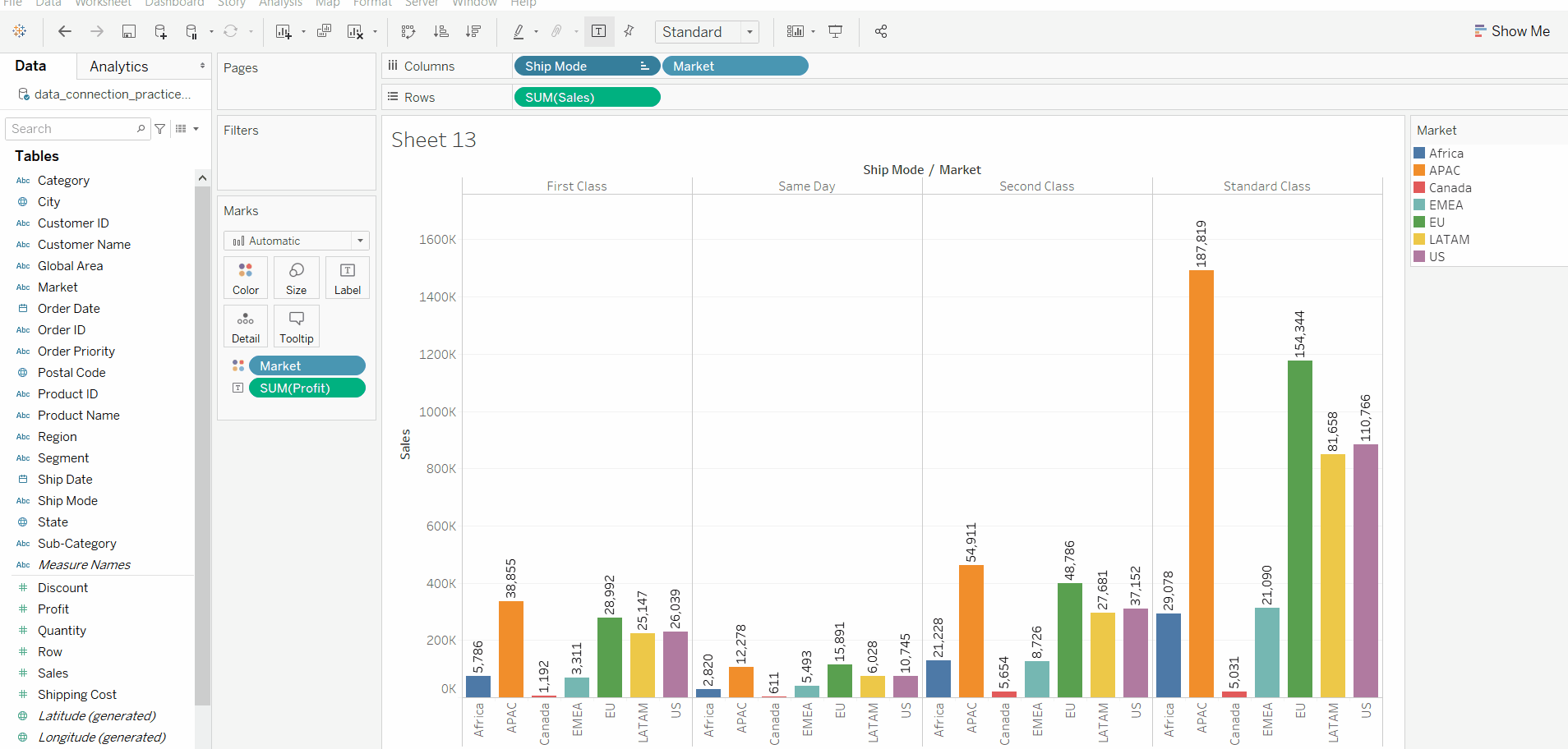
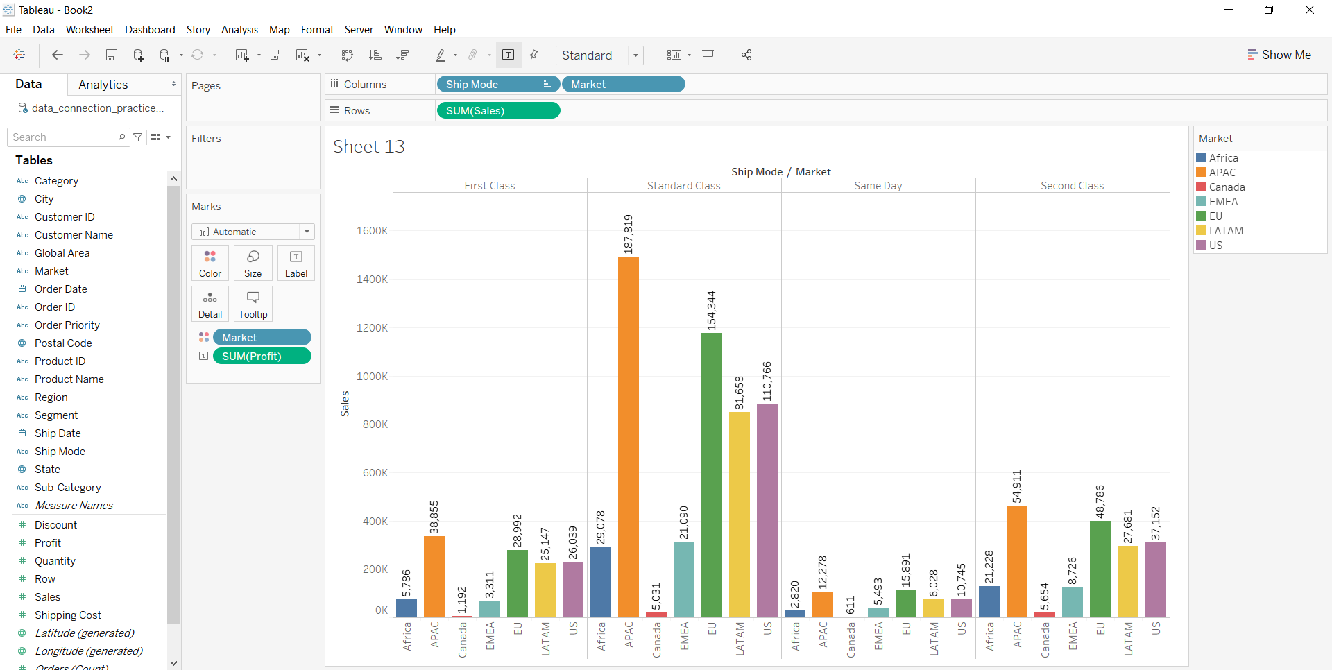
5. Draw a graph to visualize the data and then apply the sorting technique. Here, the visualization part is sorted manually by drag and drop. The user can select and the attribute
part and arrange wherever required.
Example 1:
👁 ImageExample 2:
After adding the fields to rows and columns, in Marks section, click on labels and enable it to get the labels over the bars.