 |
VOOZH | about |
|
VOOZH | about |
Pie Chart is a circular statistical graphic divided into slices, where each slice represents a proportion of the total. They are widely used visualization for showing percentages of a whole. The arc length, central angle and area of each slice are proportional to the value it represents.
Pie charts are useful for:
To create a basic pie chart in Tableau:
👁 ImageNote: You can use in-built datasets of tableau.
This gives us a simple pie chart showing the proportion of each category based on the selected fields.
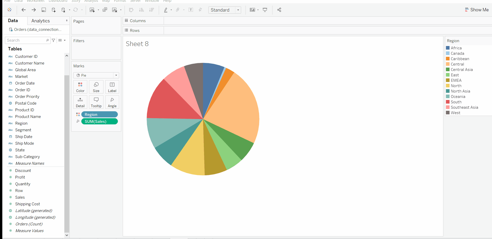
This chart provides a clear view of how each category contributes to the total.
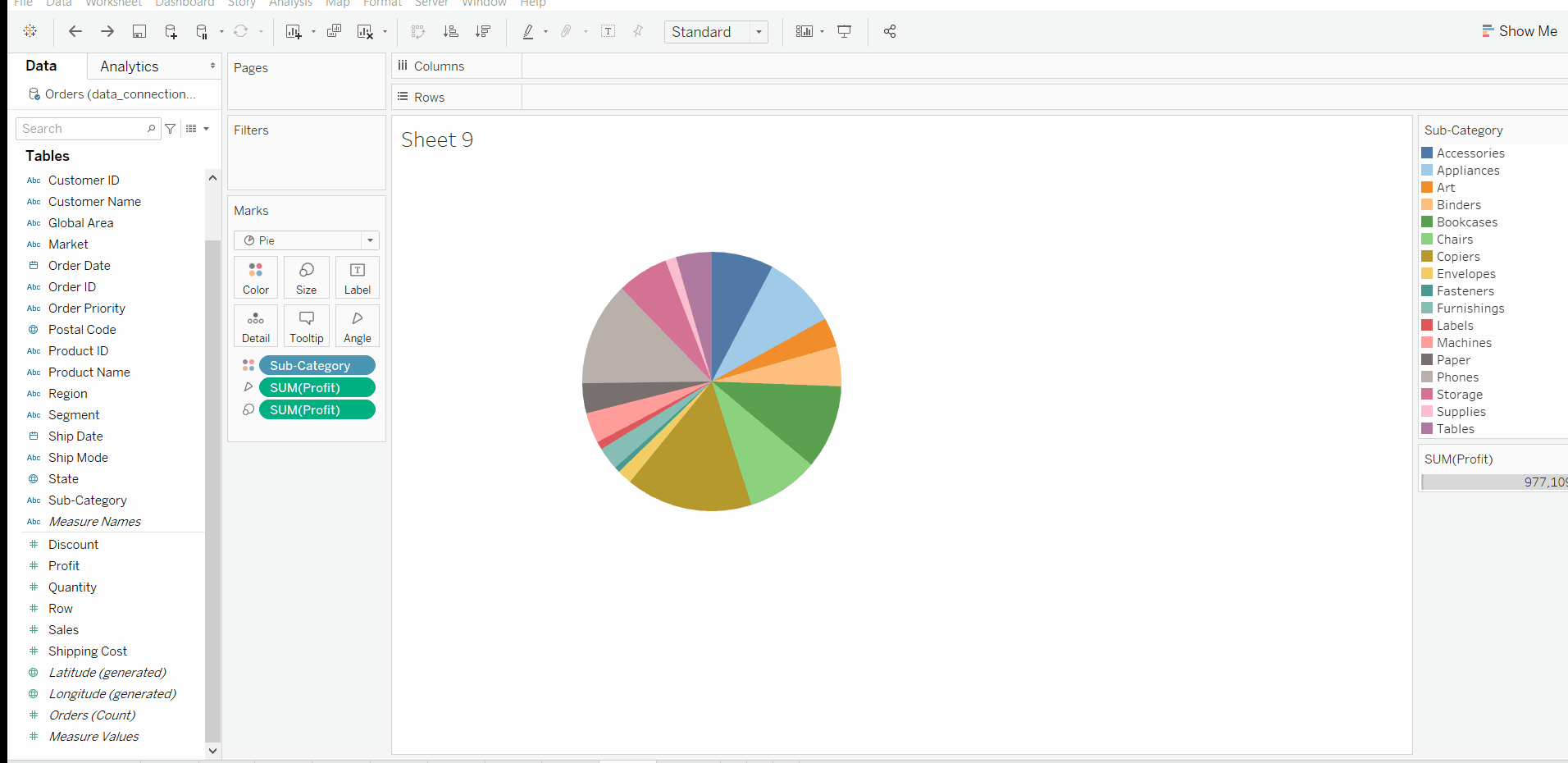
This customization helps us highlight profit values while using colors to differentiate categories.
This advanced pie chart allows us to display multiple metrics (Sales, Region) and customize both slice colors and borders for better visual distinction.