 |
VOOZH | about |
|
VOOZH | about |
A Dual-Axis Map in Tableau allows you to overlay two different map layers on the same geographic view. This makes it possible to combine multiple measures, such as a filled (choropleth) map and a symbol map into a single visualization for deeper geographic insights.
Dual-axis maps are useful for:
Tableau supports dual-axis maps by layering latitude and longitude fields. Below are the steps to create a dual-axis map:
Note: For this article, the dataset used is Sample_Superstore.xls. To download click here.
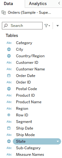
Double-click on the State field in the Data pane. Tableau automatically generates a geographic map using latitude and longitude.
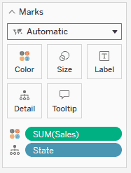
In the Marks card, drag and drop Sales to Color. This creates a filled (choropleth) map where states are shaded based on sales values.
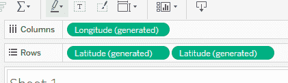
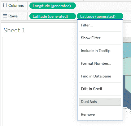
Go to the Rows shelf. Press and hold Ctrl, then drag Latitude and place it next to the existing Latitude field on the Rows shelf.
You will now see two Latitude pills.
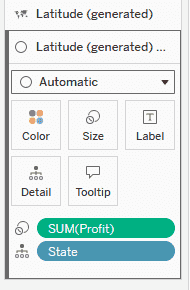
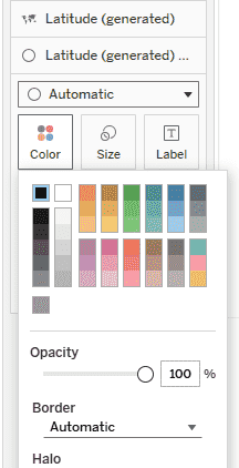
1. In the Marks card, select the second Latitude map (the lower Marks card), remove SUM(Sales) from the Color shelf and drag and drop Profit to Size to represent profit using symbols.
2. Click Color and change the symbol color to Black.
Go back to the Rows shelf, right-click on the second Latitude pill and select Dual Axis.
This overlays both maps into a single view combining the choropleth and symbol map.
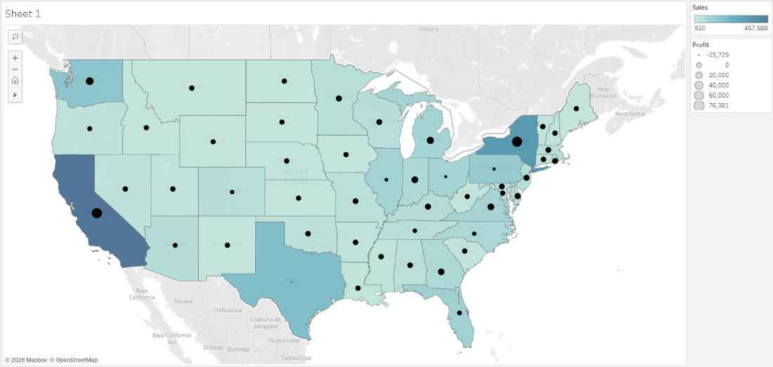
After completing these steps, you will have a Dual-Axis Map that combines two geographic visualizations: