 |
VOOZH | about |
|
VOOZH | about |
A Jitter Plot is a variation of a scatter plot used to reduce over-plotting when multiple data points share similar values. By slightly spreading (jittering) data points along one axis, it becomes easier to see the distribution and density of data across categories. Jitter plots are useful for:
Tableau does not have a direct jitter plot option but it can be created using a random calculation to spread data points along one axis.
Note: For this article, a sample dataset "vgsales.csv" is used, to download click here.
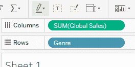
1. Drag Genre to the Rows shelf and drag Global_Sales to the Columns shelf.
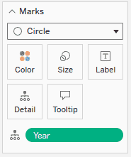
2. In the Marks card, change the mark type to Circle and drag the Year field to Detail in the Marks card.
This creates a basic scatter layout where each point represents a game’s global sales within a genre.
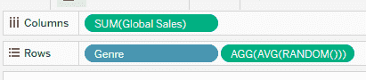
1. On the Rows shelf, click next to Genre and type AVG(RANDOM()) and press Enter to apply the calculation.
2. Tableau will now slightly spread the points vertically, creating a jitter effect and reducing overlap.
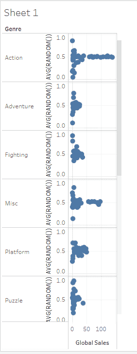
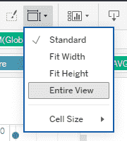
1. Now go to top Toolbar, click Fit and select Entire View to increase the width of the chart.
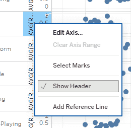
2. Right-click on the Genre axis and uncheck Show Header to remove axis labels.
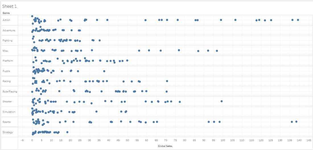
The final Jitter Plot displays Global Sales distributed across Genres, with individual data points spread vertically to avoid overlap. This makes it easier to observe patterns, density and variations within each category.