 |
VOOZH | about |
|
VOOZH | about |
A Pareto Chart is a combination of a bar chart and a line chart that follows the Pareto principle (80/20 rule). It helps identify the most important categories by displaying individual values in descending order along with a cumulative percentage line. They are useful for:
Tableau does not provide a built-in Pareto chart option, but it can be created by combining a bar chart with a cumulative line chart using a dual axis.
Note: For this article, the sample dataset "vgsales.csv" is used, to download click here.
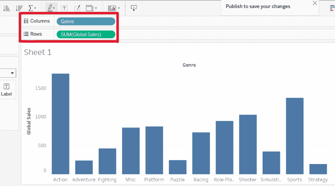
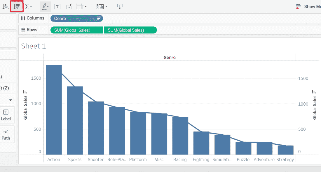
1. Drag the Genre dimension to the Columns shelf and Global_Sales to the Rows shelf.
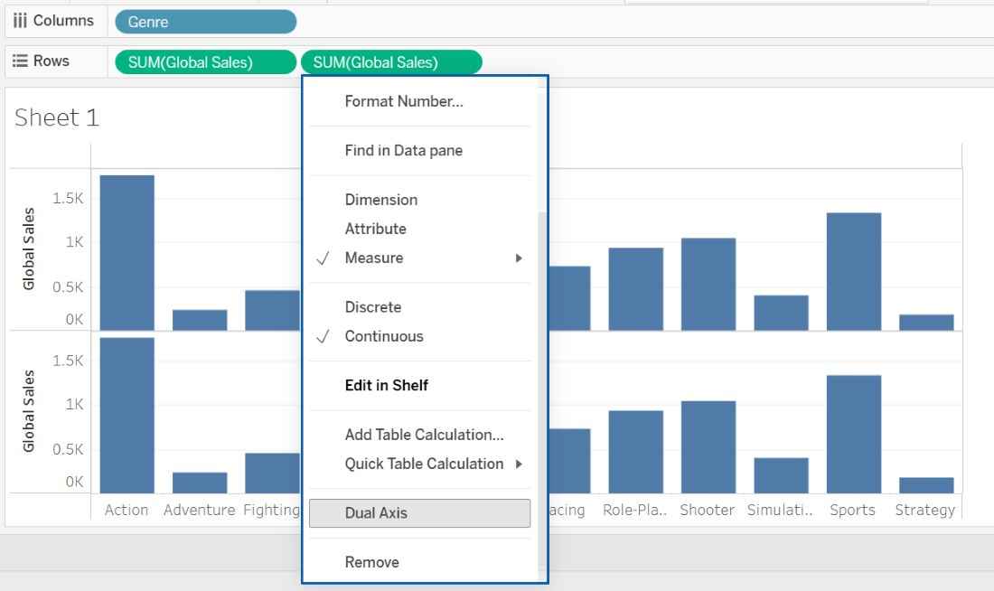
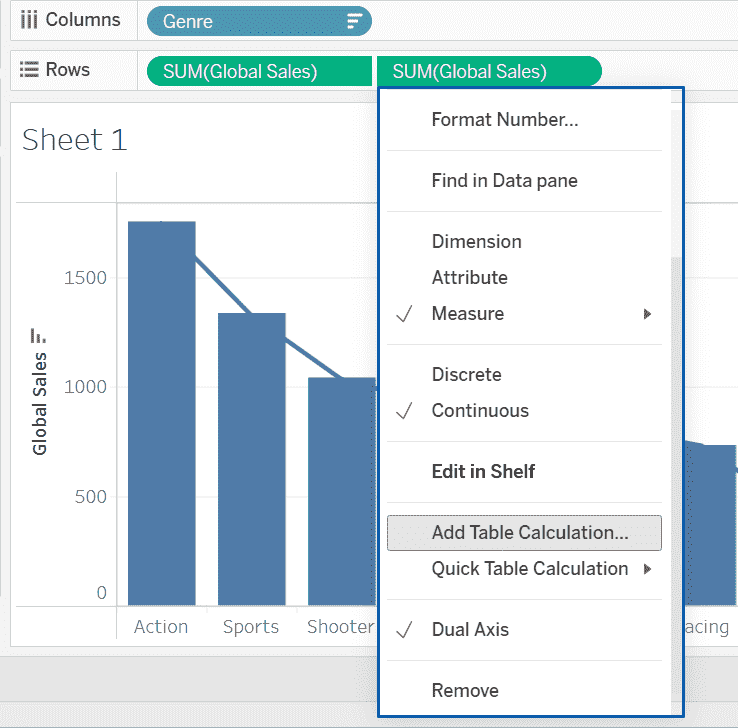
2. Drag Global_Sales again to the Rows shelf so that two measures appear and right-click on the second SUM(Global_Sales) pill and select Dual Axis.
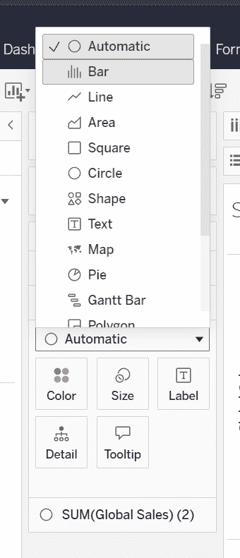
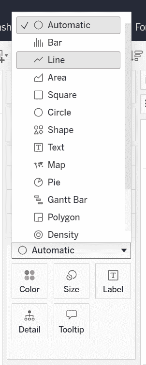
1. In the Marks card, select the first Marks card and change the mark type to Bar and select the second Marks card and change the mark type to Line.
2. Sort the bars in descending order based on Global Sales so that the highest values appear first.
1. Click the drop-down arrow on the second SUM (Global_Sales), pill (line chart) and select Add Table Calculation.
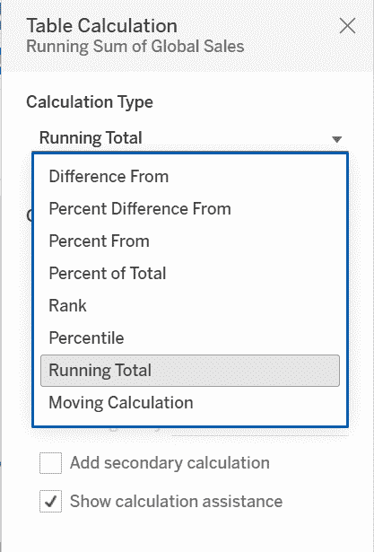
2. Choose Running Total.
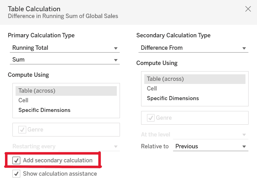
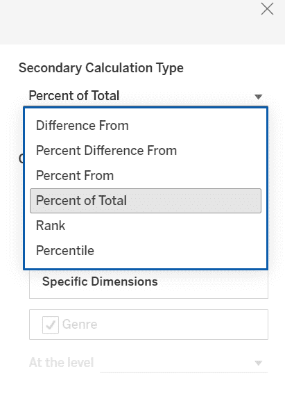
1. On the same SUM(Global_Sales) pill, again click the drop-down arrow and select Add Secondary Calculation.
2. Choose Percent of Total to convert the running total into a cumulative percentage.
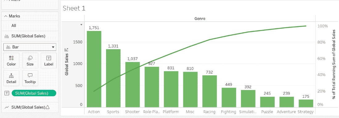
Select the first Marks card (Bar chart) and change the color to Green and select the second Marks card (Line chart) and change the color to Dark Green.
Select the first Marks card and drag Global_Sales to the Label shelf to display values on the bars.
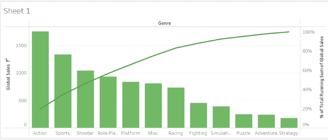
The final Pareto chart shows: