 |
VOOZH | about |
|
VOOZH | about |
One of the common queries, which I get on the blog is:
I am not a Mathematics / Statistics graduate. Can I still become a good business analyst?
or
I am not good at statistics. Can I still change my career to become a business analyst?
The simple answer to the question is – you can’t become a good analyst until you know statistics. However, you don’t need to be an expert in statistics to become a good business analyst.
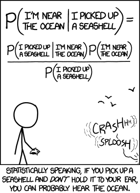
So, you don’t need to understand the joke in the strip, in order to qualify as a business analyst:
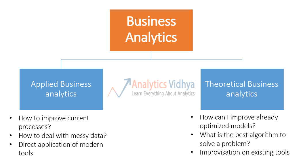
Business anlaytics can be divided in two classes – applied business analytics and theoretical business analytics. Here are definitions of the two streams:
👁 categories of business analytics
Please note that this is not a standard categorization of Business Analytics and it might be difficult to identify some projects in exact buckets. However, it is good enough to communicate the point that you can deal with most of the business analytics problems with basic knowledge of statistics.
Now, that you understand the two classes of business analytics, here is some good news! You don’t need to be a statistician to practice applied business analytics.
So, what exactly do you need to know to become an applied business analytics practitioner? I thought why not run a series of articles explaining the basic concepts of statistics, an applied BA practitioner needs to know.
Please note that this series is not intended to be a thesis on statistics. Instead, it takes a very practical outlook to apply statistics to solve business problems.
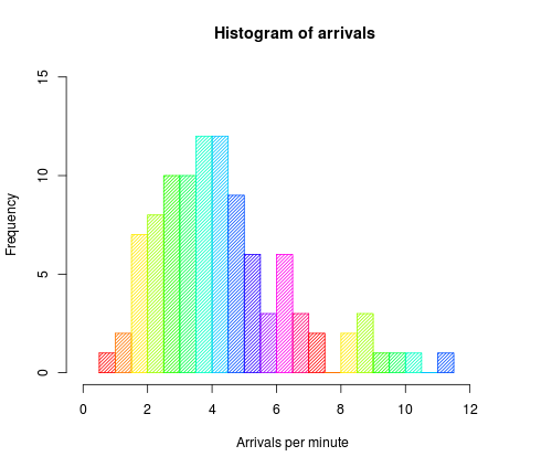
One of the first things a business analyst needs to do is understand various distributions of parameters and population.
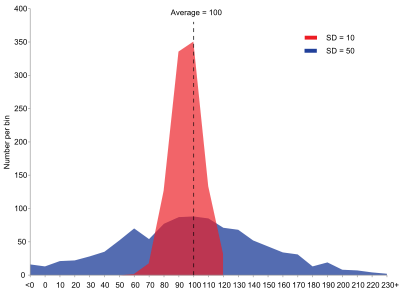
One of the most frequently used method to understand distributions is to plot them using histograms. A histogram represents frequencies of various values through a plot in uniform buckets (popularly known as bins). In case of continuous variables, a histogram represents the probability distribution function (we will cover this later). If you want an example of how histogram is plotted, you can look at this video from Khanacademy. Here is how a typical histogram might look like:
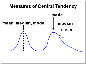
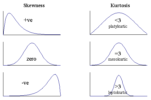
There are 3 variety of measures, required to understand a distribution:
Measures of central tendencies are measures, which help you describe a population, through a single metric. For example, if you were to compare Saving habits of people across various nations, you will compare average Savings rate in each of these nations.
Following are the measures of central tendency:
The following image illustrates how mean, median and mode would be placed in a couple of scenarios:
Among the three measures, mean is typically affected the most by Outliers (unusually high or low values), followed by the median and mode.
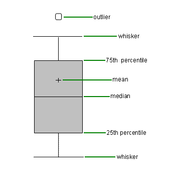
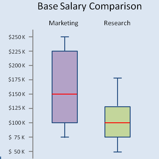
Measures of dispersion reveal how is the population distributed around the measures of central tendency.
Difference in distribution of 2 populations with same mean, median and mode. Source: Wikipedia
A few practical tips to understand distributions better:
👁 box_plot_comparison
In this post, we looked use of statistics to plot and understand distributions of populations – first steps for any business analyst to do in a project. In the articles to follow in this series, we will look at use of confidence intervals, hypothesis testing, probabilities and measures to judge various predictive models. If you would want me to cover more topics, please let me know through comments below.
In the article next week (from baby steps in Python series), we will see how to look at these measures and distributions using Python on a Kaggle dataset.
Kunal Jain is the Founder and CEO of Analytics Vidhya, one of the world's leading communities of Al professionals. With over 17 years of experience in the field, Kunal has been instrumental in shaping the global Al landscape. His expertise spans diverse markets, from developed economies like the UK to emerging ones like India, where he has successfully led and delivered complex data-driven solutions. As a recognized thought leader, Kunal has empowered countless individuals to realize their Al ambitions through his visionary approach to Al education and community building. Before founding Analytics Vidhya, Kunal earned both his undergraduate and postgraduate degrees from IIT Bombay and held key roles at Capital One and Aviva Life Insurance across multiple geographies. His passion lies at the intersection of analytics, Al, and fostering a thriving community of data science professionals.
GPT-4 vs. Llama 3.1 – Which Model is Better?
Llama-3.1-Storm-8B: The 8B LLM Powerhouse Surpa...
A Comprehensive Guide to Building Agentic RAG S...
Top 10 Machine Learning Algorithms in 2026
45 Questions to Test a Data Scientist on Basics...
90+ Python Interview Questions and Answers (202...
8 Easy Ways to Access ChatGPT for Free
Prompt Engineering: Definition, Examples, Tips ...
What is LangChain?
What is Retrieval-Augmented Generation (RAG)?
Thank you for a lovely insight . I have just started my career as a data analyst so i would like to ask you are there any books or courses that i can do to enhance my statistics skills ?
Precise and to the point. Your blog is such a treasure trove. Looking forward to read more on this topic. Thanks Kunal
Thanks Kunal, helpful article, Can you explain same things using SAS ? If possible, please explain a bit more about kurtosis and what is the physical significance of it along with skewness ? Also, by looking at default output of means procedure in SAS, what story can we tell to the client ? Can you please answer this to make me understand how to interpret the results. I know we get N, min, max, std and mean as default but how to tell a story using these to the third person is what I want to understand . Any enlightment would be of great help.
Parul, Getting the output from SAS is very easy, you can use proc means and proc univariate. With regards to the story, stay tuned for the next article. Regards, Kunal
Edit
Resend OTP
Resend OTP in 45s