 |
VOOZH | about |
|
VOOZH | about |
I was completely focused on analyzing data and using statistical methods to build complex data science models when I first started my analytics journey. In fact, I know a lot of newcomers are fixated on this method of approaching things. I have some news for you – this is actually not the core quality of a good analyst.
The stakeholders weren’t able to understand what I was trying to communicate to them. There was a missing link in the whole scenario – storytelling.
I was able to level-up by improving my storytelling skills. To convey the story to our management team, a key skill to learn is understanding different types of charts. Usually, we can explain most things with a simple bar chart or a scatter plot but they don’t always fulfill the need.
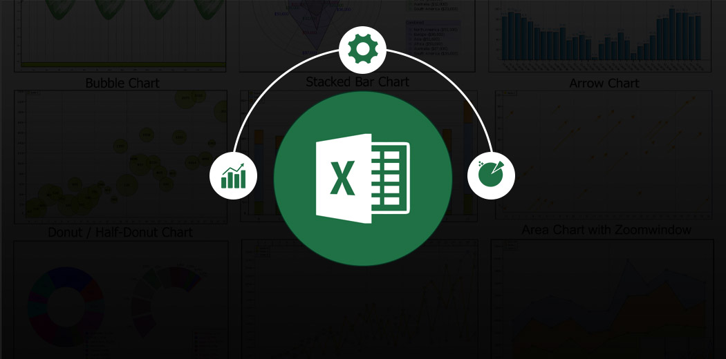
There is no one size fits all chart and that’s why to create intuitive visualizations, it is imperative that we understand different types of charts and their usage. And Excel is the perfect tool to build advanced yet impactful charts for our analytics audience.
In this article, I am going to discuss 3 powerful and important advanced Excel charts that are going to make you a pro in front of your audience (and even your manager).
This is the sixth article in my Excel for Analysts series. I highly recommend going through the previous articles to become a more efficient analyst:
I encourage you to check out the below resources if you’re a beginner in Excel and Business Analytics:
I will start off with one of my favorite chart types – Sparkline charts. These charts really help me out in making amazing dashboards! So what are sparkline charts?
Sparkline charts are typically small in size and fit into a single cell. These charts are wonderful to visualize trends in your data such as seasonal increase or decrease in value.
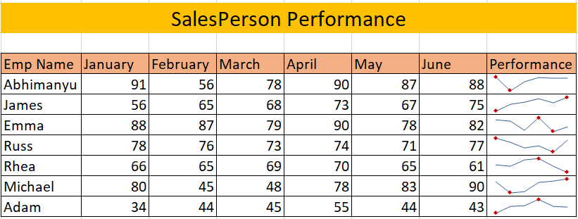
In Microsoft Excel, we have 3 different types of sparkline charts – Line, column, and Win/Loss. Let us see how can we make a sparkline chart with this problem statement:
You are an analyst in a product-based company and you want to understand the performance of the salespersons during the first six months of the year. You decide to use the sparkline charts for this.
Follow the steps or refer to the video for more understanding of sparkline charts:
You will first need to select the type of sparkline chart you want to plot. In our case, we will be using a line chart.
Go to Insert -> Line:
Select the first row of the data in the Data Range and the corresponding Location Range:
We have successfully made our Sparkline chart! Now we just need to drag it for all our rows:
We have the basic sparklines ready. We can format it so that the chart becomes more intuitive to understand. In this case, we have selected High Point and Low Point:
Finally, our table looks like this:
Try using sparklines in your reports next time. You will absolutely love it!
If you have previously worked in the field of Project Management, then you must be familiar with Gantt charts. These charts are one of the most popular and useful ways to track activities of a project against time.
Gantt charts are essentially bar charts. Each activity represents a bar. The length of the bar represents the duration of the activity or a task.
To understand Gantt Charts, let us take up a problem statement. There are two roommates – Joey and Chandler. Due to the recent pandemic, they usually stay at home and they decided to build themselves a home entertainment unit. Chandler being interested in analytics and visualization turns this small project into a Gantt chart representation. Let us see how.
You may refer to the video or the steps given below according to your convenience:
Since Gantt charts are basically bar charts, let us first select one:
Go to Insert -> 2D Bar -> Stacked Clustered Bar
You may notice that the sequence of events is actually in a manner opposite to the required sequence. So let’s reverse it.
Select the categories on the axis and right-click -> Go to Format Axis:
Now simply select the tickbox – “Categories in reverse order”:
If you observe the chart properly, you’ll notice that the blue chart represents the start date. We will remove the color of this chart to attain the desired Gantt chart.
Select the blue chart -> right click ->Format Data Series:
Now go to the fill section and select – No fill:
Now the chart looks something like this:
The date in our chart starts from 29 April which we clearly don’t want as it is utilizing unnecessary space. So let us select the bounds for our Gantt Chart dates.
Select the date (Horizontal Axis) -> Right-click -> Format Axis:
Now we simply need to provide a minimum and maximum bound date:
We have made the following chart:
We have made our Gantt chart but we won’t be showing it to someone unless it looks appealing to the eyes so we’ll do a bit of formatting to make our chart look cool.
Here we have done a few things:
Congratulations! You have made your first Gantt Chart! Joey and Chandler must be enjoying their new entertainment unit.
Thermometer charts are really interesting and they disburse crucial information in a very crisp manner. These charts are great in visualizing the actual value and the target value. It is useful in visualizing sales, the footfall on the website, etc. Let us understand the charts better with a problem statement.
Every New Year’s, people tend to make resolution. Jake had taken a resolution to complete 48 books during the year. That is around 1 book every week. Let us understand how did Jake perform.
You can follow along with the steps and refer to the video for better understanding:
Select the Percentage data as shown below:
Go to Insert -> 2D Column -> Clustered Column:
Here is our chart:
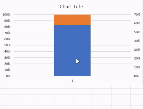
Go to Chart Design -> Select Switch Row / Column and click OK:
Now, right-click the Achieved % column -> Go to Format Series ->Select Secondary Axis:
This will overlap both the columns into one column.
We have our overlapping columns but in different axes so let us give it a uniform bounding.
Select the percentages (Vertical axis values) and right-click -> Format Axis:
Now select the minimum bound as 0.0 and maximum bound as 1.0:
Select the Goal % chart and right-click -> Format Data Series:
Go to Fill options -> Select No Fill and Solid line border:
Now we have a chart that finally resembles a thermometer chart. All we need is some additional formatting.
Here, we have followed the below steps for formatting:
Perfect!
In this article, we covered three beautiful Excel charts of different kinds to help you become an efficient analyst. I hope these charts will help you in building amazing visualizations, save you a lot of time. and impress your boss. 🙂
Let me know your favorite Excel Charts which you feel make a visualization great.
Product Growth Analyst at Analytics Vidhya. I'm always curious to deep dive into data, process it, polish it so as to create value. My interest lies in the field of marketing analytics.
GPT-4 vs. Llama 3.1 – Which Model is Better?
Llama-3.1-Storm-8B: The 8B LLM Powerhouse Surpa...
A Comprehensive Guide to Building Agentic RAG S...
Top 10 Machine Learning Algorithms in 2026
45 Questions to Test a Data Scientist on Basics...
90+ Python Interview Questions and Answers (202...
8 Easy Ways to Access ChatGPT for Free
Prompt Engineering: Definition, Examples, Tips ...
What is LangChain?
What is Retrieval-Augmented Generation (RAG)?
I liked how well you have explained everything
Edit
Resend OTP
Resend OTP in 45s