 |
VOOZH | about |
|
VOOZH | about |
This article aims to take you through the process of performing a Logistic Regression algorithm in python to classify whether clients will subscribe to a term deposit or not.
Logistic Regression is used for classification problems. It is used to carry out analysis when the dependent variable is binary (dichotomous). In other words, logistic regression is used when there are 2 classes. Logistic regression explains the relationship between one dependent binary variable and one or more nominal, ordinal, interval or ratio-level independent variables.
I assume you are familiar with the concept of logistic regression. In this blog, we shall see how to implement logistic regression using the sklearn library in python. This will enable you to have hands-on experience implementing the logistic regression algorithm and learning the sklearn library.
Let’s dive in!
Here we will import pandas, numpy, matplotlib, seaborn and scipy. These libraries are required to read the data, perform transformation and visualize the data, respectively.
#Importing the required libraries
import numpy as np
import pandas as pd
import matplotlib.pyplot as plt
import seaborn as sns
import scipy.stats as stats
Here we will import pandas, numpy, matplotlib, seaborn and scipy. These libraries are required to read the data, perform transformation and visualize the data, respectively.
#Loading the csv file containing the raw data
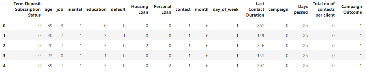
df = pd.read_csv("Bank Marketing project.csv")
df.head()
You need to load the dataset using panda’s library. Once the data is loaded, you can check the shape of the data i.e. you can find the number of columns and rows in the loaded dataset using the shape attribute of pandas which stores the number of columns and rows as a tuple.
# ives No. of rows and columns in data
df.shape
You can also use the described method of pandas to find the statistical data like minimum, mean, quartiles and maximum values of columns having numeric values.
df.describe()
A. Remove Null Values
After this, prior to beginning with the exploratory data analysis, you need to check for null values (NaN) in the dataset and remove them or replace them with specific values as per your business standards and experience. To check the null values, you can use isnull() method, which will return False for non-missing values and True for missing components.
df.isnull().sum()
B. Remove Outliers
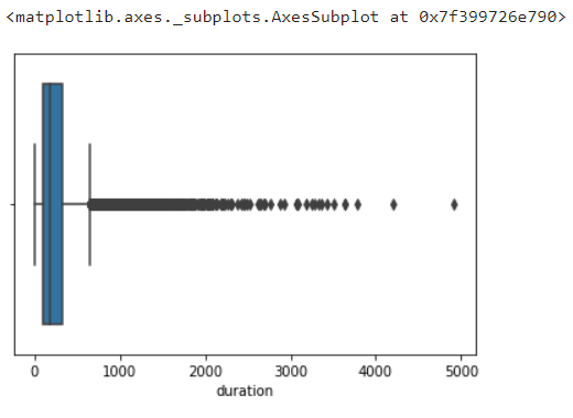
An outlier is an extremely low or extremely high data point relative to the nearest data point and the rest of the neighbouring co-existing values in a dataset. In short these are extreme values that stand out from the overall pattern of values in a dataset.
Plot the box plot for each numeric column to find the outlier.
sns.boxplot(data=df,x='duration')
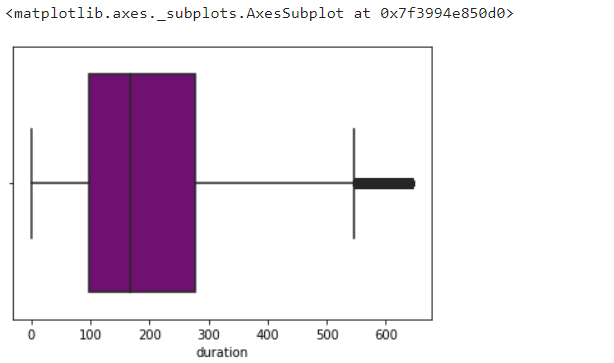
To eliminate the outliers found using box blot, you can use the Z score or quartile method. In this case, we have used inter quartile method to remove the outliers. In case you use a Z score, then you need to remove the records whose Z score is greater than +3 and less than -3. In the below figure, you can see the inter quartile method.
#Removing the outliers
q3 = df['duration'].quantile(.75)
q1 = df['duration'].quantile(.25)
iqr = q3-q1
iqr
upperrange = q3+1.5*iqr
bottomrange = q1-1.5*iqr
df1 = df[(df['duration']>bottomrange) & (df['duration']<upperrange)]
sns.boxplot(data=df1,x='duration',color = 'purple')
Exploratory data analysis (EDA) analyses data sets to summarize their key characteristics, often using data visualization methods and statistical graphs. It is a crucial process of performing data analysis to discover anomalies and patterns, test hypotheses, and present the summary of data using graphical representations.
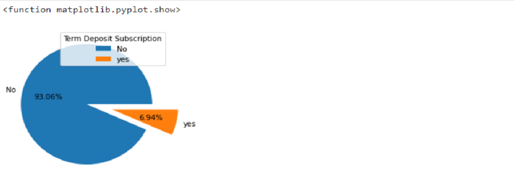
The below pie chart shows the percentage of customers that applied for a term deposit
#shows the no.of customers vs Client's Term Deposit Subscription Status
plt.subplots(figsize=(12,4))
sns.countplot(x ='job', hue = 'y', data = dfnew, palette = 'colorblind')
plt.ylabel('No. Of Customers')
plt.show
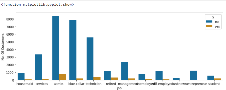
The below count plot shows the subscription status of customers based on their occupation.
Usually, in machine learning, you will usually deal with datasets that contain multiple labels in one or more than one columns. The labels are generally in the form of numbers or words. The training dataset is usually labelled in words to make the data more user-friendly or in human-readable form.
In Label Encoding, the system converts the labels into a numeric form starting from 0 to convert them into machine-readable form. This is a very important step of data pre-processing in supervised learning.
Example – Suppose, in our case, the column martial has 4 labels (Married, Single, Divorced, unknown). After applying the label encoding the martial column will be converted into: –
| Married | 0 |
| Single | 1 |
| Divorced | 2 |
| Unknown | 3 |
from sklearn.preprocessing import LabelEncoder
for column in bank.columns:
 if bank[column].dtype == np.number:
 continue
 bank[column] = LabelEncoder().fit_transform(bank[column])
bank.head()
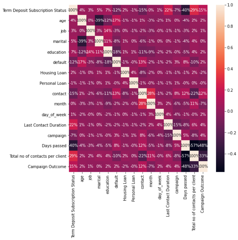
A correlation matrix is a table showing correlation coefficients between variables. Each variable is plotted along the row and column. The intersection between rows and columns gives the correlation coefficient between those variables. The value lies between -1 and 1. More the value towards -1, the variables are said to have a strong negative correlation, and more the value towards +1, the variables are said to have strong positive correlation.
#correlation visualization
plt.subplots(figsize=(8,8))
sns.heatmap(bank.corr(), annot = True, fmt = '0.0%')
plt.show
To estimate the performance of machine learning algorithms, you need to split data into train-test datasets. As a thumb rule, the training set is split into 70% of the actual data, and the Test set is split into 30 % of actual data. The train set statistics are known and used to fit the model. The test data set is solely used for predictions.
#split data into 70% training and 30% testing.
from sklearn.model_selection import train_test_split
X = bank.iloc[:, 1:bank.shape[1]].values
Y = bank.iloc[:,0].values
X_train, X_test, Y_train, Y_test = train_test_split(X,Y, test_size = 0.3, random_state = 1)
X_train
This means to store the data of dependent variables into one variable, “Y”, and the independent variable into “X”. This is done to simplify the code and make it more user friendly.
#Split the data into independent 'X' and dependent 'Y' variables
X = bank.iloc[:, 1:bank.shape[1]].values
Y = bank.iloc[:, 0].values
bank.head()
#Logistic Regression model building
from sklearn.linear_model import LogisticRegression
logmodel=LogisticRegression(solver = 'sag',random_state=100,multi_class='ovr')
logmodel.fit(X_train,Y_train)
#Training Model Score
logmodel.score(X_train,Y_train)
0.9415242494226328
#Testing Model Score
logmodel.score(X_test,Y_test)
0.9398954703832753
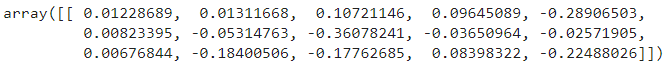
#intercept 𝑏₀
logmodel.intercept_
array([-0.07177432])
#slope 𝑏₁
logmodel.coef_
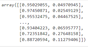
#In the matrix below, each row corresponds to a single observation.
#The first column is the probability of the predicted output being zero, that is 1 - 𝑝(𝑥).
#The second column is the probability that the output is one, or 𝑝(𝑥).

logmodel.predict_proba(X)
#This function returns the predicted output values as a one-dimensional array.
logmodel.predict(X)
array([0, 0, 0, …, 0, 0, 0])
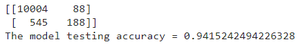
A confusion matrix is a table which is used to describe the performance of a classification model on a set of test data for which the true values are known.
#plotting confusion matrix
from sklearn.metrics import confusion_matrix
cm = confusion_matrix(Y_test,logmodel.predict(X_test))
TN = cm[0][0]
FN = cm[1][0]
FP = cm[0][1]
TP = cm[1][1]
print(cm)
print('The model testing accuracy = {}'.format((TP+TN)/(TP+TN+FN+FP)))
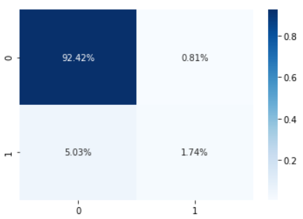
#Confusion matrix heat map
import seaborn as sns
sns.heatmap(cm/np.sum(cm), annot=True,
 fmt='.2%', cmap='Blues')
plt.show
To summarize the article, we learned why to use logistic regression algorithm and how to perform it using python. I also learned the flow and necessary steps to take before building the logistic regression model. This was a basic logistic regression model.
Further, to enhance the model for better results, you need to apply resampling techniques such as oversampling, undersampling or SMOTE when dealing with such imbalanced datasets. Imbalanced data means datasets where the target class has an uneven distribution of observations, i.e. in our case, the variable Term Deposit subscription status has two classes. The class “no” has a very high number of observations, and the clas ‘yes” one class label has a very high number of observations, and the other has a very low number of observations.
The media shown in this article is not owned by Analytics Vidhya and is used at the Author’s discretion.
I am a Data Science enthusiast and have pursued my MBA in Research and Business Analytics from Welingkar Institute of Management. I have an ENTP personality i.e Extravert, Intutitive, Thinking and Perceiving. My areas of interest are Machine Learning, Deep Learning, Natural Language Processing (NLP) and data visualization.
GPT-4 vs. Llama 3.1 – Which Model is Better?
Llama-3.1-Storm-8B: The 8B LLM Powerhouse Surpa...
A Comprehensive Guide to Building Agentic RAG S...
Top 10 Machine Learning Algorithms in 2026
45 Questions to Test a Data Scientist on Basics...
90+ Python Interview Questions and Answers (202...
8 Easy Ways to Access ChatGPT for Free
Prompt Engineering: Definition, Examples, Tips ...
What is LangChain?
What is Retrieval-Augmented Generation (RAG)?
Edit
Resend OTP
Resend OTP in 45s