 |
VOOZH | about |
|
VOOZH | about |
Customizing styles in Matplotlib refers to the process of modifying the visual appearance of plots such as colors, fonts, line styles and background themes to create visually appealing and informative data visualizations. Using built-in styles, custom style files you can control the appearance of your plots to match reports, presentations or personal preferences.
The Figure class in Matplotlib represents the entire plotting area where one or more charts (axes) are drawn. It acts as the main container for all plots in a figure. Below is the syntax used to create a Figure object:
class matplotlib.figure.Figure( figsize=None, dpi=None, facecolor=None, edgecolor=None, linewidth=0.0, frameon=None, subplotpars=None, tight_layout=None, constrained_layout=None)
Example 1: This example creates a figure and adds one plotting area (axes) to it. A simple line graph is then drawn inside that figure.
Output
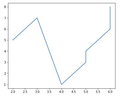
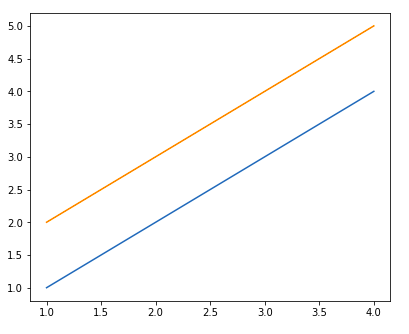
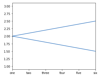
👁 ImageExample 2: This example creates one figure and adds two different axes inside it. Each axes displays its own line plot within the same figure window.
Output
👁 ImageThe Pyplot module in Matplotlib is used to create and control plots using simple plotting functions. It allows you to quickly draw and display graphs. Below is the syntax of the plot() function used in Pyplot:
matplotlib.pyplot.plot(*args, scalex=True, scaley=True, data=None, **kwargs)
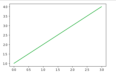
Example: This example uses Pyplot to draw a line graph by providing x and y values and then displays it on the screen.
Output
👁 ImageThe Axes class represents the plotting area inside a figure where data is drawn. Each figure can contain multiple axes, but each axes belongs to only one figure. Below is the syntax used to create and control an axes object:
matplotlib.pyplot.axes(*args, **kwargs)
Example 1: This example creates an empty axes region on the figure by specifying its position and size.
Output
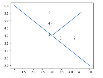
👁 ImageExample 2: This example creates a figure, adds an axes to it and plots two line datasets inside the same axes.
Output
👁 ImageColors in Matplotlib control the appearance of lines, markers and plot elements to visually distinguish data on a graph.
Example 1: This example draws a line plot and applies a custom color to the line using the color parameter.
Output
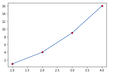
Example 2: This example plots points with circular markers and applies a different color to the marker fill.
Output
Text and grid lines in Matplotlib are used to label plots and show reference lines that make values easier to read. Below is the common syntax used to add text and grid lines to a plot:
plt.title(label, **style)
plt.grid(**style)
Example: This example creates a line chart and adds a title at the top along with grid lines in the background to make the plot easier to read.
Output
Legends in Matplotlib are used to identify different plotted data by showing their labels inside a small box on the chart. Below is the basic syntax used to display a legend on a plot:
plt.legend(labels=None, loc='best', bbox_to_anchor=None, ncol=1)
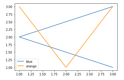
Example: This example plots two lines and adds a legend so each line can be identified using its label.
Output
👁 ImageTicks and tick labels control how values are displayed along the X-axis and Y-axis in a Matplotlib plot. Below are the main methods used to control axis limits and tick labels:
ax.set_xlim(min, max)
ax.set_ylim(min, max)
ax.set_xticklabels(labels)
ax.set_yticklabels(labels)
Example: This example creates a line plot, restricts the X-axis range and assigns custom text labels to the X-axis ticks.
Output
👁 ImageMatplotlib styles change the visual theme of a plot such as colors, fonts and background. Below is the syntax used to apply a style to a plot:
plt.style.use(style_name)
Example: This example applies a predefined Matplotlib style and plots random data using that theme.
Output
Multiple subplots allow you to display more than one plot inside the same figure for side-by-side or stacked comparisons. Below are the main Matplotlib methods used to create multiple subplots:
1. add_axes() method: The add_axes() method figure module of matplotlib library is used to add an axes to the figure. Below is the syntax:
fig.add_axes([left, bottom, width, height])
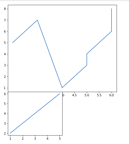
Example: This example creates one figure and places two plots inside it by defining their exact positions.
Output
👁 Image2. subplot() method:subplot() method adds another plot to the current figure at the specified grid position. Below is the syntax:
plt.subplot(nrows, ncols, index)
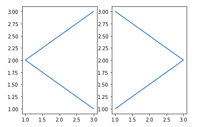
Example: This example splits the figure into two columns and places one plot in each.
Output
👁 ImageNote: Subplot() function have disadvantages like - It does not allow adding multiple subplots at the same time and It deletes the preexisting plot of the figure.
3. subplots() method:subplots() function is used to create figure and multiple subplots at the same time. Below is the syntax:
plt.subplots(nrows, ncols)
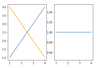
Example: This example creates one row with two subplots and plots data in each.
Output
👁 Image4. subplot2grid() method:subplot2grid() function give additional flexibility in creating axes object at a specified location inside a grid. Below is the syntax:
plt.subplot2grid(shape, location, rowspan, colspan)
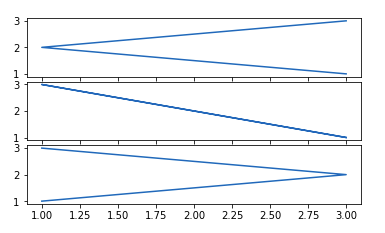
Example: This example creates three vertically stacked plots inside a grid layout.
Output
👁 ImageMatplotlib provides image functions that allow you to read and display image files directly inside a plot window. Below is the syntax commonly used for working with images:
matplotlib.image.imread(filename)
matplotlib.pyplot.imshow(image)
Example: This example reads an image file from disk and displays it using Matplotlib.
.png)
.png)