 |
VOOZH | about |
|
VOOZH | about |
The contact card component can display user information, such as a profile picture, contact details, and links to social media profiles. We will use Tailwind CSS for styling to ensure the card is visually appealing and responsive.
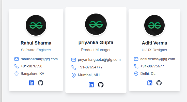
Output Preview: Let us have a look at how the final output will look like.
npx create-next-app@latest contact-card
cd contact-card
√ Would you like to use TypeScript? ... No / Yes
√ Would you like to use ESLint? ... No / Yes
√ Would you like to use Tailwind CSS? ... No / Yes
√ Would you like to use `src/` directory? ... No / Yes
√ Would you like to use App Router? (recommended) ... No / Yes
√ Would you like to customize the default import alias (@/*)? ... No / Yes
npm i react-icons"dependencies": {
"next": "14.2.14",
"react": "^18",
"react-dom": "^18",
"react-icons": "^5.3.0"
},
"devDependencies": {
"postcss": "^8",
"tailwindcss": "^3.4.1"
}
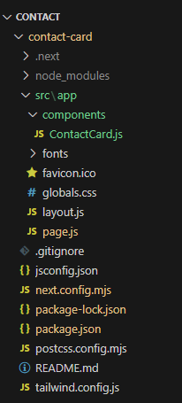
Example: In this example we will write the following code in different files(The name of the files is mentioned in the first line of each code block).
Run your app by executing below command.
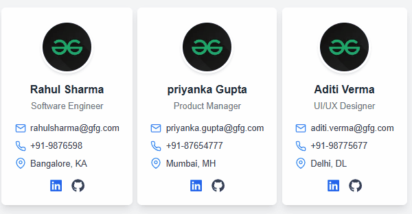
npm run devOutput