 |
VOOZH | about |
|
VOOZH | about |
This guide walks through building a responsive form layout in Next.js using Tailwind CSS for styling. It covers setting up a Next.js project, configuring Tailwind, and creating a form component with optional validation, ensuring a seamless development process for a modern web form UI.
The form consists of input fields for the user's name, email, password, and a confirm password field. Tailwind CSS is used to apply responsive styles such as padding, borders, and focus states to ensure a consistent user experience across devices. The layout is centered on the screen with a white background and shadow effect, and utility classes are used for form responsiveness. You can easily extend or modify the form components to suit various form layouts and styling needs in Next.js projects.
To start, create a Next.js app by running the following command in your terminal:
npx create-next-app@latest form-layoutNavigate to your project directory:
cd form-layoutInstall all required packages:
npm installNext, install Tailwind CSS and other required dependencies:
npm install -D tailwindcss postcss autoprefixernpx tailwindcss initThis will create a tailwind.config.js file in the root of your project.
"dependencies": {
 "next": "14.2.14",
 "react": "^18",
 "react-dom": "^18"
 }
In pages/_app.js, import the global.css file so that Tailwind styles are applied globally:
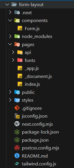
In the components/ Form.js, create a new file named Form.js and add the following code:
In the pages/ folder, create a file named index.js and import the Form component:
Start the development server by running the following command:
npm run devNow, navigate to http://localhost:3000/ in your browser to see the form in action.
Output: