 |
VOOZH | about |
|
VOOZH | about |
Tailwind CSS's utility-first design makes it easy to create a responsive and dynamic newsletter section for your Next.js application. Tailwind CSS helps you style your newsletter easily with its ready-made classes, while Next.js makes it simple to create fast and dynamic web pages. You'll learn to create responsive, visually appealing sections that work well on any device. With Tailwind and Next.js, building and customizing your newsletter will be quick and efficient.
To create a newsletter section in your Next.js project, first set up your Home component (page.tsx) by importing the Newsletter component. In the Newsletter component (NewsLetter.tsx), you design a simple form that includes a title, description, email input, and a subscribe button. Use Tailwind CSS to style the section, making it responsive with utility classes like bg-gray-100, text-center, and max-w-3xl. Tailwind’s built-in classes help with styling the input and button for a polished look. Ensure your package.json includes the necessary dependencies for React, Next.js, and Tailwind CSS.
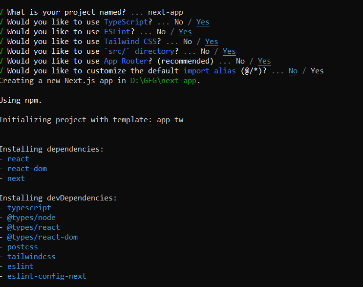
Step 1: Create the NextJs App using the following command.
npx create-next-app@latestConfiguration which you should follow while creating the App:
By default installed tailwind also.
Step 2: Move to the project folder from Terminal
cd <project_name>"dependencies": {
"react": "^18",
"react-dom": "^18",
"next": "14.2.14"
},
"devDependencies": {
"typescript": "^5",
"@types/node": "^20",
"@types/react": "^18",
"@types/react-dom": "^18",
"postcss": "^8",
"tailwindcss": "^3.4.1",
"eslint": "^8",
"eslint-config-next": "14.2.14"
}
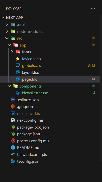
Step 3: Write the following code in different files(The name of the files is mentioned in the first line of each code block)
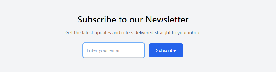
Run your app by executing below command.
npm run devOutput: