 |
VOOZH | about |
|
VOOZH | about |
In time series analysis, a moving average is a widely used technique to smooth out short-term fluctuations and highlight longer-term trends or cycles. R provides several ways to compute and visualize moving averages alongside time series data. This article will guide you through the process of adding a moving average plot to a time series plot in R Programming Language.
A moving average is a calculation used to analyze data points by creating a series of averages of different subsets of the full data set. In time series data, this technique helps to smooth out noise and allows you to better see trends and patterns.
Two common types of moving averages are:
Before we start, ensure you have the necessary libraries installed. We'll be using the zoo package for moving averages andggplot2for visualization.
install.packages("zoo")
install.packages("ggplot2")
Now we will discuss step by step implementation of how to Add Moving Average Plot to Time Series Plot in R Programming Language.
Let's create a simple time series dataset to demonstrate.
This code generates a time series of 100 random values starting from January 2020 with monthly frequency.
Next, we'll calculate the moving average of our time series data using the rollmean function from the zoo package.
Here, k = 12 specifies a 12-period moving average (i.e., a 12-month moving average in this case). The fill = NA argument pads the resulting series with NA values at the beginning where the moving average cannot be computed.
We'll now plot the original time series along with the moving average using ggplot2.
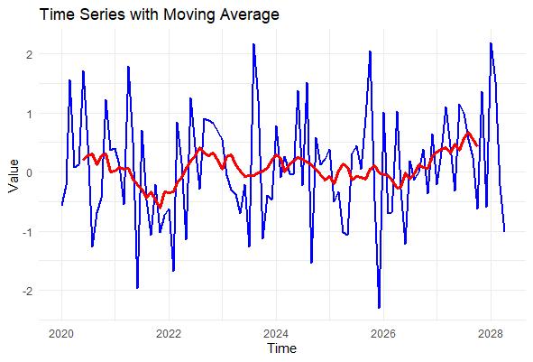
Output:
geom_line(aes(y = value), color = "blue", size = 1): Plots the original time series data in blue.geom_line(aes(y = moving_avg), color = "red", size = 1.2): Plots the moving average in red with a slightly thicker line for emphasis.The resulting plot shows the original time series data in blue and the moving average in red. The moving average line smooths out the fluctuations in the original data, making it easier to identify trends over time.
Adding a moving average to your time series plots is a powerful way to visualize trends and patterns in your data. Whether you're smoothing out fluctuations in financial data, environmental measurements, or any other type of time series, R provides flexible tools like zoo and ggplot2 to achieve your goals. You can further customize your plots with different moving averages, colors, and line styles.