 |
VOOZH | about |
|
VOOZH | about |
In R Programming Language the title() function is often used to add annotations, titles, and labels to specific regions of a plot. The function allows customization of the main title, subtitle, and axis labels. Here's a brief explanation of the parameters commonly used with the title() function.
Syntax:
title(main = NULL, sub = NULL, xlab = NULL, ylab = NULL, …)
Parameters:
main: Main title of the graph
sub: Defines subtitles
There are some common parameters that are used in title function.
xlab: Label for the X-axis.ylab: Label for the Y-axis.line: Line number where the title and subtitle start. Default is 3.outer: If TRUE, titles are plotted in the outer margin.col.main, col.sub, col.lab: Colors for the main title, subtitle, and axis labels.cex.main, cex.sub, cex.lab: Character expansion for the main title, subtitle, and axis labels.font.main, font.sub, font.lab: Font style for the main title, subtitle, and axis labels.Output:
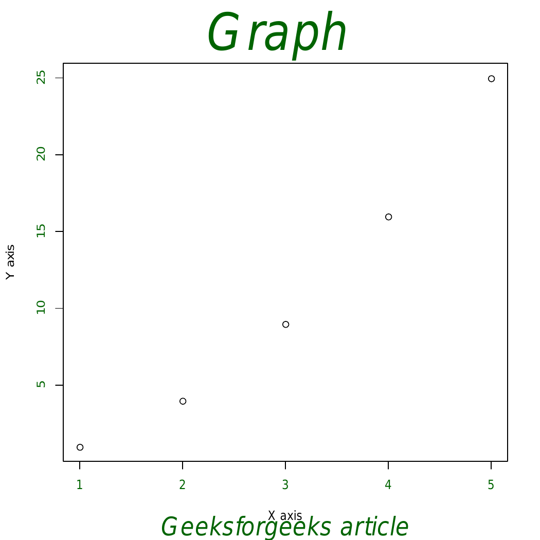
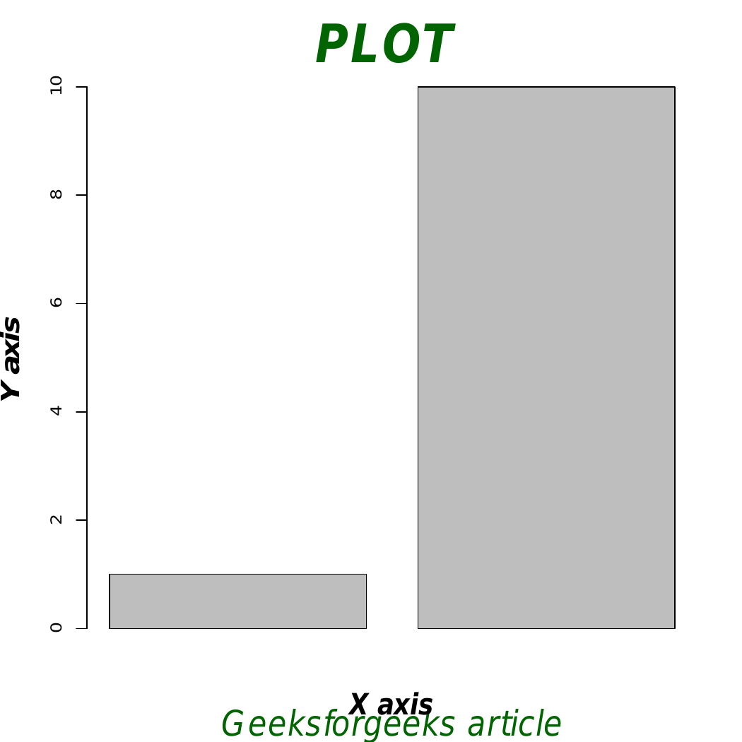
👁 ImageIn above example main title and sub titles are added to the plot. The arguments that can be used to change the font size are as follows:
Output:
👁 ImageOutput:
x and y as values for the x and y axes.plot() function to create a colorful plot with specified axes and axis color.title() to add a main title, subtitle, and customize fonts and colors for both titles and axis labels.points() for enhanced visualization.