 |
VOOZH | about |
|
VOOZH | about |
Data visualization is crucial for understanding data and sharing insights. In R Programming Language we can easily create visualizations using tools like ggplot2, lattice, and base R plotting functions. These tools offer many ways to customize the plots. However, focusing on customizing axes can really improve how clear and impactful our visualizations are. This level of customization helps ensure our visualizations are essential for exploring and sharing insights in R.
Axes, in the context of data visualization, are the horizontal and vertical lines that define the boundaries of a plot. They represent the scales along which data points are plotted, providing essential information about the range and context of the data being presented. The horizontal axis (x-axis) typically represents the independent variable, while the vertical axis (y-axis) usually represents the dependent variable. Axes play a crucial role in interpreting and understanding the data visualized in plots and charts.
Customizing axes involves tailoring the appearance and labeling of these scales to better suit the data and enhance interpretability. Whether adjusting the range, formatting labels, or modifying tick marks, understanding axis customization in R gives user to create visualizations that effectively reflect their messages.
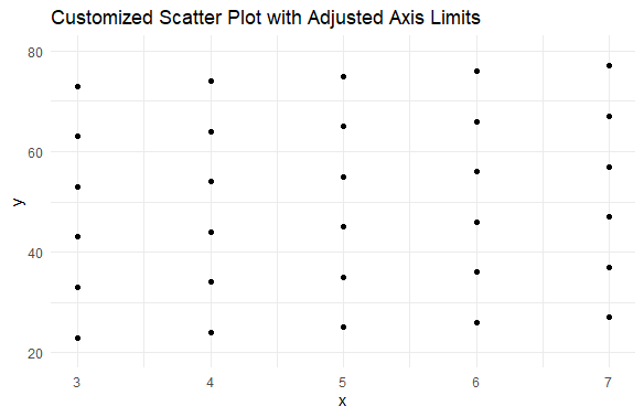
Output:
By setting custom axis limits, we focus on a specific region of interest within the data.
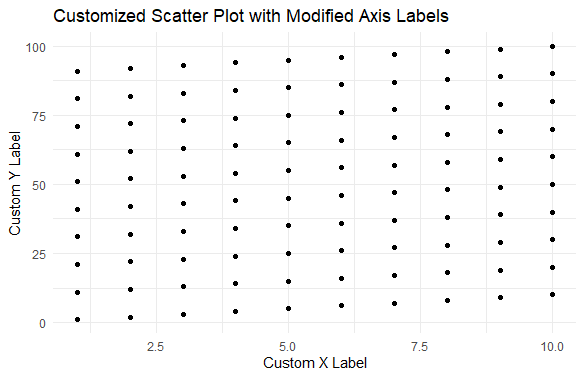
Output:
Modifying axis labels allows us to provide more descriptive information about the plotted variables.
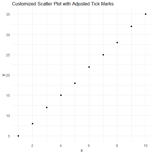
Output:
Adjusting tick marks allows us to control the placement and frequency of ticks along the axes.
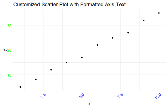
Output:
Specifically, it rotates the x-axis text by 45 degrees (angle = 45) and aligns it to the right (hjust = 1).
Output:
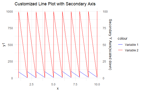
It plots a basic line plot with two variables.
Customizing axes in data visualization with R is essential for creating clear and impactful visualizations. By adjusting axis limits, labels, tick marks, and formatting text, we can better tailor plots to suit our data and enhance interpretability. These customization techniques empower us to highlight key insights and effectively communicate our message through visualizations.