 |
VOOZH | about |
|
VOOZH | about |
Boxplots are a popular way to visualize the distribution, spread, and summary statistics of numerical data. Enhancing them with color fills and adding elements like lines, dots, or other graphical markers can further enrich their interpretability, making them visually appealing and more informative. This article will guide you through how to create color-filled boxplots in R using the ggplot2package, and show you how to enhance them with lines, dots, and other similar graphical elements.
Boxplots, also known as box-and-whisker plots, provide a graphical summary of a dataset’s distribution. They display the data's quartiles, median, and potential outliers, making them effective tools for identifying distribution patterns and deviations in a dataset.
A standard boxplot consists of:
While a standard boxplot is useful for quick data analysis, adding color and other graphical elements like lines and dots can enhance its readability and effectiveness:
Now we will discuss step by step Colorfill Boxplot with Lines and Dots using R Programming Language:
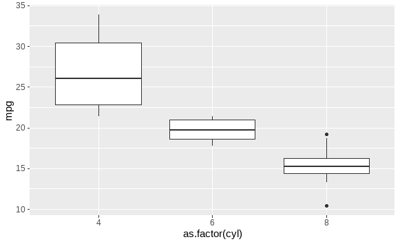
Before enhancing the boxplot with colors, lines, or dots, let's first create a basic boxplot using ggplot2.
Output:
This basic boxplot shows the distribution of miles per gallon (mpg) across different cylinder categories (cyl) in the mtcars dataset.
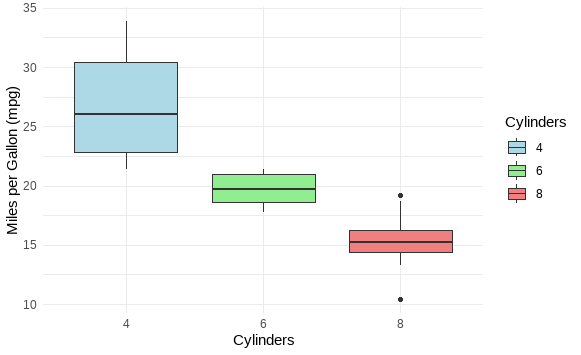
ggplot2To add color to the boxplots, you can use the fill argument inside the aes() function. This will fill the boxes with color according to a grouping variable.
Output:
In this example, the boxplot is filled with different colors for each cylinder group, making it easier to differentiate between the categories.
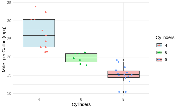
You can overlay the individual data points on the boxplot using geom_jitter() or geom_point(). This provides insight into the actual data distribution beyond the summary provided by the boxplot.
Output:
Here, the geom_jitter() function adds a slight horizontal displacement to the points, preventing them from overlapping and making the plot more readable.
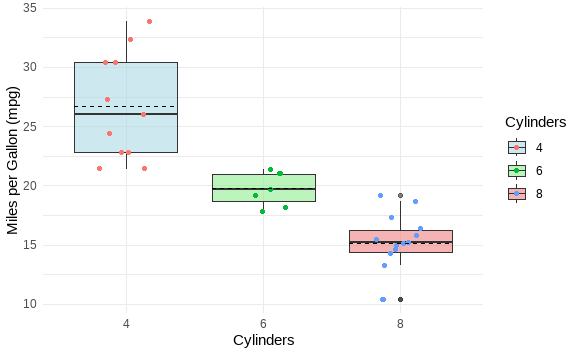
You can also add lines to a boxplot to indicate specific statistical summaries like the mean or custom thresholds. The geom_hline() or geom_vline() functions can be used for horizontal or vertical lines, respectively.
Output:
In this example, horizontal dashed lines are added to represent the mean mpg for each cylinder group. The stat_summary() function is used to calculate the mean and draw the lines.
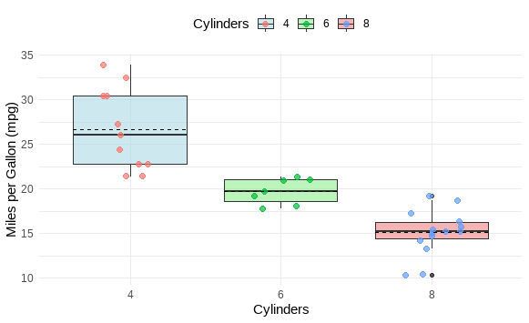
You can combine color filling, lines, and dots to create more complex and informative boxplots.
Output:
Enhancing boxplots in R with color fills, dots, and lines can make them more informative and visually appealing. The ggplot2 package provides flexibility in customizing these plots, whether you want to highlight different categories with color, overlay individual data points, or add reference lines for statistical summaries.