Interactive data visualization allows users to explore data dynamically instead of viewing static charts. By using tools like Shiny in R, we can build web applications that respond to user inputs such as dropdowns, sliders and buttons. This makes data analysis more engaging, flexible and insightful.
Shiny enables creation of interactive web apps directly from R code.
Users can modify inputs and see real-time changes in plots and outputs.
It integrates easily with visualization libraries like ggplot2 and plotly.
Shiny App
Shiny is an R package that simplifies the process of building web applications directly from R code. It provides a framework for creating interactive web applications without requiring expertise in web development technologies such as HTML, CSS or JavaScript.
It includes two key components:
User Interface (UI): The UI component shows a blueprint for defining the visual elements of the Shiny app using R functions that generate HTML.
Server: It reacts responsively to user input, processes data and generates dynamic output predicated on user interactions.
Syntax
library(shiny) ui <- fluidPage() server <- function(input, output) {} shinyApp(ui = ui, server = server)
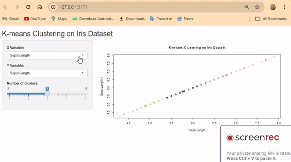
K-Means Clustering using Shiny
In this example, users can select X and Y variables from the iris dataset and choose the number of clusters.
Step 1: Install and load required packages
Step 2: Define the UI
Create a UI with dropdown lists (select inputs) for choosing the X and Y variables and a slider for selecting the number of clusters.
Step 3: Define the server logic
Step 4: Run the Shiny app
Combine the UI and server functions using `shinyApp()` and run the app.
Create a UI layout with dropdown lists (select inputs) and a slider for selecting variables and clusters.
Create a UI using fluidPage() with a titlePanel() and sidebarLayout().
Add selectInput() for X and Y variables and sliderInput() for number of clusters inside sidebarPanel().
Display the plot in mainPanel().
In the server, use renderPlot() to apply kmeans() based on user inputs.
Plot clusters using plot() and points().
Combine UI and server using shinyApp() and run the app.
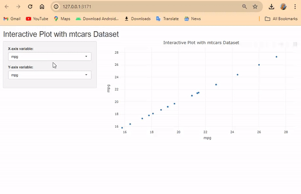
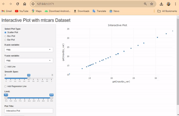
Creating Interactive Plots using Shiny
An interactive plot allows users to explore data dynamically instead of viewing a fixed graph. Unlike static plots, interactive visualizations respond to user inputs such as dropdown selections, sliders and buttons. Using Shiny and Plotly, we can create responsive plots that update in real time.
Explanation: Users can select the plot type (Scatter Plot, Box Plot, Bar Plot) via radio buttons and select variables for X and Y axes with dropdown menus.
They can add a line, smooth line (with adjustable span) and regression line using checkboxes.
checkboxInput() creates a checkbox that lets users enable or disable an option.
Users can set limits on the X-axis using a slider.
Customize the plot title using a text input.
Download option is available for the plot as an HTML file.
