 |
VOOZH | about |
|
VOOZH | about |
The GGally is an extension package to ggplot2 which contains functions to reduce the complexity of combining geoms. The plots like Scatterplot Matrix, Parallel Coordinates Plot, etc, While plotting the graphs using the ggplot() function we need to combine the geom() object to specify the type of plot but when it comes to the GGally package it contains some built functions like:
which reduces the complexity of plotting graphs with the geoms like in ggplot2.
To be able to begin using GGally in R, you will first need to install and load the ggplot2 and the GGally packages.
GGallyThe GGally package provides several built-in functions to create a variety of visualizations. Here are some of the most commonly used plots:
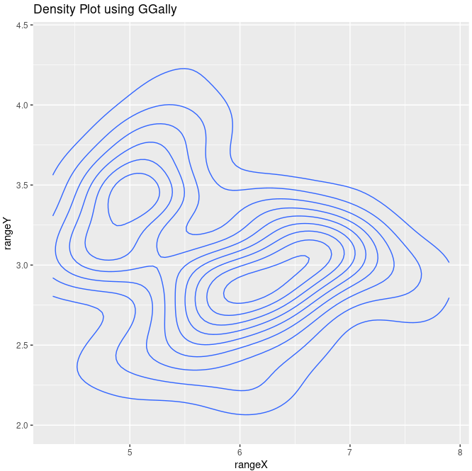
A density plot helps to visualize the distribution of a continuous variable.
Syntax:
ggally_density(data, mapping)
Where,
Output:
A density plot showing the distribution of Sepal.Length and Sepal.Width from the iris dataset.
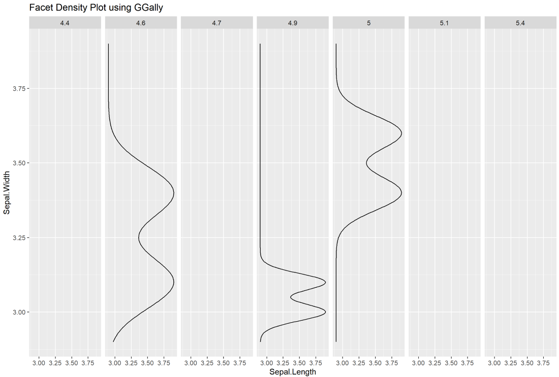
ggally_facetdensity()The facet density plot allows you to break down a density plot by a grouping variable (e.g., species).
Syntax:
ggally_facetdensity(data, mapping)
Where,
Output:
A facet density plot that displays the distribution of Sepal.Length and Sepal.Width for different subsets of the data.
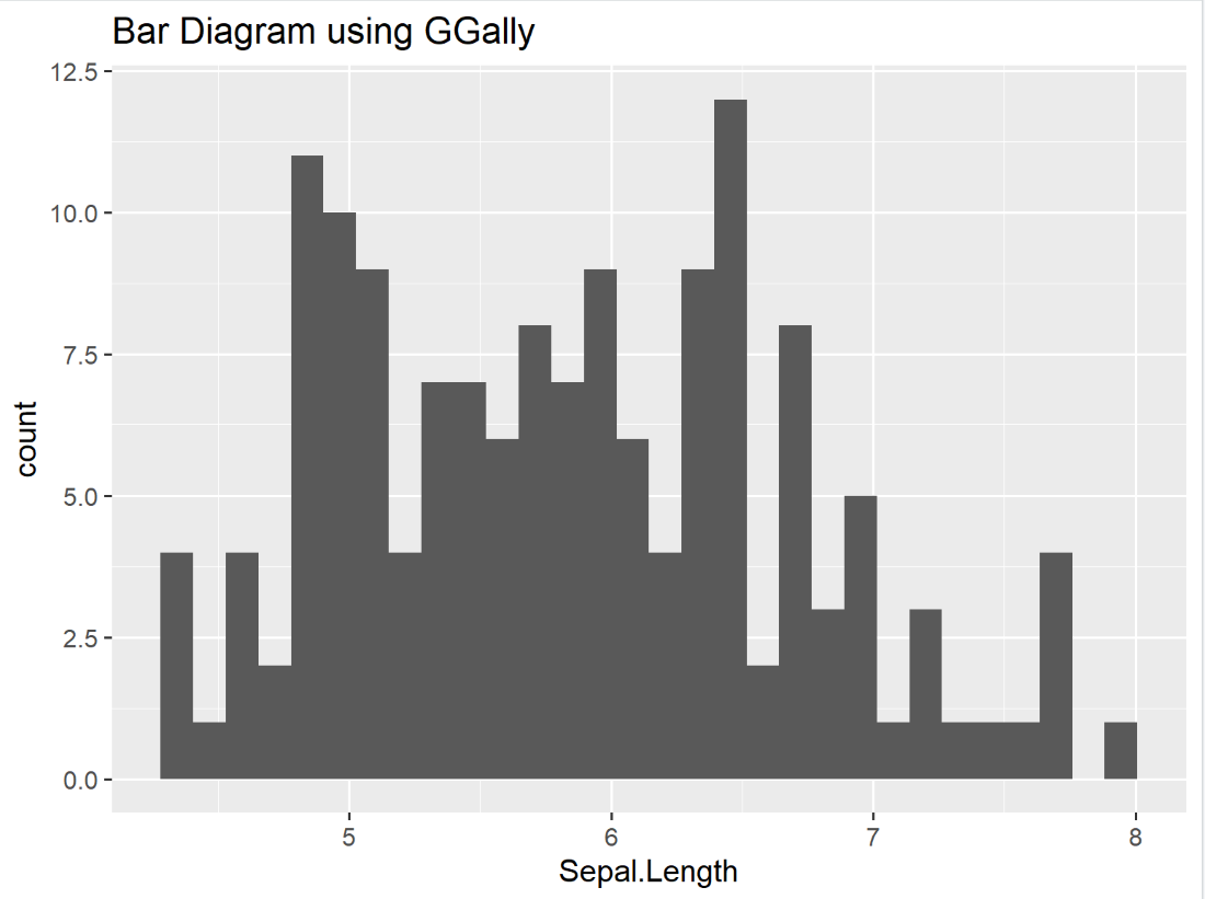
ggally_barDiag()The bar diagram can be used to visualize the frequency of a categorical variable.
Syntax :
ggally_barDiag(data, mapping, rescale)
Where,
Output:
A bar plot showing the distribution of Sepal.Length across the dataset.
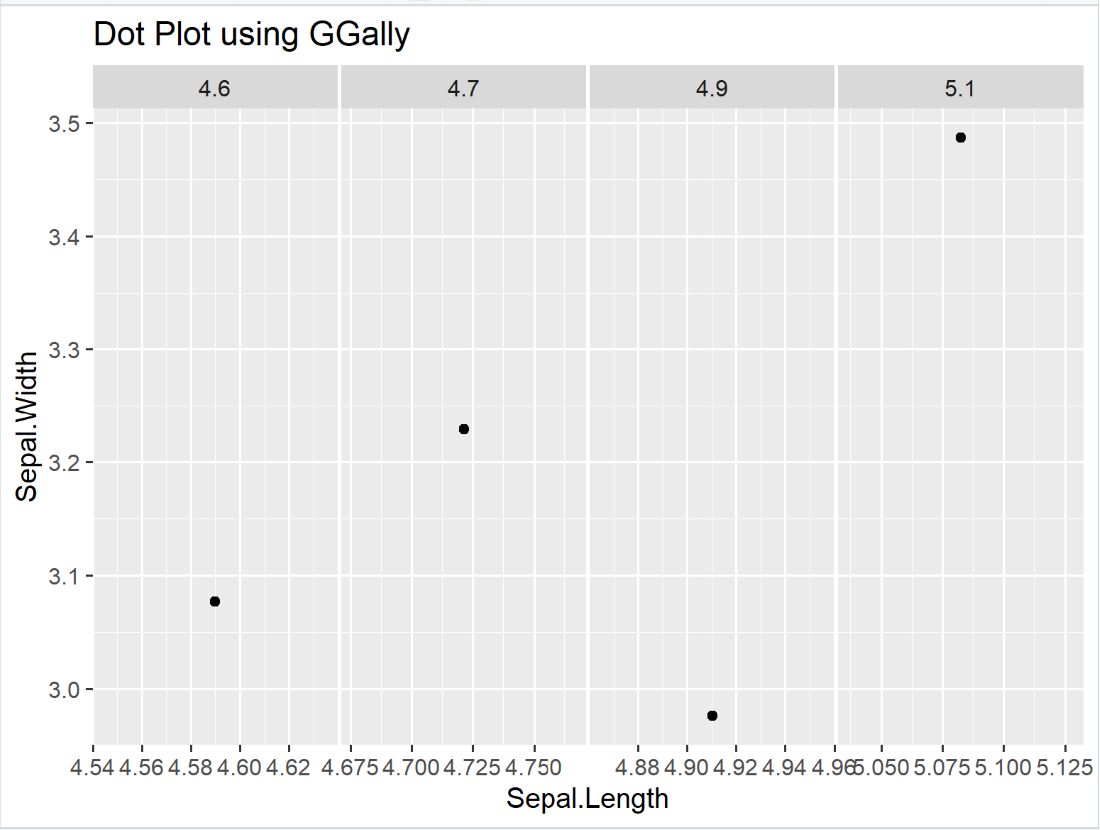
A dot plot is used to visualize individual data points in a continuous variable.
Syntax:
ggally_dot(data, mapping)
Where,
Output:
A dot plot visualizing Sepal.Length against Sepal.Width for the first four rows of the iris dataset.
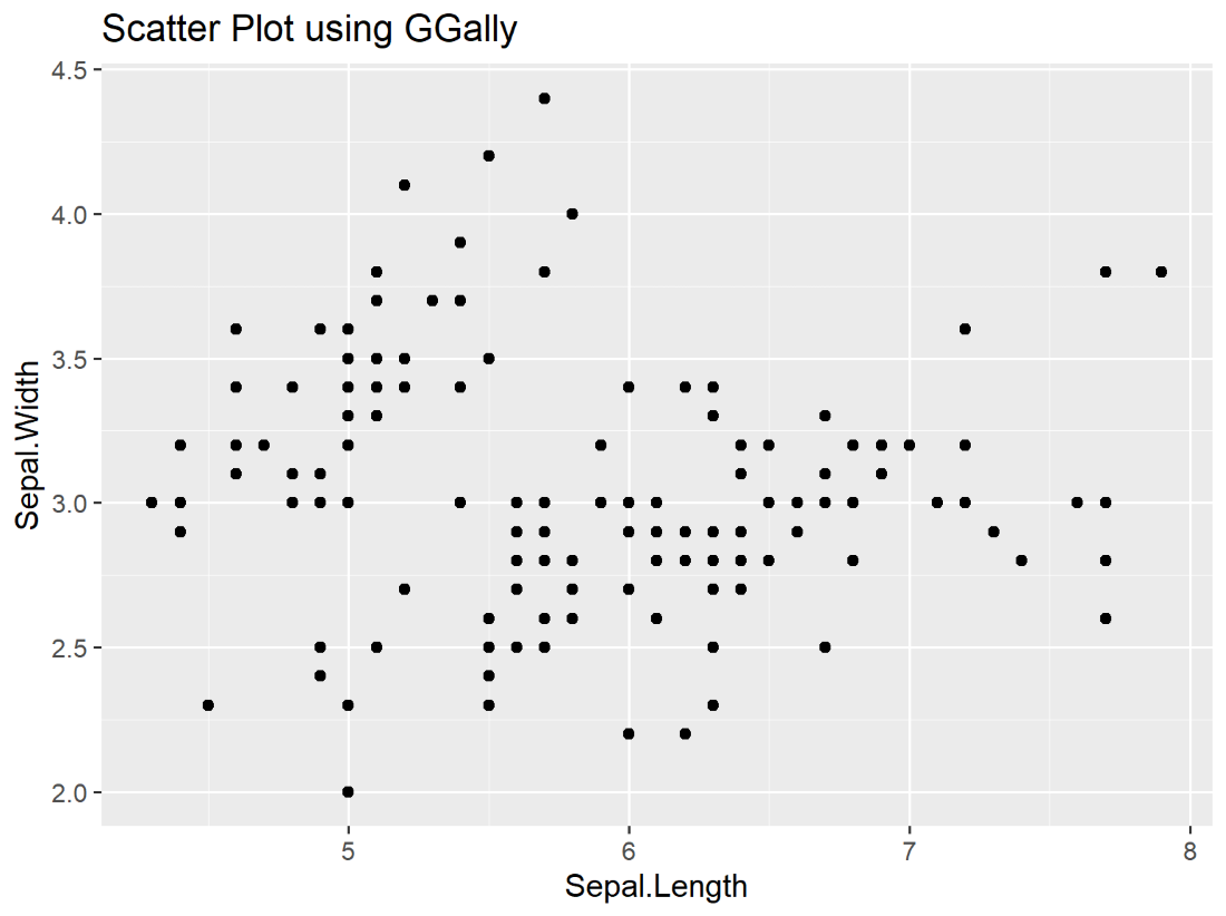
ggally_points()A scatter plot is a common method to visualize the relationship between two continuous variables.
Syntax:
ggally_points(data, mapping)
Where,
Output:
A scatter plot showing the relationship between Sepal.Length and Sepal.Width.
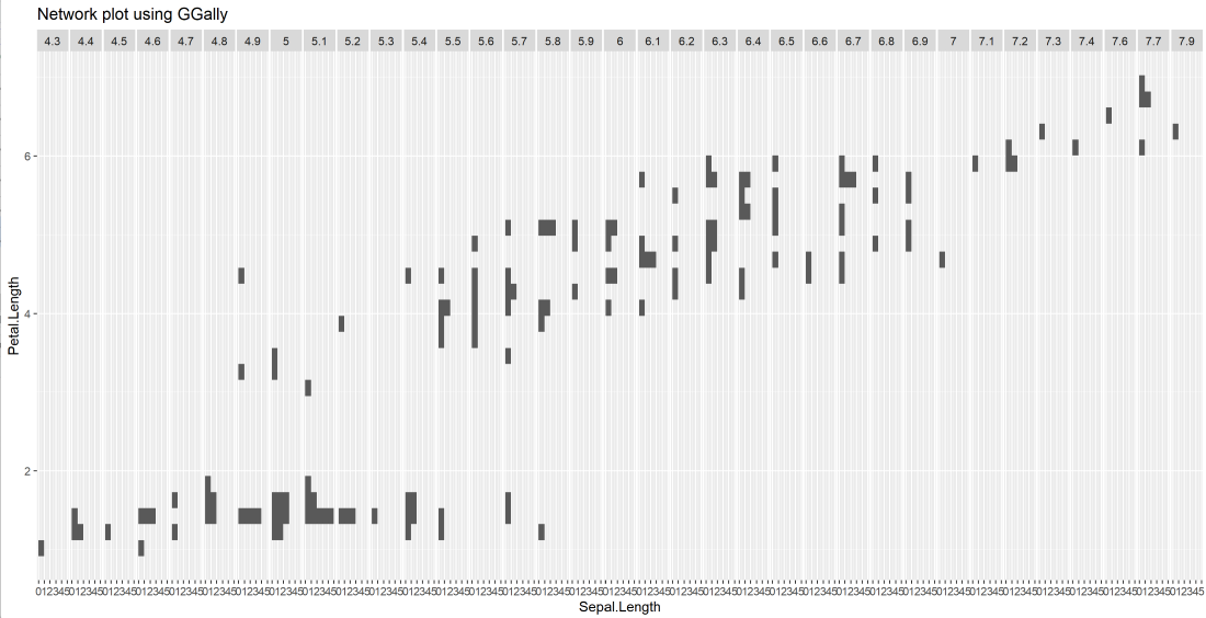
ggally_facethist()A network plot or faceted histogram displays the distribution of data across different levels of a categorical variable.
Syntax:
ggally_facethist(data, mapping)
Where,
Output:
A faceted histogram that displays the relationship between Sepal.Length and Petal.Length.
Syntax:
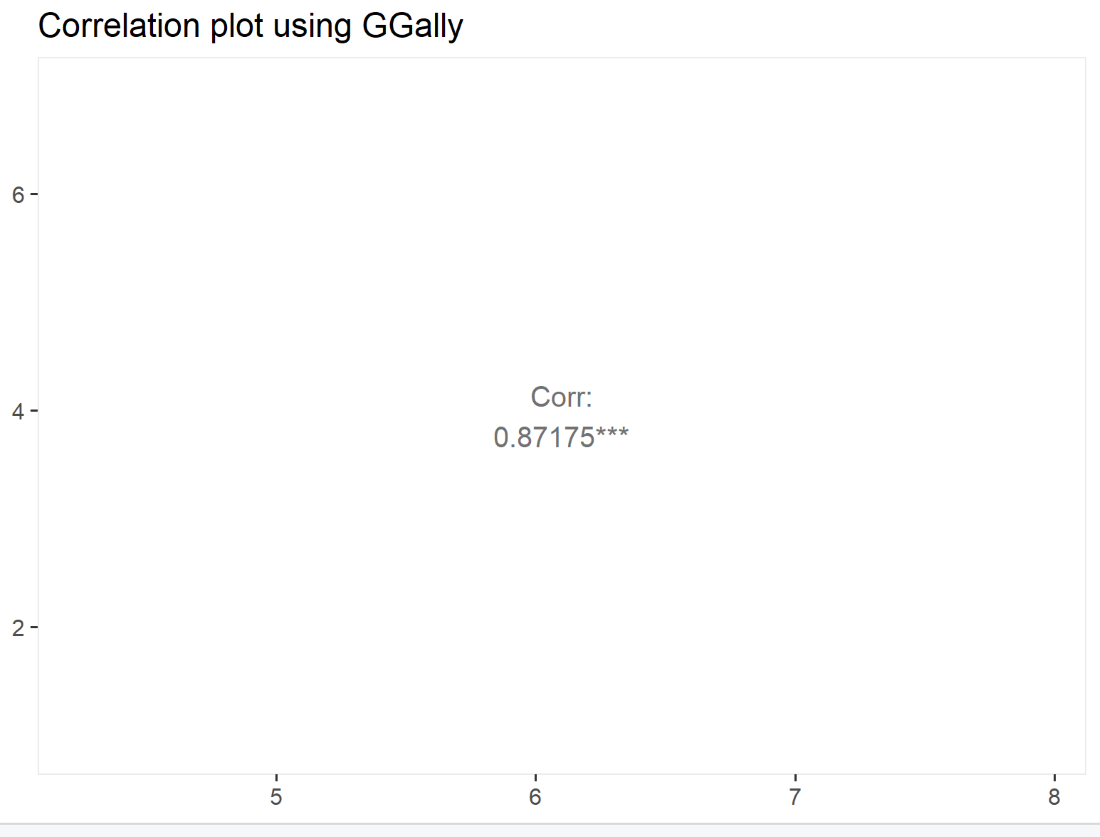
ggally_cor(data, mapping, stars, method, display_grid, digits)
Where,
Output:
A correlation plot displaying the Pearson correlation between Sepal.Length and Petal.Length.
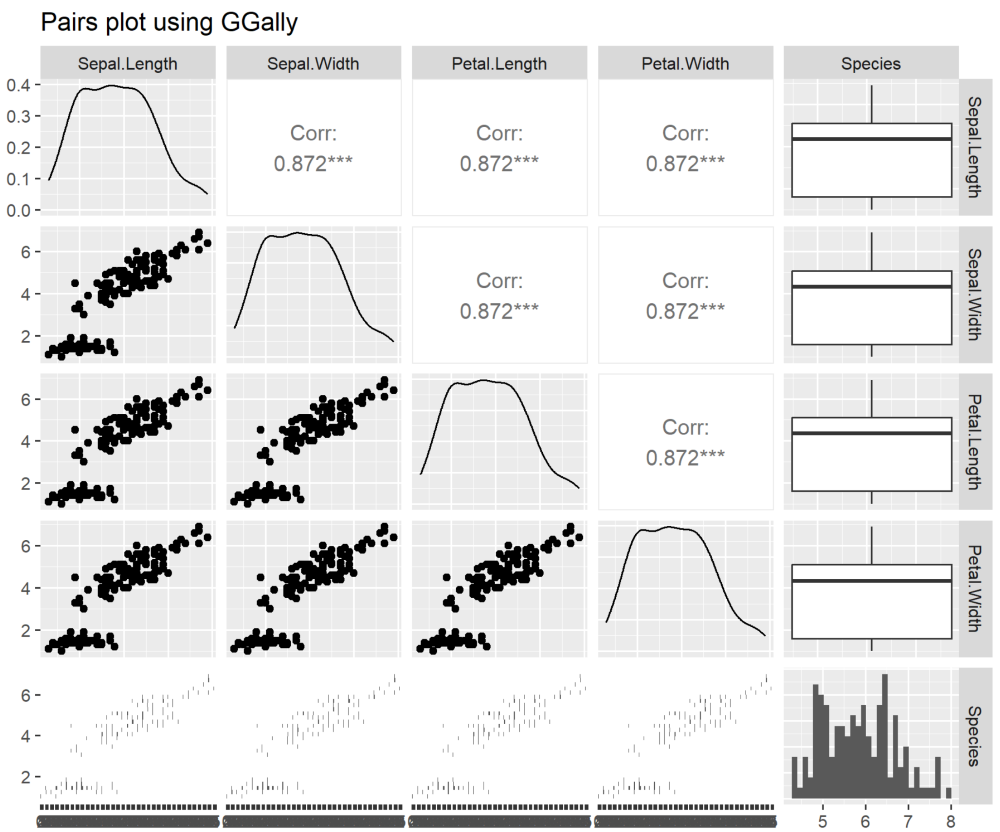
A pair plot is useful for visualizing relationships between multiple variables in a dataset.
Syntax:
ggpairs(data, mapping, columns, upper, lower, axisLables, ColumnLables)
Where,
Output:
A pair plot showing the relationship between Sepal.Length and Petal.Length for multiple variables.
Related Article: