 |
VOOZH | about |
|
VOOZH | about |
The ggpubr package in R provides a convenient interface for creating publication-ready plots by extending the functionality of ggplot2. It offers additional themes, geoms, and tools for combining multiple plots, adding annotations, and creating complex figures suitable for research and presentation.
To install Ggpubr in R, you can use the following command:
install.packages("ggpubr")
Once the package is installed, you can load it into your R session by running:
library(ggpubr)
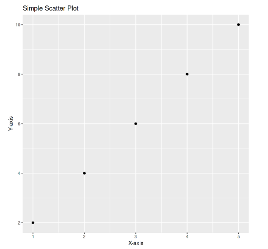
ggpubrScatter plots are used to explore the relationship between two continuous variables. In this example , we are using data from two data frames and plotting there values using a scatter plot .
Output:
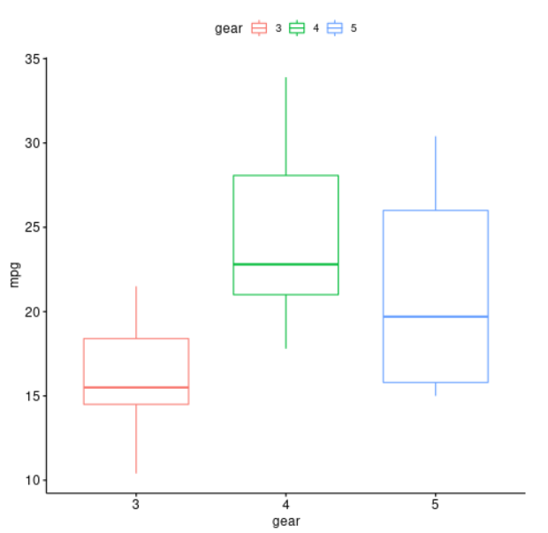
Box plots display the distribution of a variable by showing the median, quartiles, and potential outliers. In this example, we are going to create boxplot with ggboxplot() to compare miles per gallon (mpg) across different gear types in the mtcars dataset, with colors representing each gear group.
Output:
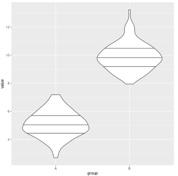
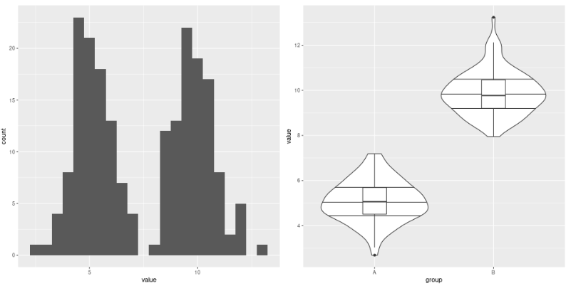
Violin plots combine the features of box plots and density plots to show both summary statistics and the full distribution. In this example, the data frame contains a column for the variable (group) and a column for the variable (value). The ggplot() function is used to create a new plot using the data frame, and the aes() function is used to specify that the x-axis should be mapped to the group variable and the y-axis should be mapped to the value variable. The geom_violin() function is used to add a violin plot to the plot, and the draw_quantiles option is used to specify that the quartiles should be plotted within the violin.
Output:
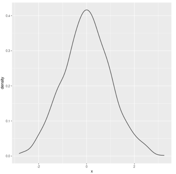
Density plots are useful for visualizing the distribution of a single continuous variable. In this example, the data data frame contains a single column of data (x) that will be plotted as the density. The ggplot() function is used to create a new plot using the data frame, and the aes() function is used to specify that the x-axis should be mapped to the x variable. The geom_density() function is used to add a density plot to the plot.
Output:
We can join multiple plots to represent our data with both , statistical precision and visual insights. Here is one such example to do so.
Output:
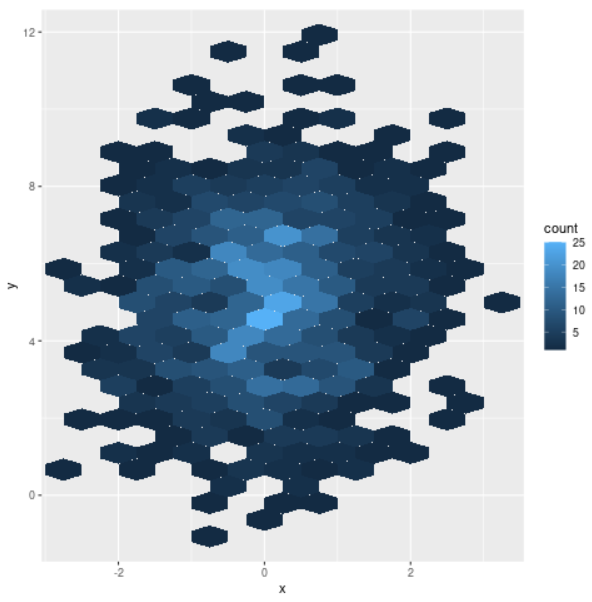
Hexbin plots are used to visualize the relationship between two continuous variables, especially with large datasets. Instead of individual points, data is grouped into hexagonal bins colored by count. Here is one example to do so.
Output: