 |
VOOZH | about |
|
VOOZH | about |
The abline() function in R is a powerful tool for adding reference lines to a plot. Whether you're visualizing trends or identifying key thresholds, abline() can help provide additional context to your data. When working with time series data, especially with the x-axis representing years, adding an abline can be crucial in highlighting trends or fixed reference points. In this article, we'll explore how to use the abline() function in ggplot2 while focusing on setting the x-axis as the year.
In base R plotting, abline() is used to add horizontal, vertical, or regression lines to a plot. However, when working with ggplot2, we use geom_abline(), geom_hline(), or geom_vline() to achieve similar results. Each of these functions allows you to add reference lines on your plots with extensive customization options.
Before diving into the plot creation, ensure your R environment is set up with the necessary libraries:
# Install ggplot2 if you haven't already
install.packages("ggplot2")

# Load ggplot2 library
library(ggplot2)
Now we will discuss step by step How to Add abline in ggplot2 with X-Axis as Year using R Programming Language:
Additionally, load or prepare a dataset with a time-based variable (years) on the x-axis. We’ll use a simple dataset.
Output:
 year value
1 2000 15
2 2001 16
3 2002 18
4 2003 17
5 2004 20
6 2005 22
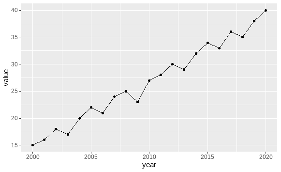
The data prepared earlier has year as a numeric variable on the x-axis. ggplot2 will automatically interpret this as a continuous variable, making it easy to add reference lines.
Output:
This basic plot visualizes the trend in the dataset, with year on the x-axis and value on the y-axis.
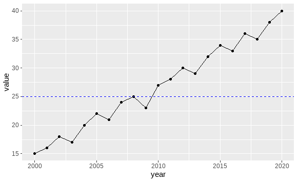
To add a reference line, you can choose one of the following methods:
Output:
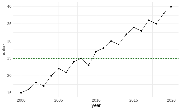
You can customize the appearance of the abline in multiple ways, including its color, line type, and thickness. For example:
Output:
Adding an abline to a ggplot2 plot, especially with the x-axis as a year variable, is a valuable technique for highlighting trends and fixed reference points. By leveraging the power of geom_hline(), geom_vline(), and geom_abline(), you can create highly customized and insightful plots in R. Remember to experiment with different visual customizations to create clear, informative visuals.