 |
VOOZH | about |
|
VOOZH | about |
A stacked dotplot is a type of plot that displays frequencies using dots, piled one over the other. Mainly 2 methods are there, to make a stacked dot plot and both of them are discussed in this article.
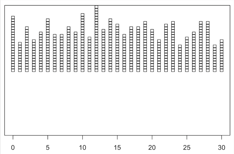
So, using the first method, stripchart method, to create our stacked dot plot. For instance, if we don’t have a set of values, we can even make them, serve our purpose. We would create a set of values that would contain numbers ranging from 0 to 30, including both the ranges too, i.e., the set of values would also include 0 and 30. After creating the set of values, we would plot our stacked dotplot based on those values. We would use the function set.seed(), to reproduce a particular sequence of 'random' numbers. stripchart produces one-dimensional scatter plots (or dot plots) of the given data.
Syntax: stripchart(x, ...)
Example:
Output:
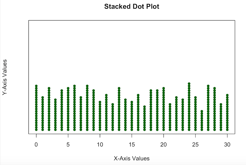
But, the dot plot which we made, is not so pleasing, like the whole stacked dotplot is somewhat above the X-axis, so now we are going to edit it a bit, to make it look more interesting.
Example:
Output:
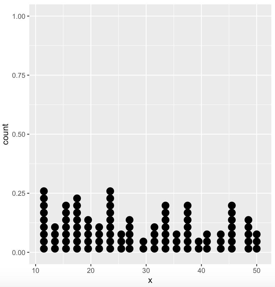
In a dot plot, the width of a dot corresponds to the bin width (or maximum width, depending on the binning algorithm), and dots are stacked, with each dot representing one observation.
Syntax: geom_dotplot()
Parameter:
- dotsize: The diameter of the dots relative to binwidth, default 1.
- stackratio: how close to stack the dots. Default is 1, where dots just touch. Use smaller values for closer, overlapping dots.
- fill: interior colour of the dots in the stack.
- color: exterior outline colour of the dots in the stack
Example:
Output:
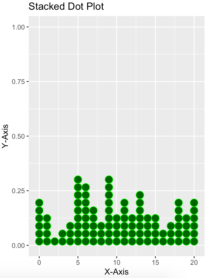
Again, for this one too, we can make it a bit more interesting, adding some more parameters.
Example:
Output: