 |
VOOZH | about |
|
VOOZH | about |
Creating interactive data visualizations is a powerful way to explore and present data. The ggvis package in R provides a flexible framework for building these visualizations by combining the capabilities of dplyr data manipulation and Shiny interactivity. This article will guide you through the process of creating interactive data visualizations using ggvis.
ggvis is an R package designed for creating interactive graphics. It allows you to create a wide variety of visualizations and supports interactivity, making it ideal for exploratory data analysis and dynamic reporting.
The ggvis package in R offers a variety of layer functions and plotting parameters to create rich, interactive visualizations. Below is a combined overview of the layer functions available ggvis and the parameters you can use to customize your plots.
Plotting parameters allow you to customize the appearance and behavior of the layers in your ggvis plots. Here are the primary plotting parameters:
Before you can start creating visualizations, you need to install and load the ggvis package:
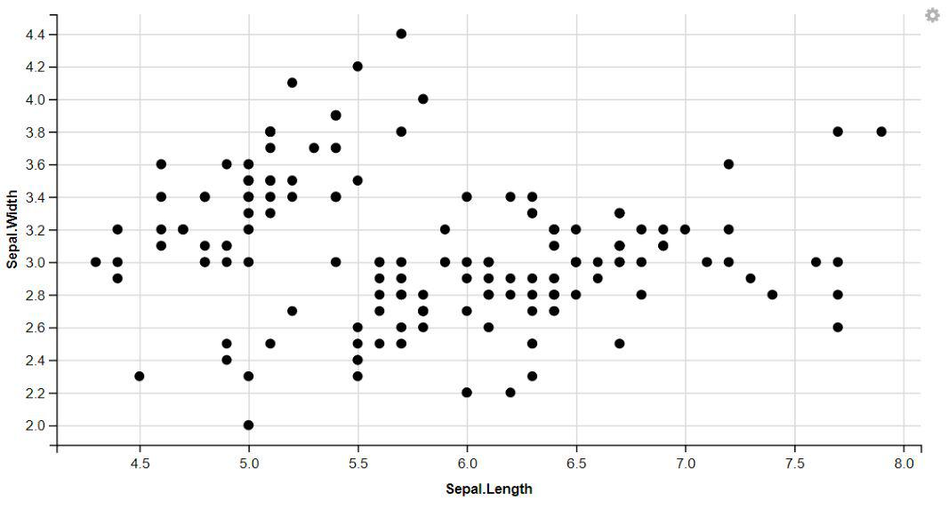
The ggvis package in R, you can easily create visually appealing scatter plots by displaying points.
Output:
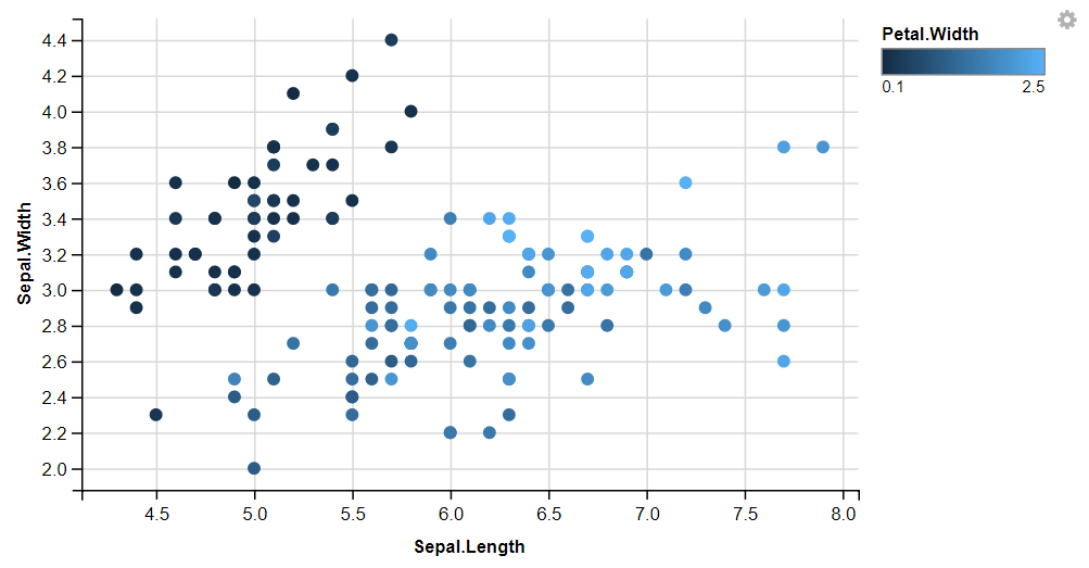
We can add more variables to the plot by mapping them to other visual properties like fill, size,shape And stroke.
Output:
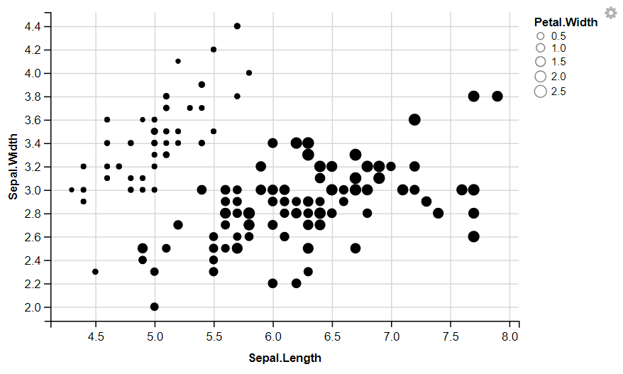
👁 GGVIS-Visualization-2The ggvis package in R, you can easily change the size of points to enhance the visual representation of your data.
Output:
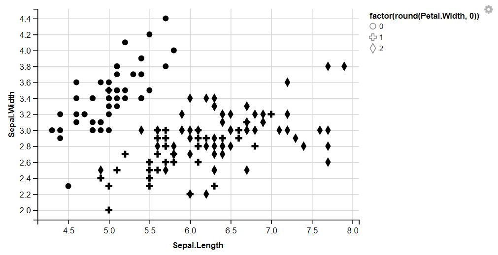
👁 GGVIS-Visualization-3The ggvis package in R, you can easily change the shape of points to enhance the visual representation of your data.
Output:
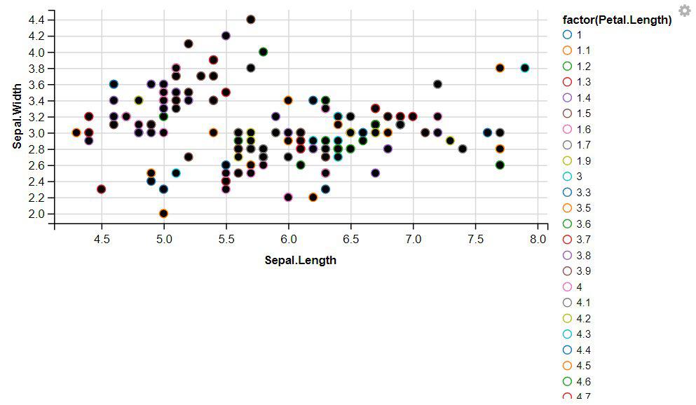
👁 GGVIS-Visualization-4The ggvis package in R, you can easily change the stroke of points to enhance the visual representation of your data.
Output:
👁 GGVIS-Visualization-StrokeWith the ggvis package in R, you can easily display dotted lines by adjusting the stroke dash pattern.
Output:
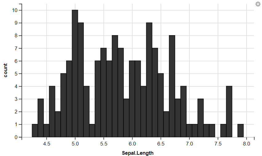
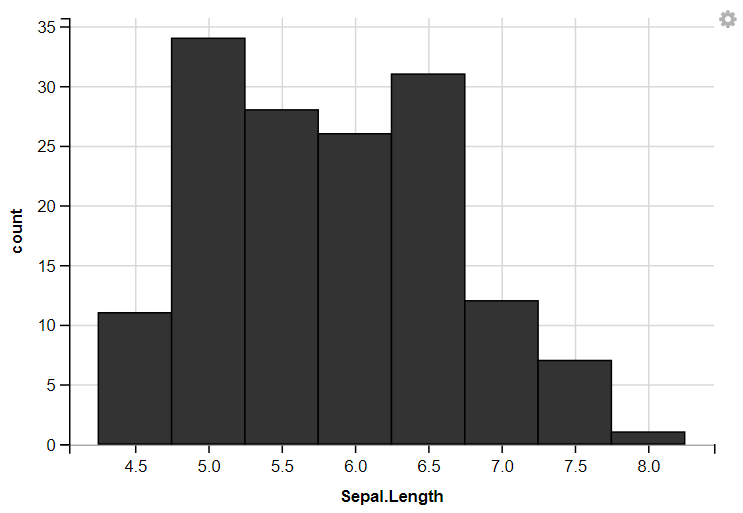
👁 GGVIS-Visualization-StrokeDashWith the ggvis package in R, you can create interactive histograms to explore your data effectively.
Output:
👁 GGVIS-Visualization-LayersHistogram1Now we plot histogram With customize Width
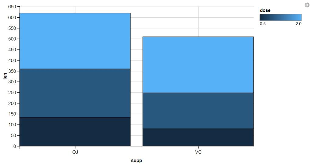
Stacked bar graphs are effective visualizations for displaying the distribution of categorical variables and comparing proportions within each category.
Output:
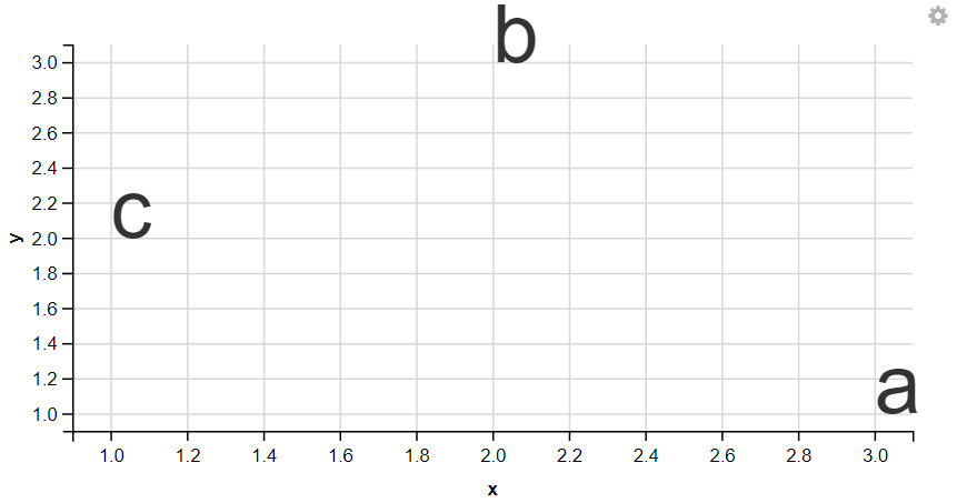
👁 GGVIS-Visualization-LayerBars1With the ggvis package in R, you can easily display text elements to annotate your visualizations and highlight important points.
Output:
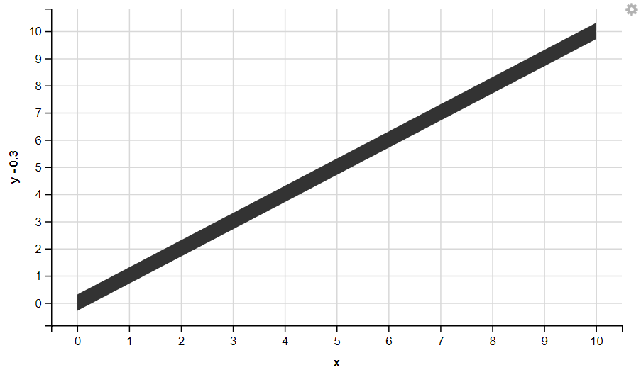
👁 GGVIS-Visualization-LayersTextWith the ggvis package in R, you can easily display Ribbon your visualizations and highlight important points.
Output:
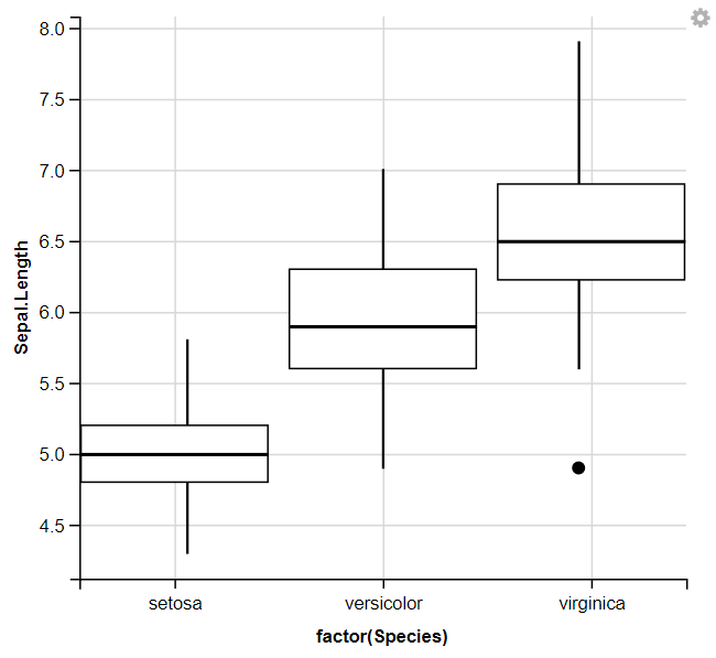
👁 GGVIS-Visualization-LayersRibbonWith the ggvis package in R, you can easily display Box Plots your visualizations and highlight important points.
Output:
👁 GGVIS-Visualization-LayersBosplotWe used ggvis to initialize the plot and mapped the Species column to the x-axis using ~factor(Species) and the Sepal.Length column to the y-axis using ~Sepal.Length. Then, it adds box plots to the plot to visualize the distribution of Sepal. Length for each species of iris flowers.
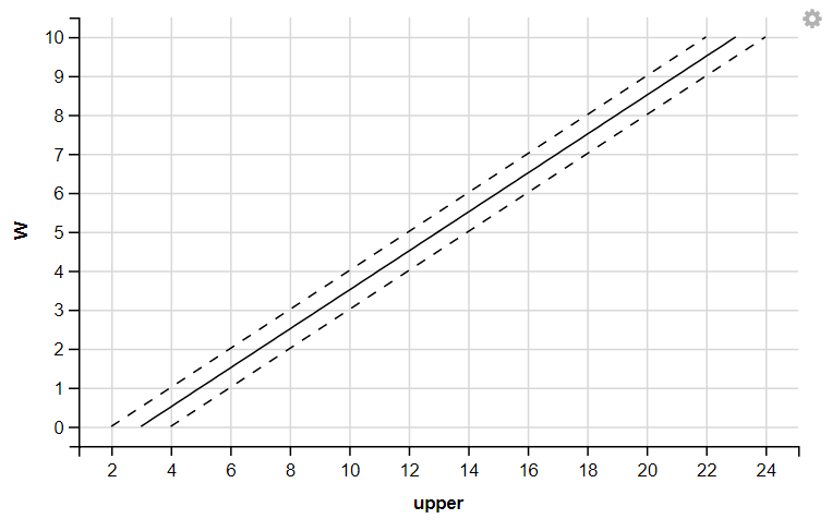
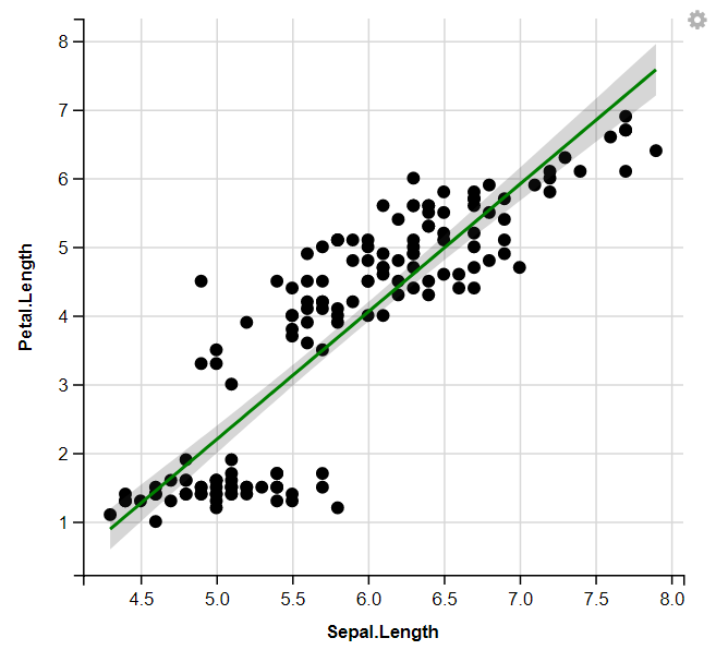
With the ggvis package in R, you can easily display Regression Lines your visualizations and highlight important points.
Output:
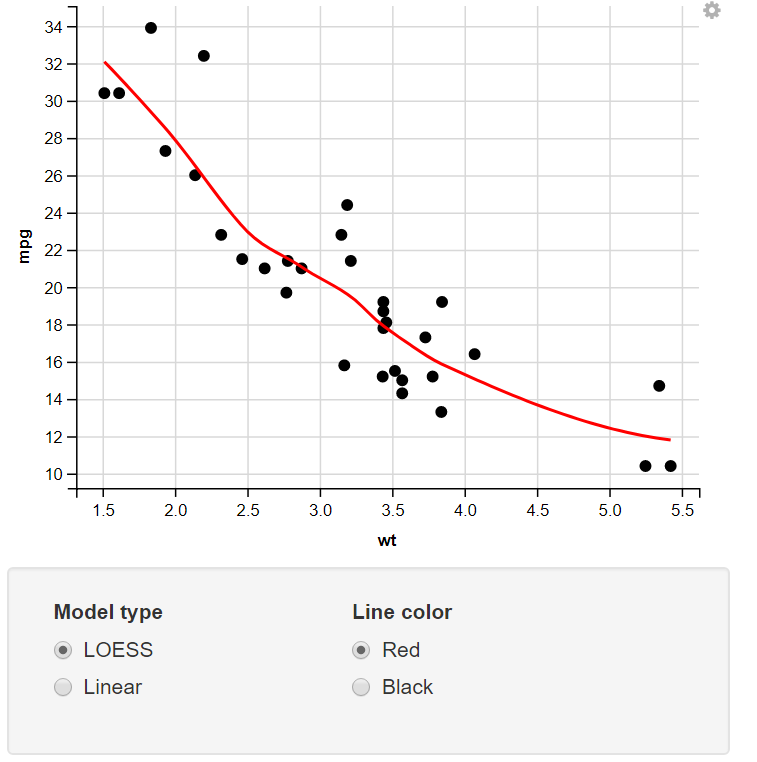
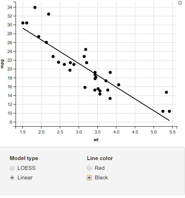
👁 GGVIS-Visualization-MultiLayer2Change the Model Type & Line Color using the Radio Button.
Output:
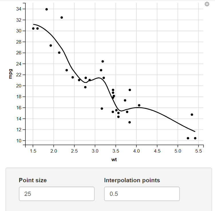
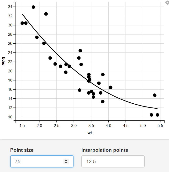
👁 RB1Change the size of the Point and number of Interpolation Points through numeric Input.
Output:
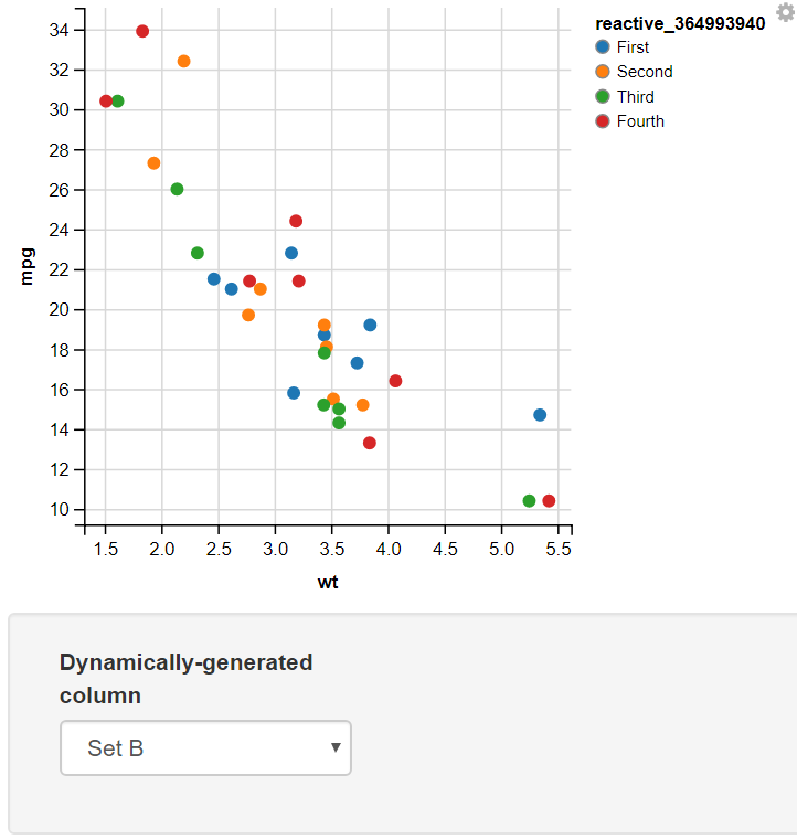
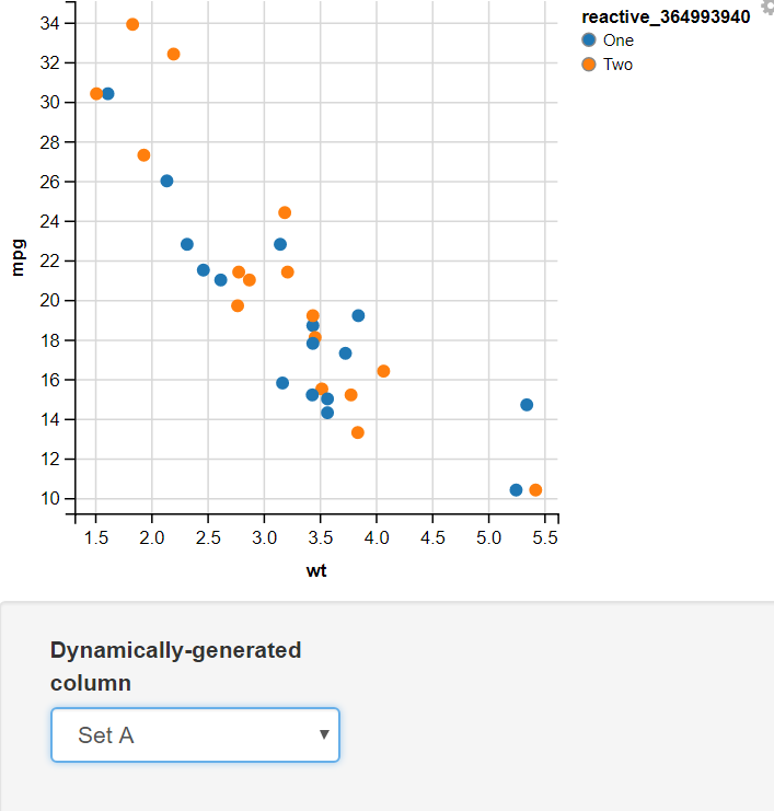
👁 NI1Creating a function mapping different values to two sets and using the Input Select to Display the Required set.
Output:
👁 D1In this example, I have added two values for the user to select input as Set A or Set B. In this, I have used the map function to map the values of Set A to "One" and "Two" and Set B to "First", "Second", "Third", and "Fourth". The switch statement takes the selected value from the dropdown menu(value) and, On the basis of its value, assigns different sets of values to the variable.
👁 D2In conclusion, ggvis offers a flexible and intuitive framework for creating interactive data visualizations in R. By following the steps outlined in this guide and experimenting with the various features and customization options available in ggvis, users can effectively communicate data insights and facilitate data exploration in a dynamic and engaging manner.