 |
VOOZH | about |
|
VOOZH | about |
In R Language the default behavior for ggplot2 bar charts is to start the y-axis at 0. However, there may be situations where you want the y-axis to start at a different value, such as 1. This is useful when you need to focus on a specific range of values, avoiding the default 0 starting point that may make your data seem less detailed. This article will guide you through the process of modifying the y-axis in ggplot2 so that it starts at 1 instead of 0 while ensuring that the rest of the chart is properly formatted and visually appealing.
First, make sure you have installed the ggplot2 package, as it is required to create the bar chart.
install.packages("ggplot2")
library(ggplot2)
Now we will discuss how to make the Y-axis start at 1 instead of 0 within ggplot bar chart using R Programming Language.
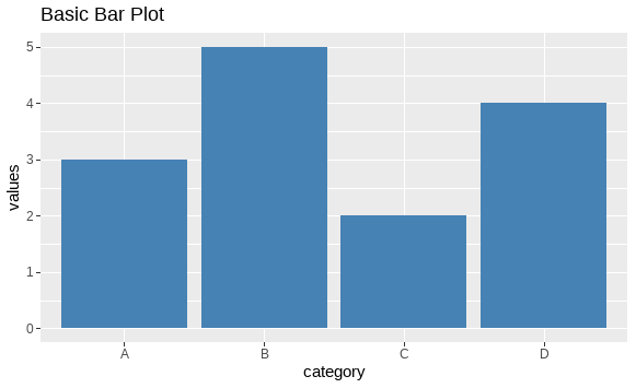
Let’s create a simple bar chart using the mtcars dataset. This will serve as our starting point.
Output:
In this chart, the cyl variable represents the number of cylinders in the cars, and the chart shows the number of cars for each cylinder count. By default, the y-axis starts at 0. We will now change this so that the y-axis starts at 1.
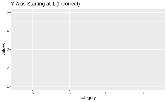
To make the y-axis start at 1 instead of 0, you can use the scale_y_continuous() function in ggplot2 and set the limits of the y-axis. However, setting the lower limit of the y-axis with this function can sometimes result in the bars being clipped if any values fall below the limit.
Output:
In the above example, values like 2 and 3 might not show up on the plot because they are below the limit of 1.
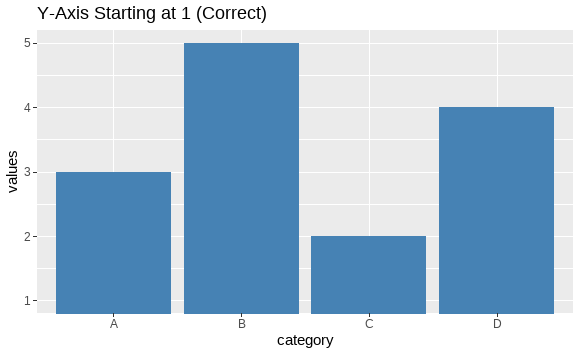
coord_cartesian()To solve this, we can use the coord_cartesian() function. This will restrict the visible range of the y-axis but retain all bars, even if their heights are lower than 1.
Output:
Here, even bars with values below 1 will still be visible, but the y-axis will visually start from 1.
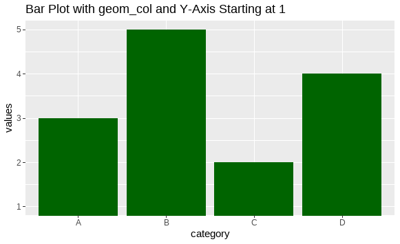
geom_col()In some cases, you might prefer to use geom_col() instead of geom_bar(stat = "identity"). Here's an example that also starts the y-axis from 1 using coord_cartesian():
Output:
Making the y-axis start at 1 instead of 0 in ggplot2 can be a useful technique for improving the visualization of certain datasets. The key to achieving this without losing any bars or data points is to use the coord_cartesian() function rather than directly manipulating the axis limits via scale_y_continuous(). By following the examples provided in this article, you can create error-free bar charts where the y-axis starts at 1, while retaining full visibility of your data.