 |
VOOZH | about |
|
VOOZH | about |
In data visualization, color plays a crucial role in distinguishing data points and revealing patterns. When dealing with continuous variables like dates, the choice of color scales can greatly affect the clarity of the visualization. One of the best color scales for continuous data is the Viridis color scale in R Programming Language.
The Viridis color scale was developed to ensure perceptual uniformity, meaning that the color changes correspond to changes in data values consistently across the scale. It is also designed to be accessible to those with color vision deficiencies. Viridis comes in four variants:
Here is the main reasons why we use viridis colour scale:
In ggplot2, we can map dates directly to a color scale. ggplot2 handles date-type data well, and it can use color scales to represent them on a plot. When visualizing time-based data, such as events over a calendar year or time points in a time series, mapping dates to color can make trends easier to identify.
First we will load the package along with ggplot2:
Let's start by creating an example dataset with dates:
Output:
 date value
1 2023-01-01 17.19762
2 2023-02-01 18.84911
3 2023-03-01 27.79354
4 2023-04-01 20.35254
5 2023-05-01 20.64644
6 2023-06-01 28.57532
This dataset has dates ranging from January 2023 to December 2023 and some random values associated with each date.
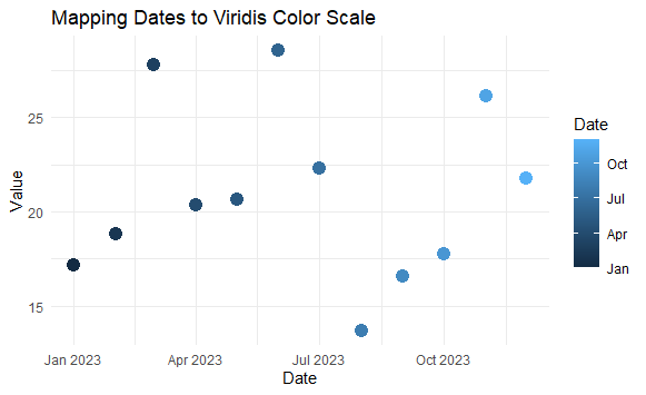
Now we will create one basic plot.
Output:
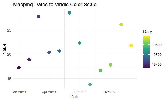
To map dates to the Viridis color scale in a ggplot visualization, we will use the scale_color_viridis_c() function for continuous data, or scale_fill_viridis_c() if filling areas.
Output:
scale_color_viridis_c().scale_color_viridis_c(option = "viridis"): Applies the Viridis color palette to the continuous variable (dates). You can change "viridis" to "magma", "plasma", or "inferno" for different color variants.
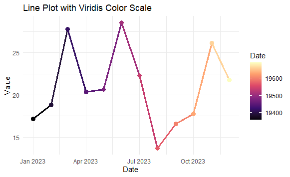
Now we will dealing with time series data, a line plot is a more appropriate visualization.
Output:
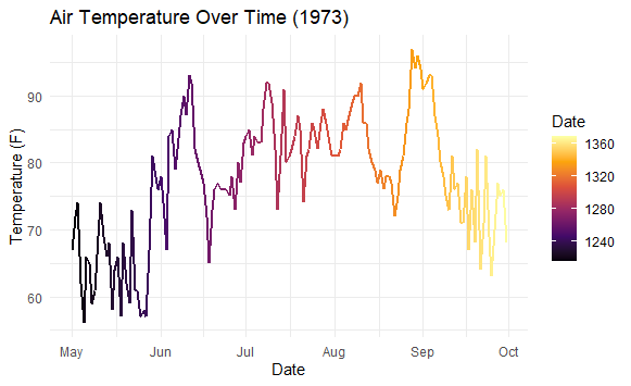
magma color scale is used here for variety.Let’s use real-world time-series data to show the practical application of mapping dates to the Viridis color scale. We'll use the built-in airquality dataset, which contains daily air quality measurements in New York.
Output:
This plot visualizes the temperature changes over time, with dates mapped to the Inferno color scale. As time progresses, the color transitions, making it easier to track trends over the months.
Mapping dates to the Viridis color scale in ggplot2 allows you to create perceptually uniform and visually appealing visualizations. It enhances your data interpretation by effectively utilizing color to represent the passage of time, making trends and patterns more apparent. You can experiment with different Viridis color variants (viridis, magma, plasma, inferno) to suit your data and the message you want to convey.