Plotting Large Datasets with ggplot2's geom_point() and geom_bin2d()
Last Updated : 23 Jul, 2025
ggplot2 is a powerful data visualization package in R Programming Language, known for its flexibility and ability to create a wide range of plots with relatively simple syntax. It follows the "Grammar of Graphics" framework, where plots are constructed by combining data, aesthetic mappings, and geometric objects (geoms) representing the visual elements of the plot.
Understanding ggplot2
ggplot2 is a widely used data visualization package in R, developed by Hadley Wickham. It provides a flexible and powerful framework for creating a wide range of visualizations.
Uses a clear and intuitive syntax for building plots.
Allows adding multiple layers to create complex plots.
Maps data variables to visual properties like color and size.
Facilitates creating small multiples for comparing groups.
Highly adaptable for creating diverse visualizations.
Provides easy theming options for customization.
Two commonly used functions for plotting large datasets in ggplot2 are geom_point() and geom_bin2d()
geom_point()
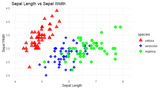
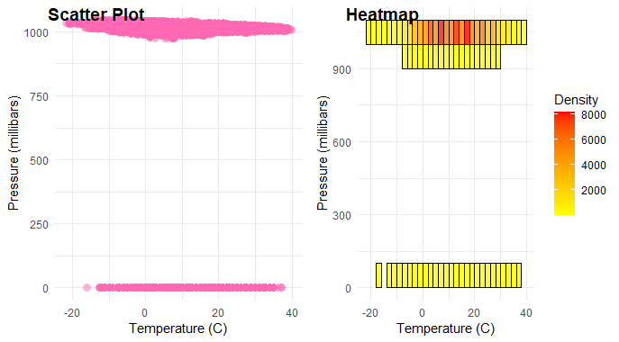
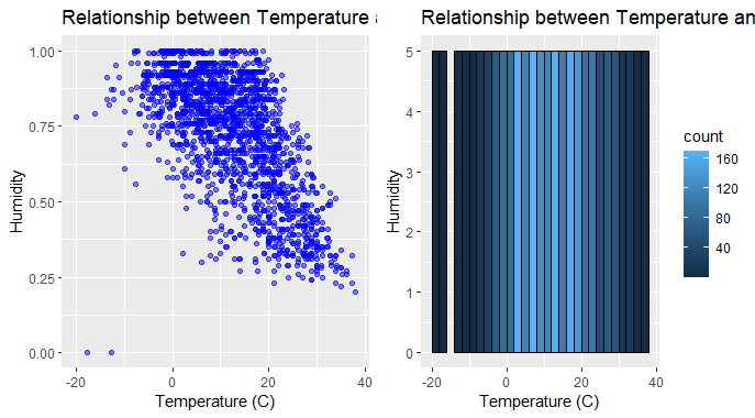
geom_point() is used to create scatter plots, where each point represents an observation in your dataset. When dealing with large datasets, plotting every single point can result in overplotting, making it difficult to discern patterns. To address this, we can use techniques such as alpha blending or jittering to make the points partially transparent or spread them out slightly. However, even with these techniques, plotting very large datasets can be cumbersome and slow.
Features:
Plots Points: geom_point() plots individual points on a graph. Each point represents a single data point.
Customizable Appearance: Customize the appearance of the points, such as their size, color, and shape, to make them stand out or fit for the preferences.
Positioning: We can position the points according to the values of your data variables on both the x-axis and y-axis.
Ease of Use: It's easy to implement. Just need to specify the data frame containing the variables and provide the aesthetics (such as x and y coordinates) to plot the points.
Plot a scatter plot using geom_point() and Customize the appearance of points.
Set the size of points using size.
Adjust transparency using alpha.
Set the width of the outline of points using stroke.
Use position_jitterdodge() to prevent overplotting and dodge points within each category to avoid overlap.
Differentiate points by species using both color and shape aesthetics.
Manually specify colors and shapes for each species using scale_color_manual() and scale_shape_manual().
Provide labels and titles for better readability using labs().
Set a minimalistic theme for the plot using theme_minimal().
Advantages of geom_point
Simple and intuitive for creating scatter plots.
Allows precise representation of individual data points.
Provides flexibility in customization of aesthetics such as size, color, and shape.
Disadvantages of geom_point
Prone to overplotting, especially with large datasets.
May encounter performance issues with rendering large datasets.
Limited insight into overall data distribution, particularly when points overlap heavily.
geom_bin2d()
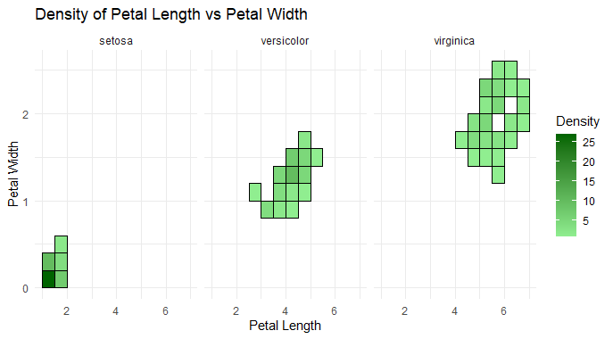
geom_bin2d() is particularly useful for visualizing large datasets by binning the data into a grid and counting the number of observations within each bin. This creates a 2D heatmap, where the color intensity represents the density of points in different regions of the plot. This is an effective way to visualize the distribution of points in a large dataset without overwhelming the viewer with individual points.
Features
Binning: It bins data into a 2-dimensional grid.
Counting: Counts the number of observations in each bin.
Density Visualization: Provides a visualization of the density of data points in a grid format.
Customization: Allows customization of bin size and appearance.
Useful for Heatmaps: It's commonly used to create heatmap-like visualizations.
Statistical Summary: Summarizes data distribution within each bin.
Customized fill color gradient using scale_fill_gradient().
Added labels for the x and y axes using labs().
Positioned the legend on the right side using theme(legend.position = "right").
Applied a minimal theme using theme_minimal().
Display Side by Side by using plot_grid() from the cowplot package to display the scatter plot and heatmap side by side, with appropriate labels.
Difference between geom_point() and geom_bin2d()
Aspect
geom_point()
geom_bin2d()
Purpose
Display individual data points
Visualize density of data points in a grid
Plot Type
Scatter plot
2D binned plot (heatmap)
Handling Large Datasets
May become slow and cluttered with large datasets
More efficient for large datasets due to binning
Performance
Slower with large datasets
Faster with large datasets
Granularity
Preserves individual data points
Aggregates data into bins
Insights
Shows individual data point relationships
Highlights density patterns in data
Transparency
Can be made partially transparent
Not applicable
Techniques for Handling Large Datasets
Reduce dataset size by selecting a representative subset of observations using methods like random sampling or stratified sampling.
Summarize data at a higher level (e.g., by grouping data into categories or summarizing time series data) to reduce the number of individual data points.
Remove outliers or irrelevant data points before plotting to focus on the most important patterns and relationships.
Reduce the number of data points by subsampling or decimating the dataset, maintaining essential characteristics while reducing computational load.
Utilize parallel processing techniques to distribute plotting tasks across multiple cores or nodes, improving performance for large datasets.
Plot data in smaller chunks or batches and progressively update the plot, allowing for interactive exploration without overwhelming resources.
Aggregate data hierarchically, starting with coarse aggregation to visualize general trends and progressively refining the visualization for more detailed insights.
Utilize spatial indexing techniques to efficiently query and visualize spatial data, reducing computational overhead for large geographic datasets.
Optimize data preprocessing steps, such as sorting or indexing, to streamline plotting operations and improve overall performance.
Conclusion
In ggplot2's geom_point() and geom_bin2d() are powerful tools for visualizing large datasets. While geom_point() excels in displaying individual data points, geom_bin2d() offers a more efficient approach by binning data into a grid. Understanding the concept of each method enables effective data exploration and insight generation in diverse analytical contexts.
