 |
VOOZH | about |
|
VOOZH | about |
Food delivery services have become an integral part of daily life, with platforms like Zomato, Swiggy, and Foodpanda leading the way. These companies generate large amounts of data that can be analyzed to offer insights. We will demonstrate a comprehensive analysis of a food delivery dataset in R Programming Language.
In this project, we will analyze a food delivery dataset to uncover patterns and trends within the food delivery industry. The dataset contains several key variables, including Delivery Person Age, Ratings, Order Date, Time Taken, and Weather Conditions.
We will:
By the end of this analysis, we will gain valuable insights that can help businesses optimize their delivery services and improve customer satisfaction.
Dataset Link:Food Delivery Data
We will begin by loading the necessary libraries for data manipulation and visualization. We installed and loaded the libraries dplyr, ggplot2, forecast, and car to handle data processing, visualization, and time series analysis.
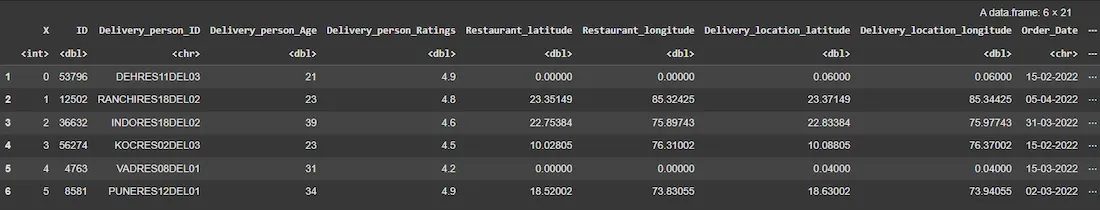
Next, we will load the food delivery dataset into R using the read.csv() function. We will display the first few rows to get an overview of the data structure.
Output:
We will clean the dataset to ensure its accuracy and prepare it for analysis.
EDA helps us understand the underlying characteristics of the dataset. We will visualize important patterns and distributions.
We will create a histogram of delivery times, a bar plot of delivery person ratings, a pie chart for road traffic density, and more to gain insights into the food delivery process.
Output:
The histogram shows the distribution of delivery times, revealing the most common delivery durations and providing insights into delivery performance.
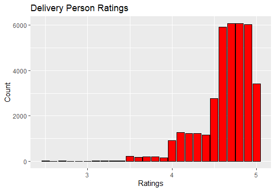
We will visualize the distribution of delivery person ratings to understand the feedback given to delivery personnel. We will create a bar plot to show the frequency of various delivery person ratings.
Output:
The bar plot reveals the distribution of ratings, indicating how delivery personnel are generally rated by customers.
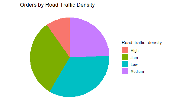
Now we will visualize the Orders by Road Traffic Density by creating a a pie chart to show the proportion of orders under different road traffic conditions.
Output:
The pie chart shows how traffic density affects the number of orders, providing insights into delivery challenges during peak traffic hours.
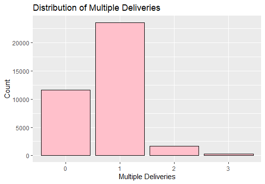
Now we will visualize the Distribution of Multiple Deliveries.
Output:
The bar plot shows that delivery personnel often handle multiple deliveries at a time, providing insights into delivery efficiency.
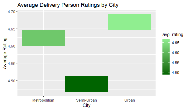
Now we will visualize the Average Delivery Person Ratings by City.
Output:
This heatmap visualizes the average ratings of delivery persons in different cities, highlighting cities with higher or lower average ratings.
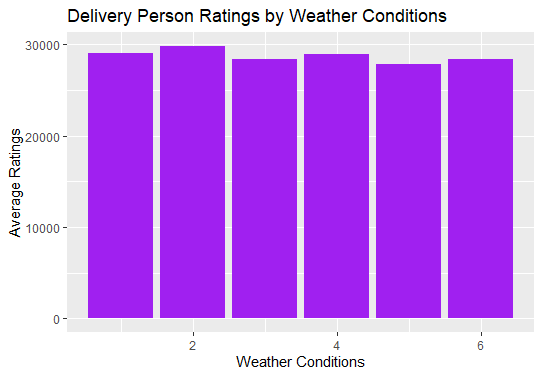
Now we will visualize the Delivery Person Ratings by Weather Conditions.
Output:
This bar plot displays the average ratings of delivery persons under different weather conditions, indicating how weather affects performance.
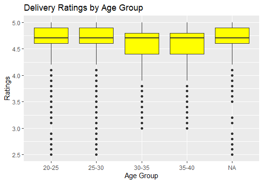
Now we will visualize the Delivery Ratings by Age Group.
Output:
This box plot shows the distribution of delivery person ratings for each age group, allowing us to compare the ratings received by different age groups of delivery persons.
From our analysis, we:
We concluded that delivery times, weather, and traffic play a significant role in customer satisfaction. By understanding these patterns, businesses can optimize routes, manage delivery times more effectively, and improve service quality, ultimately enhancing customer retention.