In binary classification problems, it's important to evaluate how well a model performs. One popular and useful method is using the ROC (Receiver Operating Characteristic) curve. This curve helps us visualize the trade-off between the model’s ability to correctly identify positive cases and the chance of incorrectly identifying negatives as positives.
What is an ROC Curve?
An ROC curve is a graph that shows the performance of a binary classifier as its decision threshold is changed. It plots:
True Positive Rate (TPR): Also called sensitivity or recall, it shows how many actual positives were correctly predicted.
False Positive Rate (FPR): The proportion of actual negatives that were wrongly predicted as positives.
Area Under the Curve (AUC): A single number that summarizes how well the model distinguishes between the two classes.
Perfect: AUC = 1 means the model makes flawless predictions, correctly distinguishing all positives and negatives.
Random: AUC = 0.5 means the model performs no better than random guessing, showing no discriminative ability.
Importance of ROC Curves in Model Evaluation
The ROC curve in R helps in understanding how well the model performs across different thresholds. It provides a visual understanding of the trade-off between true positives and false positives. The ROC curve is particularly helpful when:
Imbalanced dataset where one class dominates over the other.
Compare the performance of multiple classification models.
Interested in how the classifier performs over a range of thresholds.
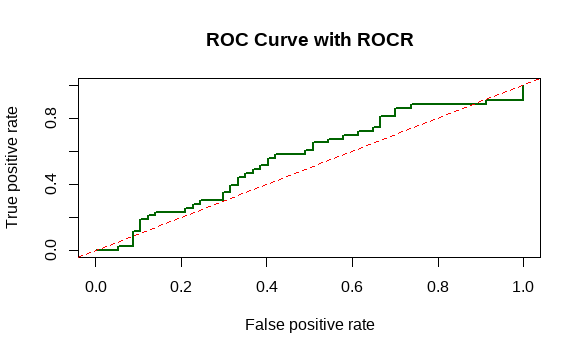
To work with ROC curves in R, we can use two packages:
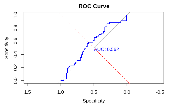
1. Plotting ROC Curve Using pROC
The pROC package makes it simple to compute and visualize ROC curves. Let's start with a basic example using a simulated dataset.
set.seed(123): Ensures reproducibility by fixing the random number generation.
sample(): Creates a vector of binary outcomes (0 and 1) to simulate actual labels.
runif(): Generates 100 random probabilities between 0 and 1 to simulate predicted scores.
library(pROC): Loads the pROC package into the R session.
roc(): Calculates the ROC curve using actual outcomes and predicted probabilities.
plot(): Draws the ROC curve with optional AUC display.
abline(): Adds a diagonal line representing random classification (FPR = TPR).
