Curve fitting in R is the process of finding a mathematical curve that best describes the relationship between input and output variables in a dataset. It is used when the data does not follow a straight line, allowing us to model complex relationships and predict unknown values.
Common Methods for Curve Fitting in R
We use the following methods to fit curves, depending on the nature of our data.
Linear Regression: Fits a straight line using least squares and is best for linear relationships.
Polynomial Regression: Extends linear regression with polynomial terms and is suitable for nonlinear trends.
LOESS / LOWESS: Fits local curves using smoothing and is ideal for noisy, scattered data.
Spline Regression: Fits flexible curves with piecewise polynomials and is useful for complex datasets.
Implementing Curve Fitting Using Polynomial Models in R
We will now perform curve fitting using polynomial regression in R programming language, which includes data visualization, model fitting, model evaluation and then plotting the best-fitting curve.
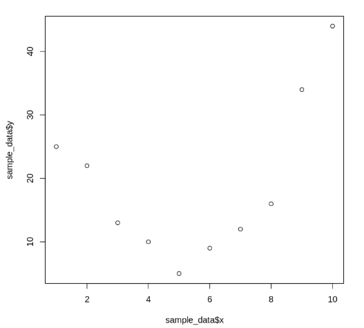
1. Visualizing the Data
We start by plotting the given data points using a scatter plot. This allows us to observe the pattern and spread of the data.
sample_data: A data frame containing x and y values.
plot(): A base R function used to create a two-dimensional scatter plot.
sample_data$x, sample_data$y: Vectors representing the x-axis and y-axis values to be plotted.
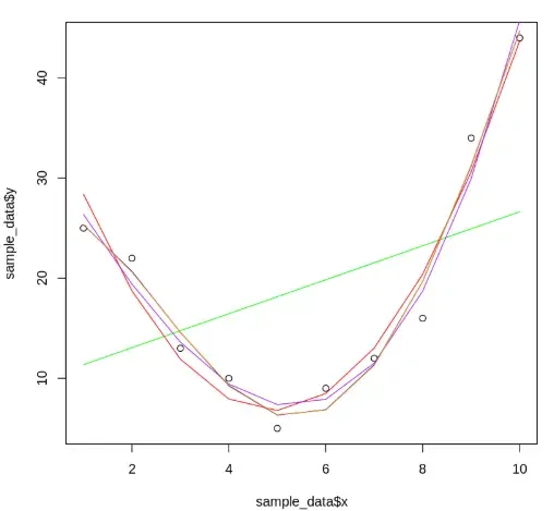
We create multiple polynomial regression models to fit curves of increasing complexity to the data, with each model representing a specific polynomial degree.
lm(): Used to fit linear models. Here, it fits polynomial relationships between x and y.
poly(x, degree, raw=TRUE): Generates polynomial terms of the specified degree from vector x.
plot(): Used again to display the scatter plot before adding fitted lines.
seq(1, 10, length=10): Generates a sequence of evenly spaced values from 1 to 10, which are used as x-axis values for prediction.
predict(): Computes predicted y-values for a given model and new x-values.
lines(): Adds the fitted curve to the existing scatter plot.
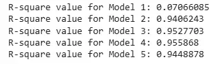
We evaluate the fitted models based on their adjusted R-squared values, which indicate how well each model explains the variability in the response data while accounting for the number of predictors.
summary(): Returns a detailed summary of the linear model.
$adj.r.squared: Extracts the adjusted R-squared value from the model summary.
Higher values of adjusted R-squared indicate better model performance.
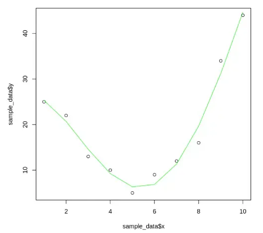
We select the model with the highest adjusted R-squared value based on the evaluation (in this case, the 4th-degree model) and visualize it clearly on the scatter plot.
best_model: Stores the final selected linear model.
The lines() function overlays the best-fit curve on the scatter plot.
