 |
VOOZH | about |
|
VOOZH | about |
A CarouselView widget in Flutter is an advanced widget that helps developers to design a list of widgets where only one item is visible as a carousel and can be implemented to cycle through images, items, product cards or content sliders, among others. In this article, more focus is given to the properties and possible ways of using the CarouselView class and the impact that the definition of specific properties would have on the carousel.
The CarouselView constructor allows you to create a material design carousel with several customizable properties:
Let's explore some of the essential properties of the CarouselView class.
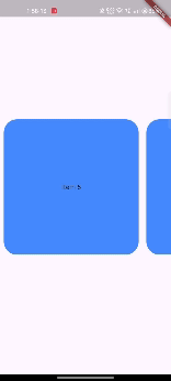
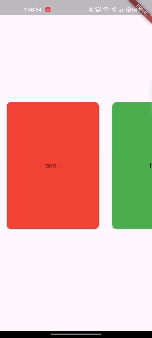
The backgroundColor property defines the background color for each carousel item. Setting this property changes the appearance of each item in the carousel.
Each item in the carousel will have a blue accent background.
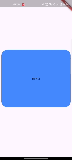
The elevation property sets the z-coordinate of each carousel item, giving it a shadow effect.
Each item will appear elevated with a shadow, making it stand out from the background.
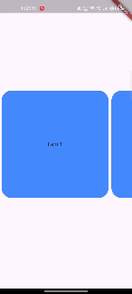
The shape property allows you to customize the shape of each carousel item using ShapeBorder.
Each item in the carousel will have rounded corners, giving it a more refined appearance.
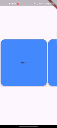
The padding property defines the space surrounding each carousel item.
Each item will have padding around it, ensuring that the items are not too close to each other.
The itemSnapping property controls whether the carousel should snap to the next or previous item when scrolling. This is particularly useful when you want the user to focus on one item at a time.
When scrolling, the carousel will automatically snap to the next item, ensuring that each item is centered in the view.
The scrollDirection property allows you to specify the direction in which the carousel scrolls. By default, it scrolls horizontally.
The carousel will scroll vertically instead of horizontally.
The reverse property determines whether the carousel should scroll in the reverse direction.
The carousel will scroll in the opposite direction, starting from the last item.
Here’s a complete example combining several properties to create a more customized carousel:
This example creates a horizontally scrolling carousel with rounded corners, padding, elevation, and snapping behavior. Each item will have a different background color, and the carousel will snap to the nearest item as it scrolls.
The CarouselView class in Flutter offers a versatile way to create visually appealing carousels with customizable properties. By adjusting properties like backgroundColor, elevation, shape, and itemSnapping, you can create a carousel that fits the specific needs of your application. The examples provided should give you a good starting point to explore the potential of CarouselView in your Flutter projects.