 |
VOOZH | about |
|
VOOZH | about |
Jetpack Compose is Google’s modern toolkit for building native Android user interfaces using declarative Kotlin code. It makes UI development faster and easier. One of the most important parts of designing any interface is understanding how to lay out your elements. Compose makes layouts flexible and powerful, offering a much simpler way to arrange UI elements compared to traditional XML. In this article, you'll learn the basics of layout in Jetpack Compose, explore the different layout containers available, and see how to create your own custom layout to fit your app's needs.
In Jetpack Compose, a layout is a container that decides how child composables (UI elements) are arranged on the screen. It defines their size and position based on certain rules or constraints. Layouts are written in Kotlin code, making them easier to manage and more readable than traditional XML. Jetpack Compose also provides several built-in layout containers like - Row, Column, Box, and Lazy Layouts that are easy to use and cover most common layout needs.
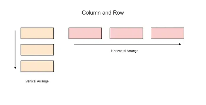
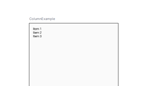
The Column composable arranges its child composables vertically, one below the other. It respects the constraints of its parent and will take up as much vertical space as it needs for its children.
Preview:
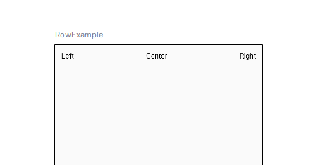
Similar to Column, the Row composable arranges its children horizontally in a line, from left to right. It takes up as much horizontal space as necessary to fit its children.
Preview:
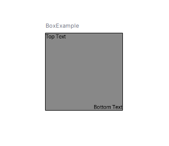
The Box composable allows children to be layered on top of each other, enabling overlays or stacking of elements. By default, each child will be positioned in the top-left corner unless specified otherwise.
Preview:
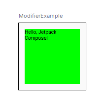
Modifiers are fundamental in Compose as they allow you to define how your composables behave and appear. You can chain multiple modifiers to achieve a range of effects such as layout control, interaction handling, and appearance styling.
Preview:
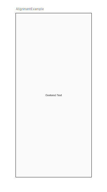
Compose provides flexibility in aligning children within layout containers like Row, Column, and Box.
Preview:
Basically, predefined layouts should be enough in most cases, but sometimes you have to place elements with specific positioning rules into your layout. With the help of Layout composable, Compose let you design your own layouts.
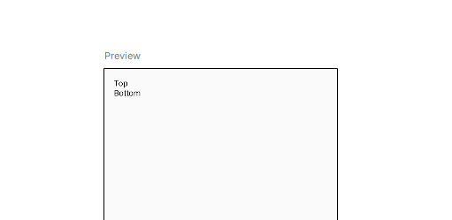
Let’s create a simple custom layout that places one composable in the center and another one below it.
Preview:
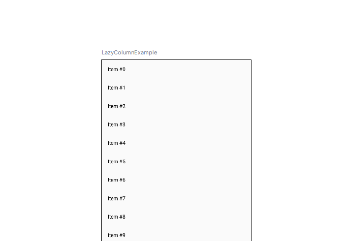
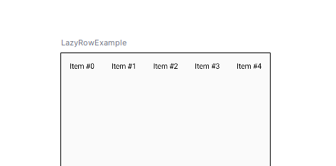
For dynamic and large data sets, LazyColumn and LazyRow are efficient alternatives to Column and Row. These layouts render only the visible items, significantly improving performance for scrollable lists.
Preview:
Preview:
Better than using XML, the layout in Jetpack Compose is easier to create and adjust for UI layouts in android applications. Apart from basic UI containers such as Column, Row, Box and LazyColumn, it offers powerful modifiers with which you can create responsive and dynamic UI. Custom layouts are useful when needed to give an option for creating extremely targeted and unique designs for your app.With this foundation you will be able to start introducing Compose layouts to build smooth and beautiful user interfaces. It’s declarative which gives you the opportunity to write the UI code in a composing clear and consistently maintainable.