 |
VOOZH | about |
|
VOOZH | about |
Jetpack Compose in Android has brought a modern and streamlined approach to building UI components inside an Android Application. One of its components is 'Slider'. It provides a way for users to select a value between a certain range by dragging their finger on a horizontal line. Sliders are perfect when you want your users to enter values inside a certain range and also define the intervals between the values. This forces users to select only predefined values which is perfect in situations that require precise control or when only certain values are valid.
In this article, we will see how to implement Sliders in Android using Jetpack Compose.
A slider is a UI component that allows users to choose a continuous or discrete value within a certain range by sliding their finger on a horizontal line.
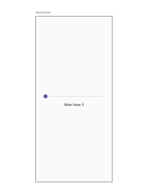
Jetpack compose makes it very easy to implement a slider in Android! There is a Slider UI component readily available to use. Below is the basic implementation of a slider in Android
Let's see the parameters used inside the Slider.
Off course a slider is useless if it doesn't show what value it is in right? To add a value label to the slider, we will need Text components. The slider component doesn't have an inbuilt label function, so we need to code it manually.
We will put all the components into a Composable function so that it binds the Text components and the Slider together! So whenever we need a slider, we will just call the function and done. We have a working slider and a label attached!
Here is the code for the Composable function:
We have added two Text Components to add a label to the Slider.
text = "${sliderValue.toInt()}". As you can see, the text component gets its value from the sliderValue variable. So whenever there is a change in the sliderValue, it gets displayed in the text component!
Preview:
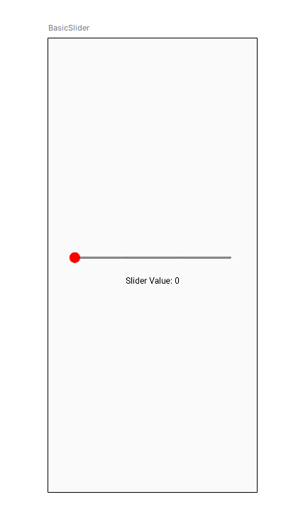
Jetpack Compose allows various customizations in a slider. Its color can be customized, its range, and its step value.
Color: An Instance of SliderColor, lets you customize the thumb color, the active region color, and the inactive region color in the slider
colors = SliderDefaults.colors(
	thumbColor = Color.Red,
	activeTrackColor = Color.Green,
 inactiveTrackColor = Color.Gray
)
valueRange: As seen previously, it lets us adjust the range of the slider. We can set its value by using this syntax: ' Low.the High '.
valueRange = 0f..100fsteps: This is the number of notches on the slider to which the thumb snaps. For example: if the step is defined as 2, the slider will only stop at 2 values between the low and high range.
steps = 2We have defined valueRange as 0f..100f, and steps as 2, so the slider will only stop at 2 intervals between 0 and 100. Those are { 0, 33, 66, 100 }.
Here is the whole implementation for the customized slider:
Preview:
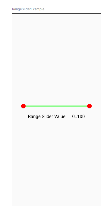
Range slider is also a component in Jetpack, same as slider. The only difference is that the Range Slider contains two thumbs and allows the user to select a range of values between the Minimum and Maximum values.
Range slider's parameters are the same as the slider's.
Here's a basic syntax of a Range Slider:
Here is the complete implementation of Range Slider:
Preview: