 |
VOOZH | about |
|
VOOZH | about |
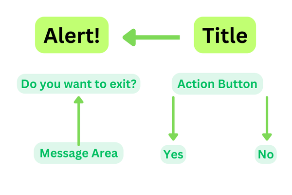
AlertDialog shows the Alert message and gives the answer in the form of yes or no. Alert Dialog displays the message to warn you and then according to your response, the next step is processed. Android Alert Dialog is built with the use of three fields: Title, Message area, and Action Button.
We have seen AlertDialog in many of the apps, this is used to display a kind of message to our users. In this article, we will see the implementation of Alert Dialog in Android using Jetpack Compose.
Attributes | Description |
|---|---|
| onDismissRequest | to check if the alert dialog is open or not. |
| title | to add title in our alert dialog. |
| text | to add a text description to our Alert Dialog. |
| confirmButton | to set a button for confirmation in Alert Dialog. |
| dismissButton | to set a dismiss dialog button in Alert Dialog. |
containerColor | used to add a background color of an Alert Dialog. |
| titleContentColor | used to add title color to our Alert Dialog. |
textContentColor | used to add text color to our Alert Dialog. |
iconContentColor | used to add icon color to our Alert Dialog. |
icon | A composable function that defines the icon for the Alert Dialog. |
modifier | Used to add padding around the Alert Dialog. |
shape | used to define the shape of the Alert Dialog. |
tonalElevation | used to define the elevation of the Alert Dialog. |
properties | used to define the properties of the Alert Dialog. |
To create a new project in the Android Studio, please refer to How to Create a new Project in Android Studio with Jetpack Compose.
Note: Select Kotlin as the programming language.
Navigate to app > java > {package-name} > MainActivity.kt. Inside that file add the below code to it. Comments are added inside the code to understand the code in more detail.
MainActivity.kt: