 |
VOOZH | about |
|
VOOZH | about |
Jetpack Compose is a new toolkit provided by Google. This is useful for designing beautiful UI designs. A Button is a UI component in Android which is used to navigate between different screens. With the help of a button, the user can interact with your app and perform multiple actions inside your application. In this article, we will take a look at the implementation of buttons in Android using Jetpack Compose.
Attribute | Description |
|---|---|
| onClick | To perform an action when your button is clicked by the user. |
| modifier | this parameter is used to add padding to our button. |
| enabled | to enable or disable your button. |
| border | this parameter is used to add a border stroke to our button. |
| shape | this parameter is used to add shape to our button. |
| Text() | this parameter will be used to add text which is to be displayed on your button. |
colors | Used Customized the button colors for different states (normal, disabled). |
elevation | Set different elevations for the default, pressed, and disabled states. |
contentPadding | Added padding inside the button around its content for a better appearance. |
interactionSource | Used a default MutableInteractionSource to handle interaction states. |
content | Added a Text composable inside the button, with customized text properties like font size, weight, style, and family. |
To create a new project in the Android Studio Canary Version please refer to How to Create a new Project in Android Studio Canary Version with Jetpack Compose.
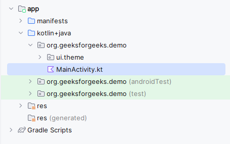
Navigate to the app > java > your app’s package name and open the MainActivity.kt file. Inside that file add the below code to it.
Comments are added inside the code to understand the code in more detail.
MainActivity.kt: