 |
VOOZH | about |
|
VOOZH | about |
Material Design Components (MDC Android) offers designers and developers a way to implement Material Design in their Android applications. Developed by a core team of engineers and UX designers at Google, these components enable a reliable development workflow to build beautiful and functional Android applications. If you like the way how the UI elements from Google Material Design Components for android which are designed by Google are pretty awesome, then here are some steps that need to be followed to get them, and one of them is Google Material Design Components (MDC) Buttons. A Button is a user interface that is used to perform some action when clicked or tapped. Under the Button category, there are mainly 4 types of buttons in Google material design components:
Below is a demo of all types of Buttons that we are going to create in this project.
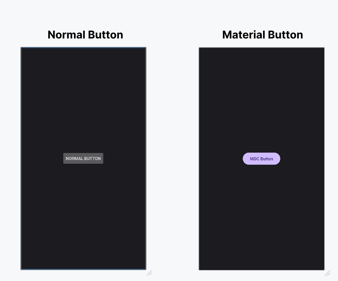
Before going to implement all types of Buttons let's understand why choosing these material components over ordinary inbuilt components in Android? Please refer to the following points to understand this.
To create a new project in Android Studio please refer to How to Create/Start a New Project in Android Studio.
Include google material design components dependency in the build.gradle.kts file. After adding the dependencies don't forget to click on the "Sync Now" button present at the top right corner.
implementation ("com.google.android.material:material:1.12.0")Note: While syncing your project you need to be connected to the network and make sure that you are adding the dependency to the Module-level Gradle file as shown below.
Go to app > src > main > res > values > themes.xml and change the base application theme. The MaterialComponents contains various action bar theme styles, one may invoke any of the MaterialComponents action bar theme styles, except AppCompat styles.
Let's discuss why we need to change the action bar theme to the material theme of the app to invoke all the Google MDC widgets in our android application:
themes.xml:
One can change the color combination of the application and it's an optional step. Go to app > src > main > res >colors.xml file and choose your color combination.
colors.xml:
Now in this file, we are going to design the material button as the user requirements. Note that for each of the Button styles the "style" attribute is different.
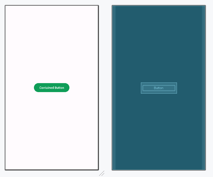
Contained buttons are high-emphasis, distinguished by their use of elevation and fill. They contain actions that are primary to the app. Note that the contained button is the default style if the style is not set. Below is the XML code for the contained button.
Design UI (Contained Button):
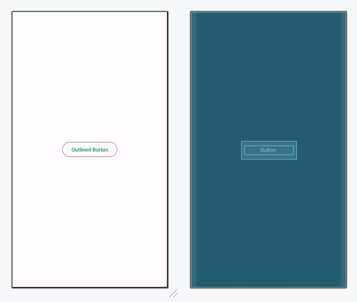
Outlined buttons are medium-emphasis buttons. They contain actions that are important but aren’t the primary action in an app. These are used for more emphasis than text buttons due to the stroke. Below is the XML code for the Outlined button.
Design UI (Outlined Button):
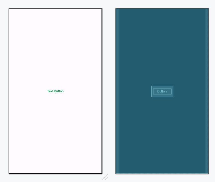
Text buttons are typically used for less-pronounced actions, including those located in dialogs and cards. In cards, text buttons help maintain an emphasis on card content. These are typically used for less important actions. Below is the XML code for the Text button.
Design UI (Text Button):
Toggle buttons group a set of actions using layout and spacing. They’re used less often than other button types. There are 2 types of Toggle Buttons in Google Material Design Components.
To emphasize groups of related toggle buttons, a group should share a common container. Add the below XML code for the Toggle button inside a parent layout.
activity_main.xml:
Design UI (Toggle Button):
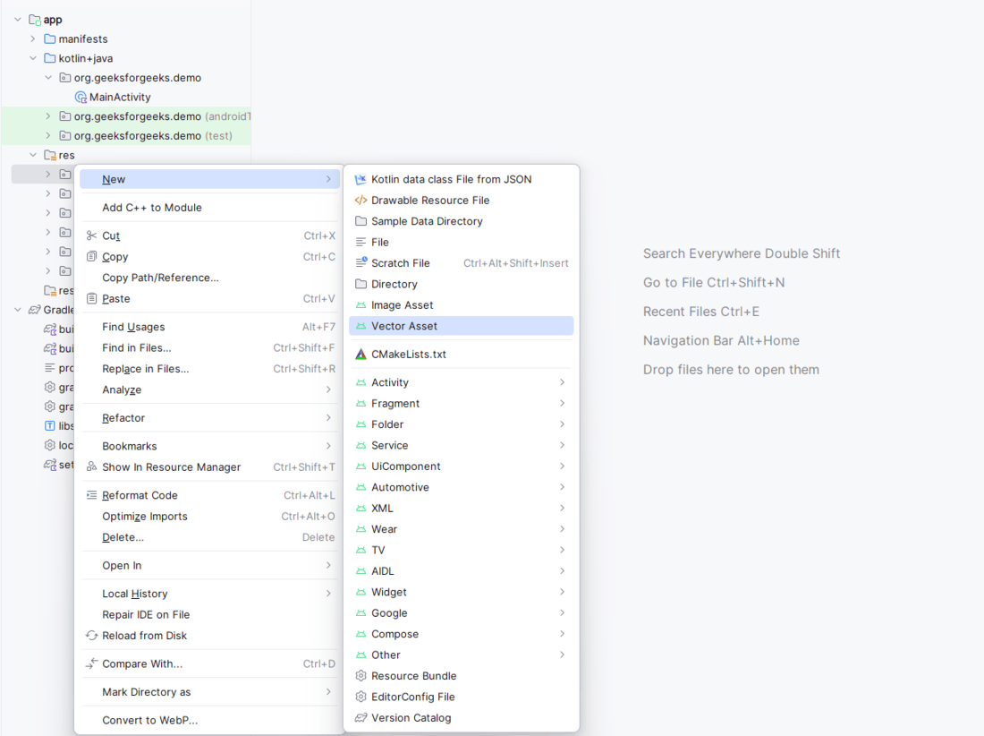
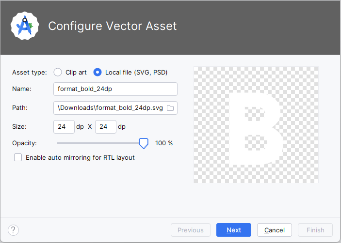
To implement the toggle button with icons only import the icons in the drawable folder. In this example, we have imported format_black, format_italic, format_underline icons. To import the icons right-click on the drawable folder, goto new, and select Vector Asset as shown below.
After clicking on Vector Asset, go to Local file (SVG, PSD) select the icon you want to import to the drawable folder as shown below.
Add the following code in themes.xml file:
After importing the desired icons invoke the code in the parent layout of the activity_main.xml file. Below is the XML code for the Toggle button with icons.
activity_main.xml:
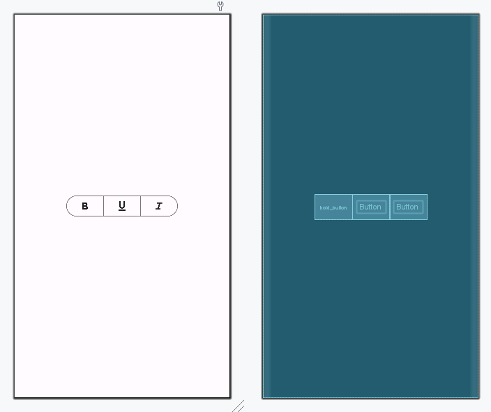
Design UI (Toggle Button with icons):