 |
VOOZH | about |
|
VOOZH | about |
EditText is one of the most important widgets which is seen in most of the apps. This widget is generally used to get the data from users. Users can directly communicate with the app using this widget. This widget is used to get the data from the user in the form of numbers, text or any other text. In this article, we will take a look at the implementation of the TextField composable function in Android using Jetpack Compose.
Attributes | Description |
|---|---|
| value | value is used to get the entered value from the user in the text field. |
| placeholder | if the text field is empty we are displaying a hint to the user what he has to enter in the text field. |
| keyboardOptions | keyboardOptions is used to add capitalization in the data which is entered by the user in the text field, we can also specify an auto correction option in this. We can specify the type of keyboard which we have to display such as (phone, text) and to display actions which can be performed from the keyboard itself. |
| textStyle | to add styling to the text entered by the user. It is used to add font family, font size and styling to our text. |
| maxLines | to add maximum lines for our text input field. |
| focusedTextColor | active color is used when a user has clicked on edit text or the text field is focused and entering some data in the text field. |
| singleLine | In this, we have to specify a boolean value to avoid moving user input into multiple lines. |
| disabledTextColor | Inactive color is specified when the user is not being focused on our Text Input Field. |
| colors | to specify the background color for our text input field. |
| leadingIcon | This method is used to add the leading icon to our text input field. With this method, we can also specify the color(tint) for our icon. |
| trailingIcon | This method is use to add trailing icon to our text input field. With this method we can also specify color(tint) for our icon. |
minLines | Used to set the minimum number of lines. |
shape | Used to provide the shape to the TextField which is set to the medium shape from the theme. |
enabled | used to make the TextField is enabled, allowing user interaction. |
readOnly | used to make the TextField not read-only, allowing text input. |
label | a composable used for displaying a label for the TextField. |
isError | used to show the TextField is not in an error state. |
To create a new project in the Android Studio Canary Version please refer to How to Create a new Project in Android Studio Canary Version with Jetpack Compose.
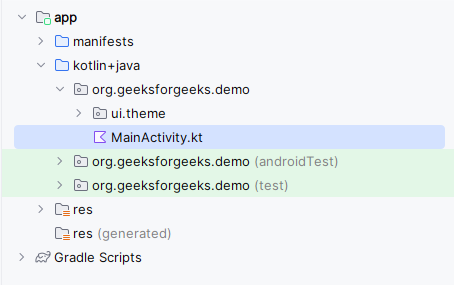
Navigate to the app > java > your app’s package name and open the MainActivity.kt file. Inside that file add the below code to it.
Comments are added inside the code to understand the code in more detail.
MainActivity.kt:
In this example we are adding some extra functionality to the TextField.
MainActivity.kt: